

Support our independent tech coverage. Chrome Unboxed is written by real people, for real people—not search algorithms. Join Chrome Unboxed Plus for just $2 a month to get an ad-free experience, access to our private Discord, and more. Learn more about membership here.
START FREE TRIAL (MONTHLY)START FREE TRIAL (ANNUAL)
Material You, for those who have not already become tired of hearing the term, is Google’s new design language which has quickly taken over its apps and services. From its Android widgets to Google TV, ChromeOS, Collections, Nearby Share, Chrome, the Play Store, Gmail, Google News, and nearly every other user experience in its ecosystem, the company has truly gone all in on modernizing with the attractive visual overhaul.
Today, the tech giant’s corner of the internet received its latest Material You makeover with the Google Account switcher found in the top-right corner of Google services. As you can see in the image below, it now features a new two-tone layout with rounded corners. I’ve gone ahead and erased my personal data, but obviously, your name and email address would occupy the darker section to the right of the profile picture.
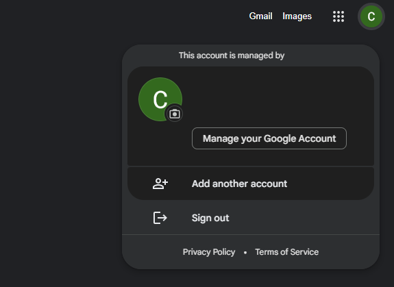
Depending on whether you have the website in light or dark mode, the switcher will follow suit. I’m only seeing this on one Google account right now, but it will, of course, be rolling out to everyone in due time. Sadly, there is no Dynamic Color applied to the new UI elements, but it’s really a non-issue given that this is only ever seen in light or dark mode since the background for most Google services utilizes one or the other.
To me, it seems a bit odd to prioritize such a thing when Gmail is still lacking a dark mode after all of this time. I just wish Google would knock that out before concerning itself with the polish of all of the other elements, but I also understand that different teams work on separate features. Let me know in the comments section if you’re seeing this new account switcher on the web. If you’re not, do keep in mind that this will occur as a server-side update.
SUBSCRIBE TO UPSTREAM
Get Chrome Unboxed delivered straight to your inbox
Upstream is our flagship, curated newsletter with the top stories, most click-worthy deals, giveaways, and trending articles from Chrome Unboxed sent directly to your inbox a few times a week. Join 31,000+ subscribers.