Support our independent tech coverage. Chrome Unboxed is written by real people, for real people—not search algorithms. Join Chrome Unboxed Plus for just $2 a month to get an ad-free experience, access to our private Discord, and more. Learn more about membership here.
START FREE TRIAL (MONTHLY)START FREE TRIAL (ANNUAL)
The advent of Google’s Material You design language on Chromebooks has been a slow process. Our own Michael Perrigo mocked up what Material You on Chromebooks would likely look like over a year and a half ago, so the idea of it isn’t new at all. Slowly over time, Google has added small bits and pieces here and there that get the overall UI closer inline with what we currently have on the company’s Pixel phone lineup.
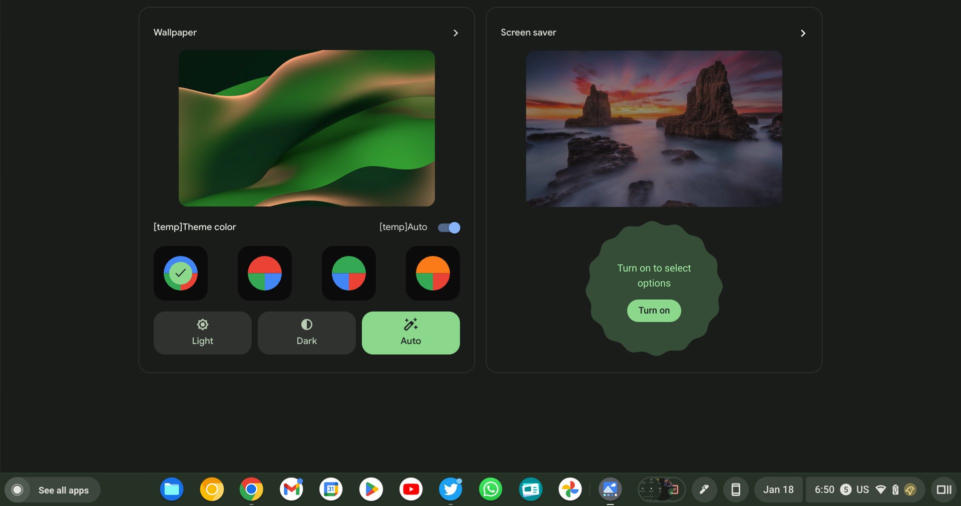
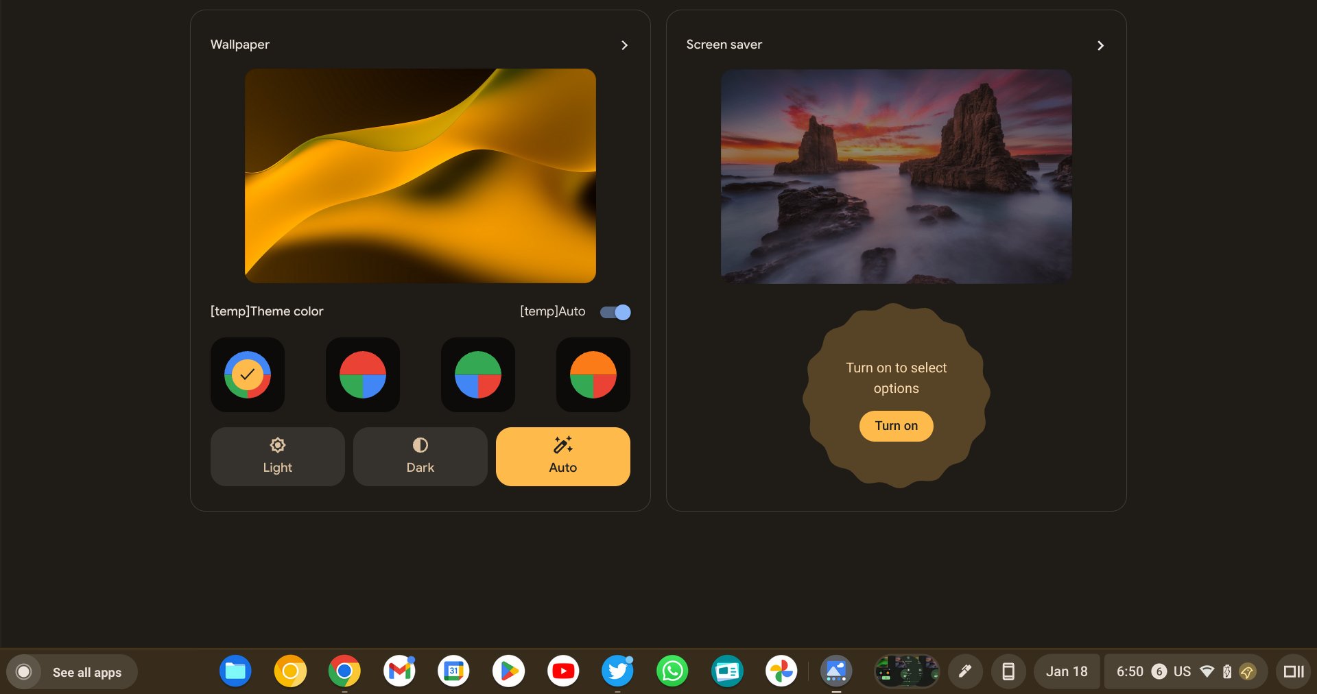
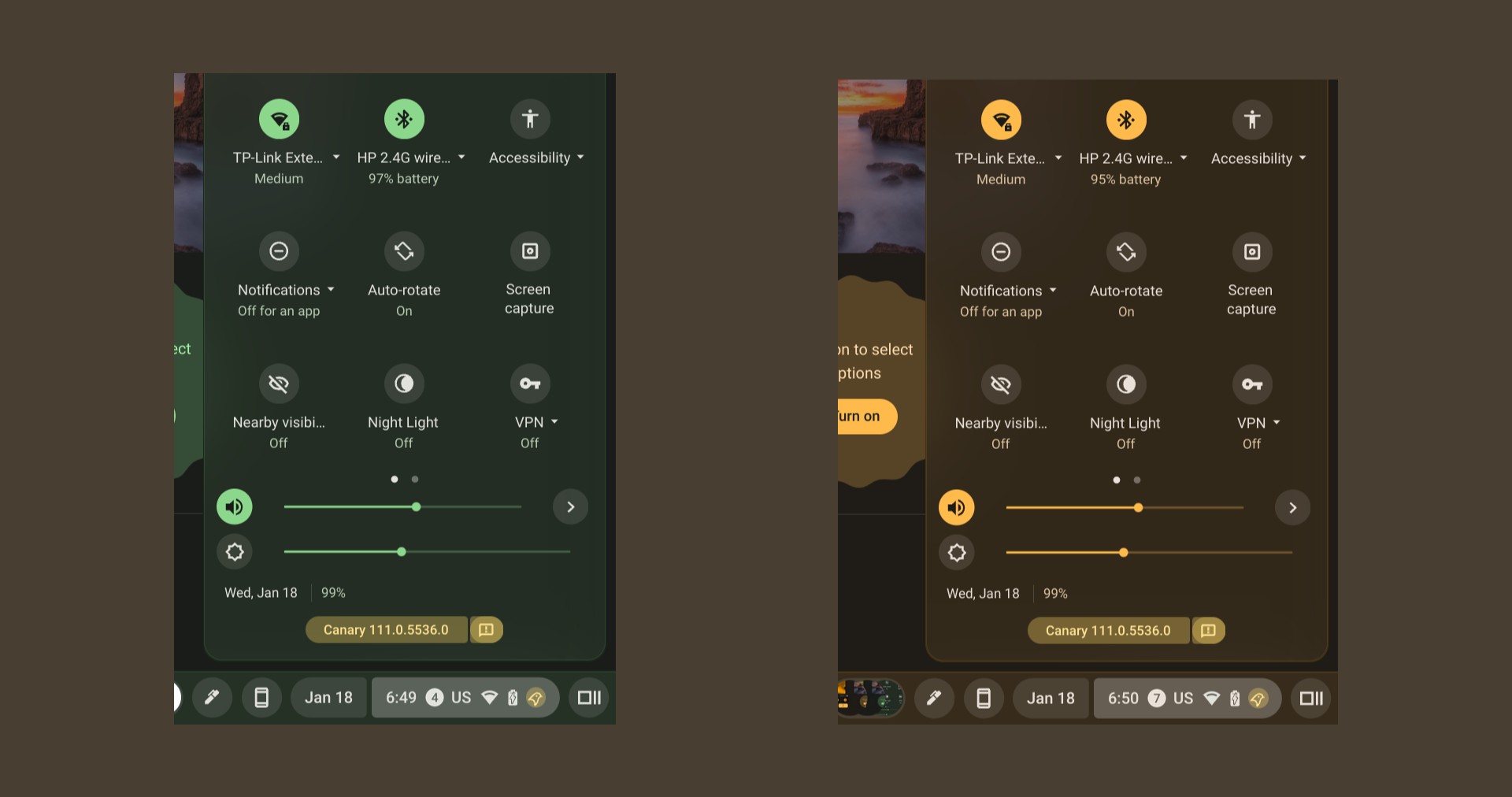
This latest addition is by far the most Google-y, most Material You inclusion yet: a theme picker that pulls from your device’s background. Complete with the rounded starburst circle in the theme picker, this new addition feels completely on-brand for Google and for Material You and is the most blatant adoption of it that ChromeOS has seen to date. Take a look at what C2 Productions over on Twitter has been able to get working:
Maybe it’s the inclusion of the rounded starburst, but this all screams Android 13 to me. We’ve successfully managed to get most of this working in the Developer Channel, too, but we’d recommend just waiting a bit for it to trickle down to the Stable or Beta Channels of ChromeOS before giving it a go.
The entire thing feels pretty far along, so we don’t suspect it will take much longer for it to become generally available. While I don’t think ChromeOS and Android have to share everything in common, Google has clearly been on a path to make them simpler to use together, and UI updates like this make things more familiar for the end-user and thus, make transtioning to a Chromebook that much more comfortable.
I know not everyone loves theming, but it is one of my favorite parts of the Material You update to Android, and I’m very glad to finally see it rolling in for ChromeOS as well. We have a feeling that there will be a lot of user-facing software updates this year as ChromeOS begins to really settle into its design language across the board. While this latest update is exciting, I think there’s more to come. Stay tuned.
SUBSCRIBE TO UPSTREAM
Get Chrome Unboxed delivered straight to your inbox
Upstream is our flagship, curated newsletter with the top stories, most click-worthy deals, giveaways, and trending articles from Chrome Unboxed sent directly to your inbox a few times a week. Join 31,000+ subscribers.


