Support our independent tech coverage. Chrome Unboxed is written by real people, for real people—not search algorithms. Join Chrome Unboxed Plus for just $2 a month to get an ad-free experience, access to our private Discord, and more. Learn more about membership here.
START FREE TRIAL (MONTHLY)START FREE TRIAL (ANNUAL)
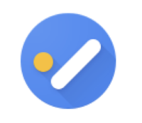
Over on the Google Workspace Updates blog this morning, Google revealed a new logo for its Tasks app. Ever since it was released, Tasks has had the same representation – a circle and a pill shape in the form of an abstract checkmark. However, with this update, which is due to roll out between September 23, 2021 and the two weeks following that date, a less clever and more straightforward version of the check mark in a circle will take its place across mobile, and the web.
Check out the images above comparing the old and the new logos. The new Workspace-style logo is more inline with the other redesigns that Google has pushed out over the past year for most of its other core services that all look virtually identical, with one massive exception – its color. Obviously, Tasks will be easier to identify when placed in your Chromebook’s launcher or in your phone’s app drawer compared to all of the other uber-colorful Google icons.
Users will no doubt appreciate this, but I do have two complaints. What would a Google update be without complaints though, right? Anyway, the new representation for Tasks looks indistinguishable from many other generic tasks apps on the Play Store. In fact, a quick search reveals that TickTick, Tasks & Notes rom UniqTec Inc., MeisterTask, When.Do, Todo Cloud, and countless other products in the same category have almost the same exact design and color scheme, with the exception of the overlapped paper design.
The old Tasks logo was very clever. Google combined two elements in order to give the impression that they were another, and left the rest up to the human brain to fill in. The entire psychology of the original was more involved and more well thought out, while the new one just seems lazy. Perhaps it’s just more utilitarian and simple, and I suppose that’s commendable, but still. I can appreciate that they’ve only used one color here, but the design is just uninspired.
Despite my gripes, Google Tasks has a bigger problem than its logo design. Tasks created in Google Chat remain separate from those in the standalone app itself, and there’s no way to import them into the company’s new Hangouts replacement. If you’re looking to make the switch, there’s some benefit to doing so, but still so many drawbacks that it’s hardly worth it at this time. Let me know in the comments what you think about the new logo for the Tasks app, and wether or not you’re still using it after its recent navigation update.
SUBSCRIBE TO UPSTREAM
Get Chrome Unboxed delivered straight to your inbox
Upstream is our flagship, curated newsletter with the top stories, most click-worthy deals, giveaways, and trending articles from Chrome Unboxed sent directly to your inbox a few times a week. Join 31,000+ subscribers.


