


Support our independent tech coverage. Chrome Unboxed is written by real people, for real people—not search algorithms. Join Chrome Unboxed Plus for just $2 a month to get an ad-free experience, access to our private Discord, and more. Learn more about membership here.
START FREE TRIAL (MONTHLY)START FREE TRIAL (ANNUAL)
Google has been absolutely crushing it with its Material You redesign efforts across all of its apps, services, and products lately. On top of the growing list of updates it’s pushed out over the past year in this space, it also just revamped its web-based account switcher to utilize Material designs as well.
You may also remember this week that Robby drew attention to the beautiful new dynamic colors discovered on ChromeOS by C2 Productions on Twitter. At the time, we did see that Google was still using the circular quick tiles as well as the thin volume and brightness sliders it’s always had.
However, a new ChromeOS Canary update (version 111.0.5550.0) that just dropped reveals that the company is finalizing the Android 13-based redesign of its laptop operating system! That’s right, in addition to everything else it’s implemented from the Material You mockup for ChromeOS that I created last year, including its “MY” notifications revamp, Chromebooks in Canary are now receiving the tile-based quick settings icons and thick volume and brightness sliders found nowadays on Android phones!
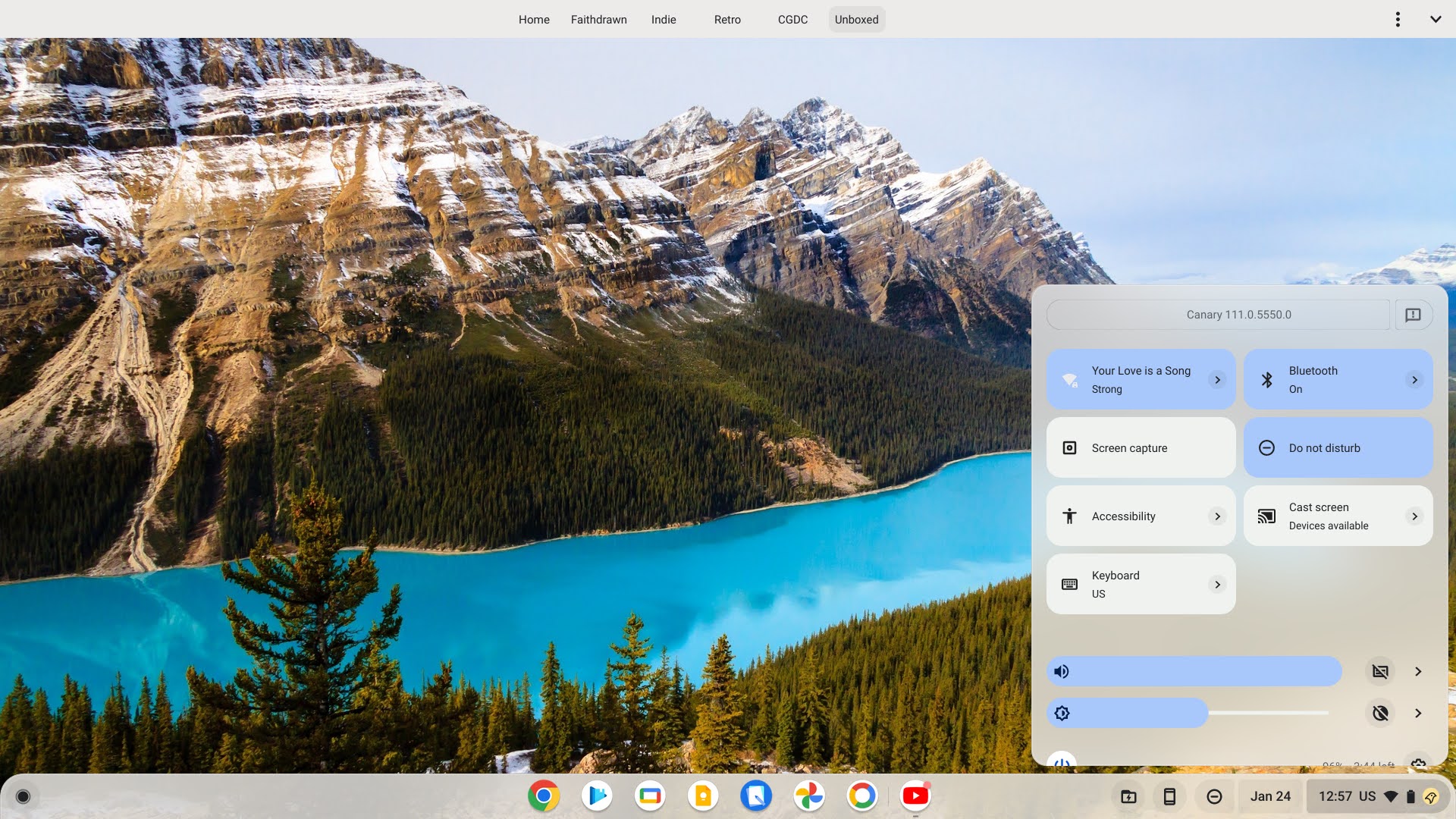

You can see in the screenshots I took above from my Pixelbook Go that this is, in fact, the case. Both volume and brightness, as well as any activated quick settings tiles, are accented with the Material You Dynamic Color picked from the wallpaper.
In this early stage of development, the dark mode toggle is broken, leaving me stuck with a bright theme, but more importantly, the dark mode tile itself is gone in favor of a small theme switcher icon found sitting to the right of the brightness slider itself.
It would seem that it’s just as C2 Productions pointed out on Twitter a while back, Google is looking to consolidate these features where they make more sense to access them, which I’m glad for. I, for one, am very excited to have more accessible, wider, and more visually appealing buttons to rapidly access what I need on the shelf.
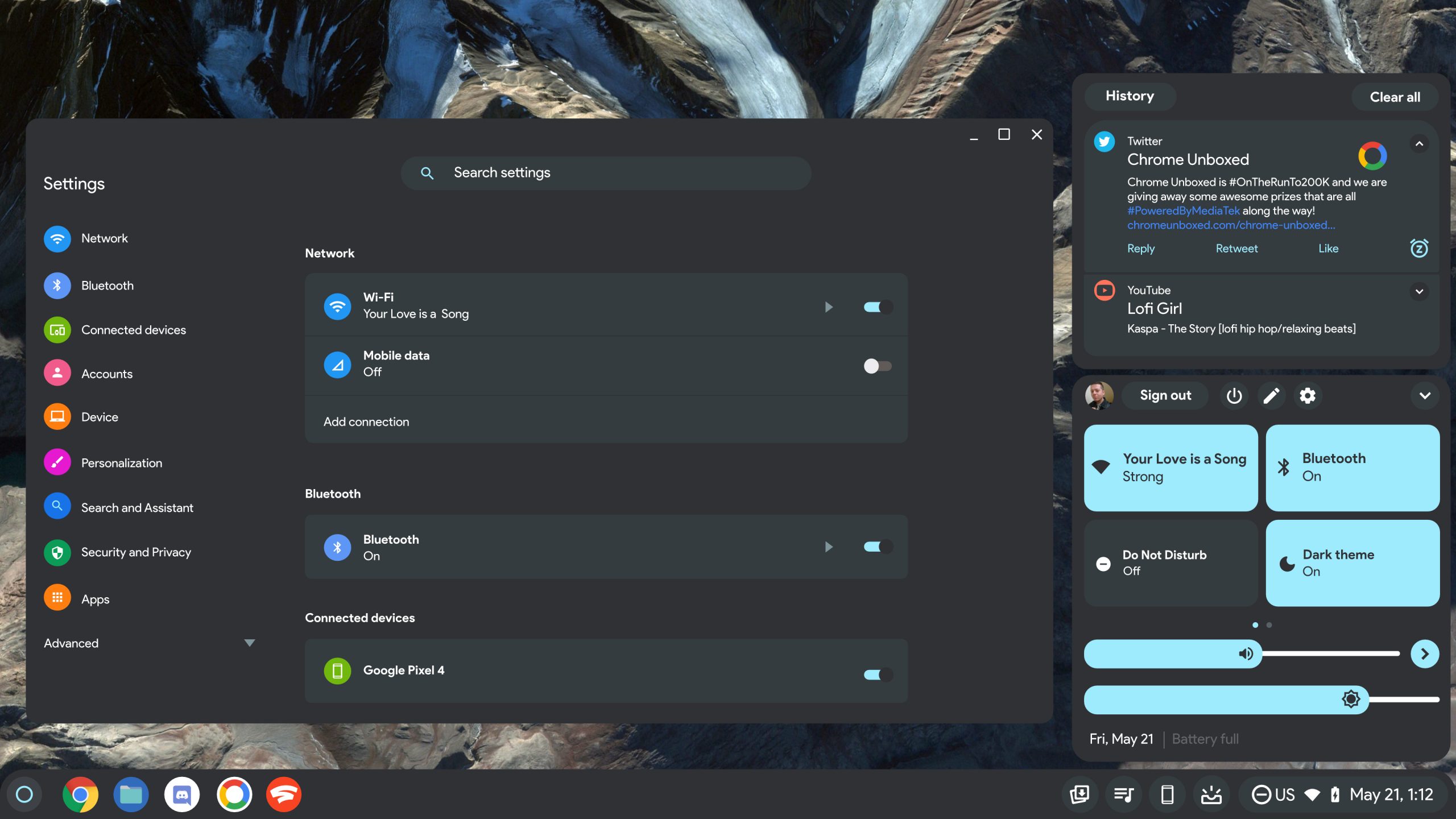
Most notable, however, is the separation of the notifications on the shelf from the quick settings! If you’re an O.G. Chromebook user, you’ll remember that this is how things used to be from the start, but Google decided back when it implemented the Peeking Launcher to combine the two, giving you much less space to view things unless you decided to collapse one or the other.
Now, clicking the notification indicator to the left of the date and time will let you view and manage or dismiss any of the notifications that you’ve received. It’s refreshing to no longer have to fight between which UI element I want to focus on. I honestly think that they thought it was clever to merge everything together, and just refused to admit that it was a bad idea after the fact. Oh well – at least that’s in the past, right?
I know that some folks really don’t see the technical point of Material You on Chromebooks, but aside from it being easier to see and use (which I suppose is partially subjective), it just looks more approachable! Let me know in the comments if you’re excited to receive this on ChromeOS Stable when the time finally comes.
SUBSCRIBE TO UPSTREAM
Get Chrome Unboxed delivered straight to your inbox
Upstream is our flagship, curated newsletter with the top stories, most click-worthy deals, giveaways, and trending articles from Chrome Unboxed sent directly to your inbox a few times a week. Join 31,000+ subscribers.