

Support our independent tech coverage. Chrome Unboxed is written by real people, for real people—not search algorithms. Join Chrome Unboxed Plus for just $2 a month to get an ad-free experience, access to our private Discord, and more. Learn more about membership here.
START FREE TRIAL (MONTHLY)START FREE TRIAL (ANNUAL)
If you clicked on this article, then you probably already know what I’m going to say within – the Chromebook launcher is long overdue for an overhaul, and there are several things that it’s needed for quite some time now. However, for one reason or another, Google has not shown it any love even though the rest of the operating system has experienced incredible growth and transformation. From Tote to Phone Hub, printing and scanning apps, a light and dark mode, and more, Chromebooks have come a long way. With how much Google is pushing PWAs and web applications as the core experience on its laptops, you’d think that finding them in the launcher would also be modernized. Sure, you could search for things, and there’s no doubt that it’s the fastest way to do so, but there’s something about launching an app icon by typing that takes the ease of use out of its original design. With all of that out of the way, let’s take a look at three major things that the Chromebook launcher can improve upon. At the end, I’ll have a few bonus improvements to discuss as well.
Accessing the launcher
Accessing the Chromebook launcher has a few flaws. To start, it takes two clicks with a mouse in order to see all of your applications. Once to click the launcher button at the bottom left of your shelf, and another to click the up arrow above the search bar. You can also use your mouse scroll wheel or two-finger swipe, but therein lies our second problem – depending on your mouse or touchpad direction (normal or reverse scrolling), you’ll swipe or scroll one direction in order to open the all apps page and then attempt to perform the same directional motion in order to move to the second page of apps, only to close the launcher entirely.
You see, the action required to open the all apps page and the action required to move to the second page of apps are opposite of one another! This never actually used to be the case, and perhaps it’s only this way on Chrome Canary, but if Google is considering implementation of this, it’s a terrible idea. Users expect consistency – even if it makes less sense from a technical standpoint. The development team has done a pretty good job to date of changing things in a way that benefits users, but this is one change that seems to have been decided by programmers, and not by UX designers. In short, it needs to go!
Lastly, I wanted to do more than merely gripe about these things and offer solutions instead. While you can swipe up or scroll on the Chromebook shelf in order to open the launcher, I believe that for those of us who want to get to the all apps page in one fluid action, swiping up on this area with a mouse or touchpad should open the full launcher, not the half-sized one with the search bar. I think this is best because it still allows others to access the half-page search launcher regularly, and also because a full finger swipe up on the shelf will open the all apps page anyway, so this remains consistent across the board.
Sorting the launcher
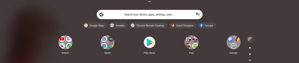
Here’s the big one, folks. So, so many of you constantly mention this one and it feels as though Google has not heard your cries. The Chromebook launcher desperately needs a sort button. As previously stated, searching for apps and web apps tends to be the fastest way to find and use experiences on Google’s laptops, but typing something counteracts the simplicity of tapping an icon. It’s also less visual. Despite our tendency and comfort with typing things, into a search bar these days, I truly feel that the company’s hesitancy to put a sort button in the launcher is odd. In the image below, I’ve mocked up what one could one day look like – provided Google sees this and gets excited about the possibility.
I’ve utilized the default sort icon from the material design icons website and placed it inside of a colored bubble so that it’s consistent with other modern Chromebook UI elements like Tote, Global Media Controls, and Phone Hub. If it sat in alignment with the top of the pagination indicators (dots on the right side) and no higher than the top row of icons, I believe that it would make for a fantastic place for it. Since the majority of users are right-handed, placing it on the right side of the apps seems to make the most sense.
Tapping it could bring up a white box that allowed you to choose “My order”, or “A > Z”. It would also be awesome to create custom orders based on your workflow and then name it and save it as a preset. With the launch of LaCrOS and its domination of the built-in Chrome browser, we’d also have the ability to add multiple Google accounts per login in a more natural way, so allowing a custom sort order or filter for each account’s installed apps and web apps could also be a great idea. Food for thought, Google…food for thought.
Batch actions and applying changes on the server
Okay, to wrap up this little adventure into what-if land, I want to point out that when performing massive amounts of changes to the app launcher – renaming app icons, deleting or adding them, and moving them around in folders – Chromebooks often have an issue where those changes are not saved and after restarting (or in my case, crashing) your device, many of the things you did are completely, well, undone. This is exacerbated when you’re moving from one Chrome OS device to the other. There seems to be a set time on the server needed to allow these changes to be synchronized on Google’s end, and sometimes that’s hours.
So your best bet is to do these things and then simply not reset your Chromebook for a good, long while. I’m really not sure why this occurs, and I hope that some engineers can investigate it. At least they’ve mostly solved one of the most annoying issues to ever grace our devices – web apps reverting to generic text block icons after a powerwash.
Speaking of large amounts of actions related to moving, renaming, and managing app and web app icons, it’s super frustrating to have to move and delete icons one at a time – especially if you’re looking to clean up the place a bit. If Google one day finds a meaningful way for users to manage the launcher quickly and efficiently, I’m sure that many people – myself included – would appreciate it greatly.
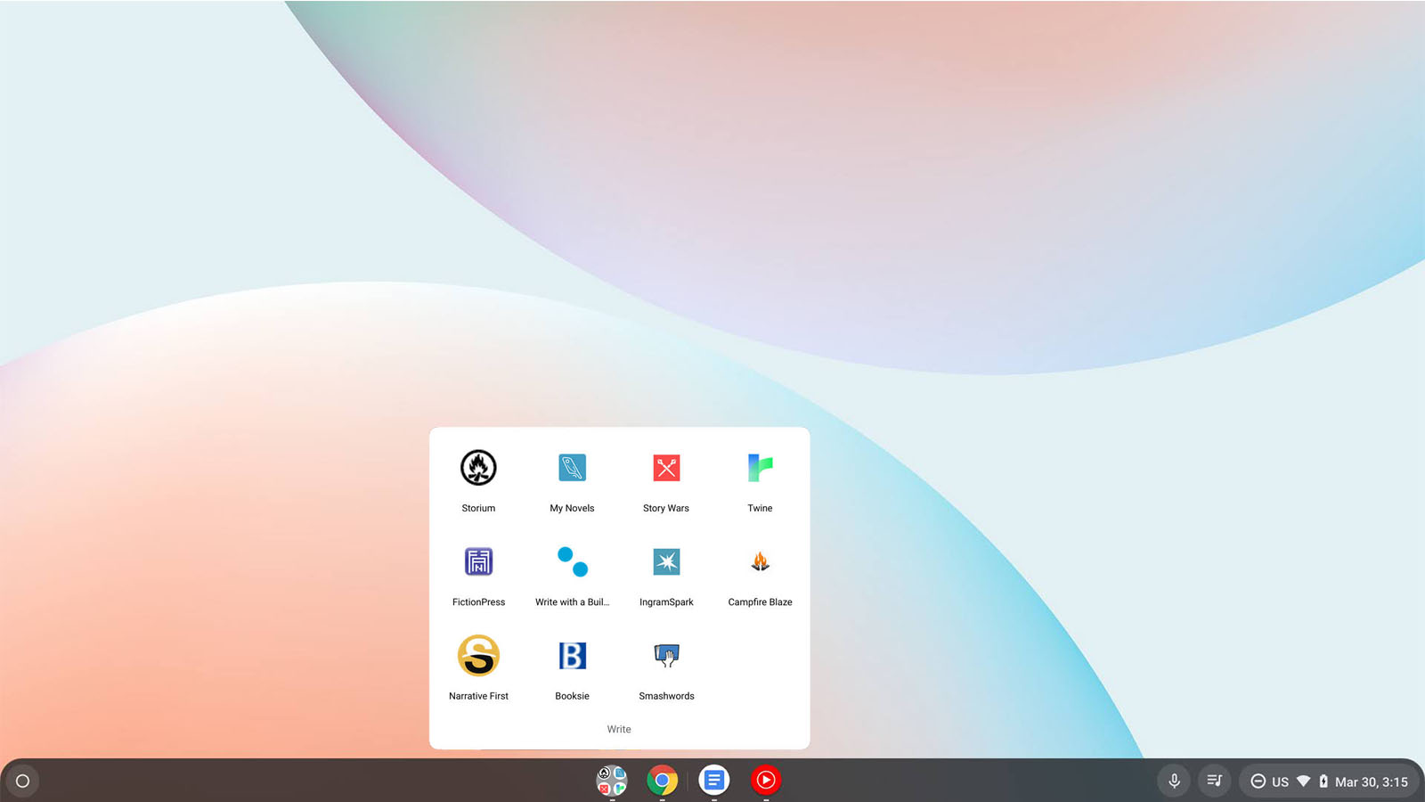
Bonus – Pinning folders to the shelf
Because this pertains to the shelf in some ways, I thought it would be fun to mention it here. As a Chromebook expert in the retail space, I’ve had many customers over the years ask me why they can’t pin full launcher folders full of apps to the shelf and access them. I know this isn’t common or possible by default on any other operating system, really, but as Chrome OS grows up a lot over the past 10 years, and having some more advanced functionality in regards to productivity and customization should be considered. I don’t believe that it will rob Chromebooks of their simplicity in the process, and I think that it can be done strategically. I would love to at least see this be experimented with eventually! Here’s a quick mock-up of what this could look like:
Bonus – Performance Improvements
Okay, one last bonus – while dragging and dropping icons from a folder, users are often met with an odd bug that causes the app icon to appear far to the right of their cursor and not properly drop into the folder when released. This is fixed after a few attempts, but it’s clear that the launcher’s performance is lacking when it comes to moving things around. I did see a Chrome Bug report on this, so I know that the development team is working on it – I just hope that they prioritize this soon!
What do you think about the Chromebook launcher? I feel it’s come a long way since its inception and transformation into the “peeking launcher”, but I do believe it has some growing to do. I sincerely hope that this wishlist, so to speak, sparks many of you to write in the comments what you agree with and what you’d like to see in the future. I also hope that these things are eventually considered and implemented for all our sake.
SUBSCRIBE TO UPSTREAM
Get Chrome Unboxed delivered straight to your inbox
Upstream is our flagship, curated newsletter with the top stories, most click-worthy deals, giveaways, and trending articles from Chrome Unboxed sent directly to your inbox a few times a week. Join 31,000+ subscribers.