

Support our independent tech coverage. Chrome Unboxed is written by real people, for real people—not search algorithms. Join Chrome Unboxed Plus for just $2 a month to get an ad-free experience, access to our private Discord, and more. Learn more about membership here.
START FREE TRIAL (MONTHLY)START FREE TRIAL (ANNUAL)
It has been just over a year since Google officially launched Dark Mode for the Android operating system and not long after, we discovered that developers were already hard at work preparing a similar experience for Chrome OS. While we’ve been tracking this feature for quite some time, Chrome OS’ Dark/Light Mode just recently made its debut in the Canary channel of Chrome OS and we’re here to give you a hands-on look at how far this project has come.
Dark/Light Mode is an unfinished symphony for sure but this highly sought after feature is working will in Chrome OS Canary apart from some styling issues here and there. That’s a big leap from previous updates where system menus and web pages were all but illegible due to the way elements were being rendered. Instead of a sleek dark theme, most windows and websites ended looking like you had your device in high contrast mode and that is not what we were hoping for at all. Thankfully, Google appears to be dedicated to bringing the Dark/Light Mode to Chrome OS and doing it well. So, without further ado, here is our hands-on with the new Dark/Light Mode for Chromebooks.
Chromebook Dark/Light Mode
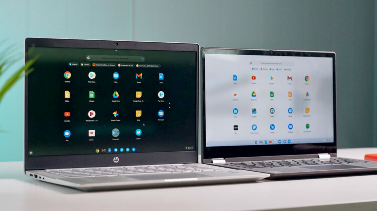
The latest update to the Canary channel brought two new Dark theme flags that signal the return of the Dark UI for websites as well as system menus inside of Chrome OS. As you can see in the video, web pages that are forced to Dark mode are actually rendering quite will with just the elements put in place by Chrome OS. That means sites that haven’t coded for dark mode can still render a dark version of pages without completely trashing the UI. The update also added the Light Mode theming to the app launcher which was previously still rendering the standard black background with a white shelf.
One additional feature that I discovered while setting up this video took me a bit by surprise. The Dark/Light Mode apparently syncs on an account level. When I changed the theme on one device, it immediately switches on the other Chromebook when logged into the same account. I guess I just expected this to be a local setting but it looks like your theme may follow you from device to device. I expect that it will be a few more months before we see Dark Mode land in the Stable channel but you can bet that we are keeping a close watch on this one. I, for one, am very excited to have a Dark mode on my Chromebook.
Menus look good with most of the elements rendering relatively visible but most windows still have a white bar at the top which will need to be fixed to complete the look of the Dark Mode. Other elements such as text and buttons will also need some styling in order to give elements the pop they need to be clearly visible atop the super dark backgrounds. Apart from that, the Dark/Light Mode is shaping up nicely and will play very well with the new wallpapers that will be rolling out at some point in the next few months. Each background features a dark and a light version meant to complement the chosen theme.

SUBSCRIBE TO UPSTREAM
Get Chrome Unboxed delivered straight to your inbox
Upstream is our flagship, curated newsletter with the top stories, most click-worthy deals, giveaways, and trending articles from Chrome Unboxed sent directly to your inbox a few times a week. Join 31,000+ subscribers.