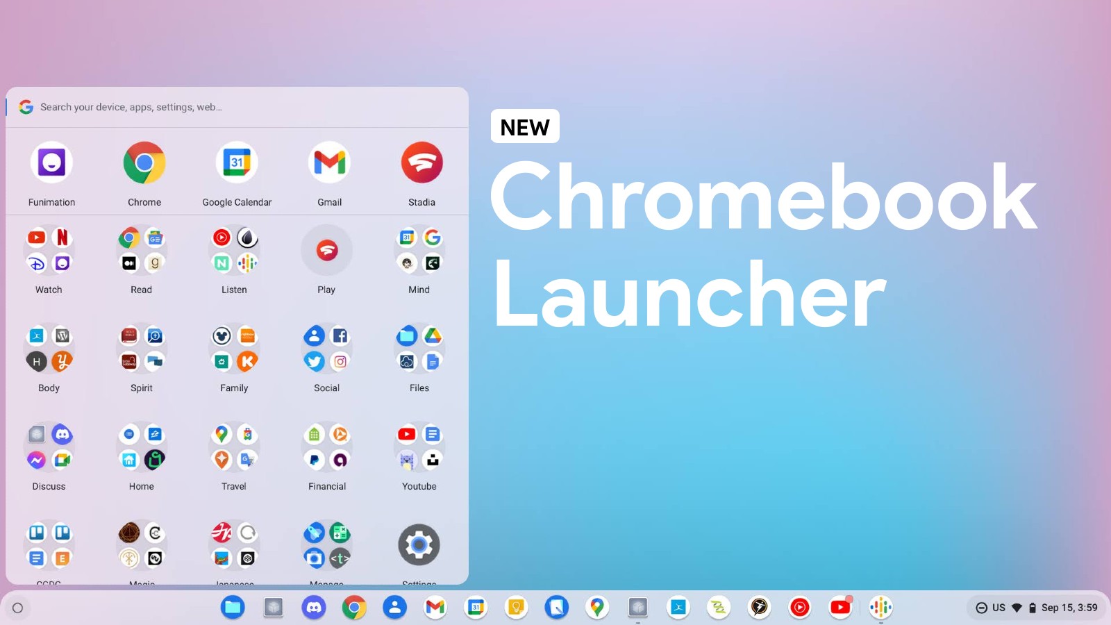
Google’s new Chromebook Productivity Launcher is a smaller, more compact way to access your apps and web apps among other things. By tapping the ‘Everything button’ on your keyboard, you can search all of your files, even in the cloud, along with your history, bookmarks, and so on. This new launcher is a clean and rapidly developing Chrome OS Canary channel alternative to the existing half and full-page launcher that stable users have on their devices today, and it’s quickly becoming my favorite aspect of Google’s vision for the future of its operating system.
While it uses some pretty neat user psychology tricks to speed up how you find things, is baking in recently used files, recently added alphabetical sorting (though only in tablet mode), and even made your icons smaller to add an air of maturity to its overall look, the overall feel of the launcher has remained largely…utilitarian, for lack of a better word. Yes, it’s still in development, and yes, it’s coming along nicely, but pulling it up just lacked that same polish of the existing launcher.
Now, a Chrome OS Canary developer flag that I discovered adds a slick, new animation to the Productivity Launcher! As you can see in the video below, instead of just popping into existence, it appears from bottom to top in a short, quick fade. It’s subtle but effective. Each icon or folder also nudges upward as it appears, giving a living and active feel to the whole thing. I’m sure the video won’t perfectly do it justice as the recording seems a bit janky, but if you watch it on loop, you’ll see what I mean.
App Launcher: Animation
Enables new animation in the enhanced app launcher. – Chrome OS
#productivity-launcher-animation
As I’ve said in previous discussions, there’s no date when the Chromebook Productivity Launcher is set to release to the public, but as I watch its development and how quickly it’s feeling like a mainstream feature, I can’t help but feel as though we’re going to see it in the near future. This tool is certainly not far off, and though it will likely be a toggle in the Settings app for those who want something more streamlined and compact compared to the standard launcher, I personally believe that in time, Google will replace the traditional look and feel of the app drawer entirely with this new, left-aligned and smaller launcher.
Although this is a small polish update, I truly wanted to cover it because it’s exciting to see Chrome OS mature so quickly. The developers are doing everything in their power to make Chromebooks appealing to the masses, and since most people are accustomed to Windows 10’s start button, this is a good move. I would very much like to see the ability to center align the launcher, but I know that Microsoft and Google go back and forth with making their operating systems different from one another to stand out in the market and to reduce confusion.


Leave a Reply
You must be logged in to post a comment.