Support our independent tech coverage. Chrome Unboxed is written by real people, for real people—not search algorithms. Join Chrome Unboxed Plus for just $2 a month to get an ad-free experience, access to our private Discord, and more. Learn more about membership here.
START FREE TRIAL (MONTHLY)START FREE TRIAL (ANNUAL)
I know I’ve been delivering a lot of updates lately regarding Google’s new Chromebook Productivity Launcher experiment, but that’s because it’s a truly exciting update. For years now, we’ve been using this awkward, full-screen app launcher, and I’ve convinced myself that it’s great. The problem is that it’s just not. I guess the ability to adapt to something makes one complacent and even accepting of tools that are less optimal and in some instances, downright bad.
The new launcher seems to be a love letter to Chromebook users. The developers have realized many of the current design’s faults and have ironed them out before we even thought to ask. For example, it no longer takes up the entire screen, alphabetical sorting is now live in Chrome OS Canary, and several unnecessary speed pitfalls like pagination and lengthy drag and drop animations have been cut out. Not only that but quick access to recently used files now graces the top of the launcher, making it more functional than its predecessor.
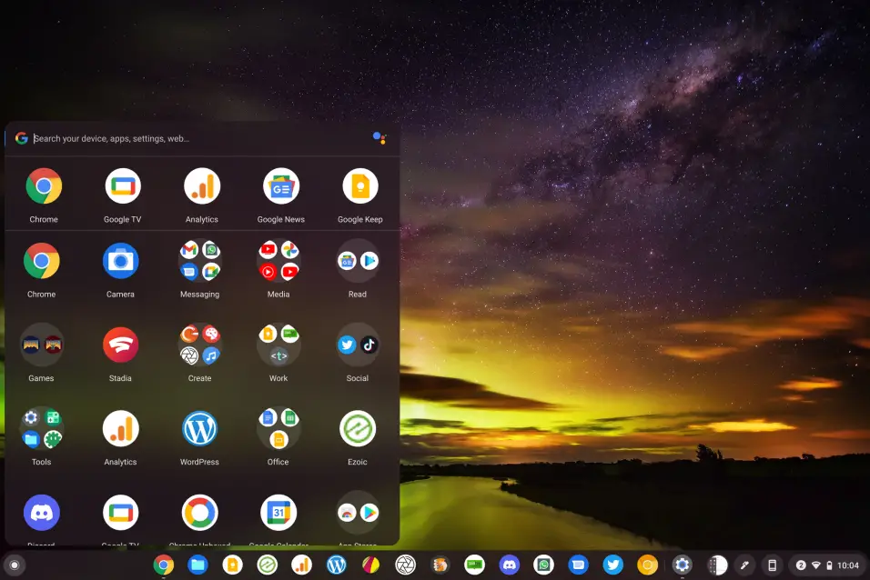
Today, I want to bring attention to what I feel is one of the biggest improvements to date with the experiment. Comparing the two images below, you’ll notice that the one on the left looks – in my opinion – as though Google made a Chrome OS for Kids. The icons are huge! Quite honestly, using it feels like someone got the arts and crafts out and began cutting large construction paper circles or something. That’s probably a terrible example, but I think you get the point. This size is great for accessibility, but not everyone should be forced to use them that way.
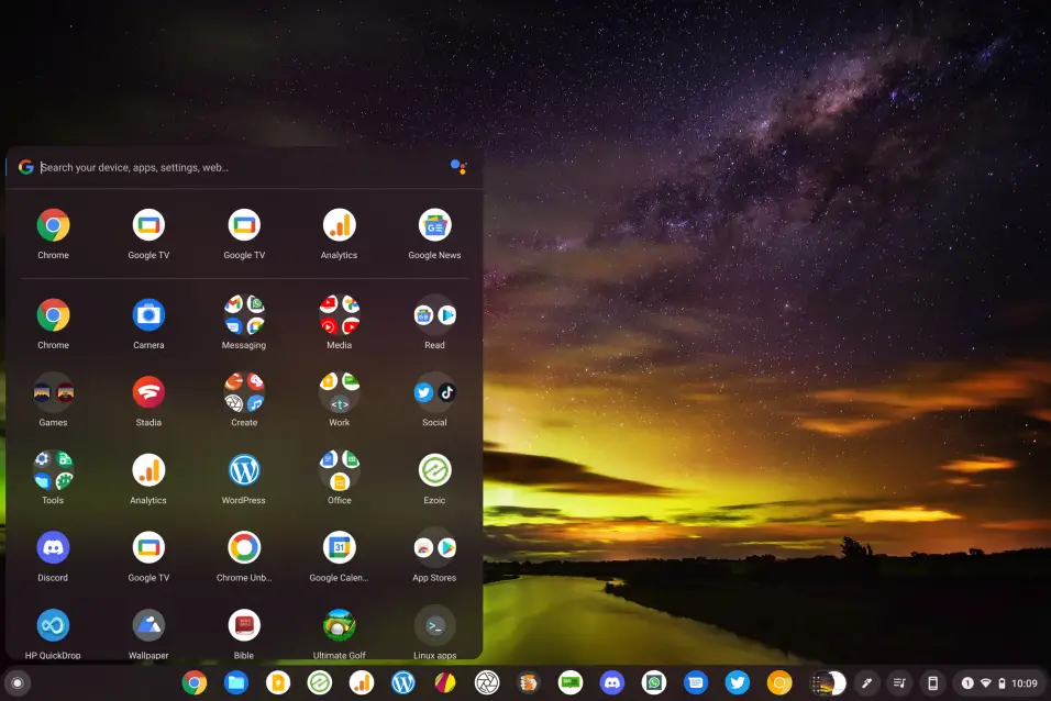
By comparison, the image on the right is post-update. The icons are tightened up. They’re smaller, but not small enough to be uncomfortable for me, at least. I understand that some will dislike this change, but ultimately, matching the size of the icons in the ‘Recents’ section, as well as those inside and outside of folders to the size they’ve always been on the shelf feels both consistent and more mature.
The same can be said for the icons in the launcher while using your Chromebook in tablet mode, but this is where it becomes an issue. Tablet users should have the larger icons by default, and at this time, that’s just not the case. Instead, they’re the same, small size as they are in laptop mode and tons of space exists between them. This is clearly just a transitional step, and I’m sure this will be addressed before the experiment launches officially, so I wouldn’t worry too much about it right now.
For those using their device as a laptop though, I do understand the need for larger icons as a means of increasing visibility, and I’m sure this will still exist as an accessibility option. For now, you can simply increase the screen resolution to control this, but all other on-screen elements will also be enlarged.
Having a separate setting for increasing the size of the icons independent of everything else may be nice to have. Let me know your thoughts in the comments below. Do you think that the smaller launcher icons make Chrome OS feel more mature, especially as it becomes more popular in the Enterprise sector, or do you think that they’re too small now?
SUBSCRIBE TO UPSTREAM
Get Chrome Unboxed delivered straight to your inbox
Upstream is our flagship, curated newsletter with the top stories, most click-worthy deals, giveaways, and trending articles from Chrome Unboxed sent directly to your inbox a few times a week. Join 31,000+ subscribers.