Support our independent tech coverage. Chrome Unboxed is written by real people, for real people—not search algorithms. Join Chrome Unboxed Plus for just $2 a month to get an ad-free experience, access to our private Discord, and more. Learn more about membership here.
START FREE TRIAL (MONTHLY)START FREE TRIAL (ANNUAL)
The new Chromebook Productivity Launcher looks all set to replace the current Peeking launcher that gets called up with the ‘Everything button’ on your Chrome OS devices, and though Google is still just and only testing it in the Canary channel, it seems to be working rapidly toward a public release. As of now, there’s no telling whether or not it will replace the old, full-screen design entirely or become something that’s optional, but with how much I love it already, I can’t see going back to how it used to be.
With an already highly polished design, frosted glass look, Assistant built-in, its icons and folders being reduced in size, and more, the new launcher is picking up yet another trick. Check out the image below – you’ll notice a large section above the ‘Recent’ apps that says ‘Continue’. This segment was only recently added and is only showing up on select Canary devices. It shows recently accessed files and looks as though Google wants to give you quick access to pick up where you left off – not unlike the new Drive Files module on Chrome’s New Tab Page.
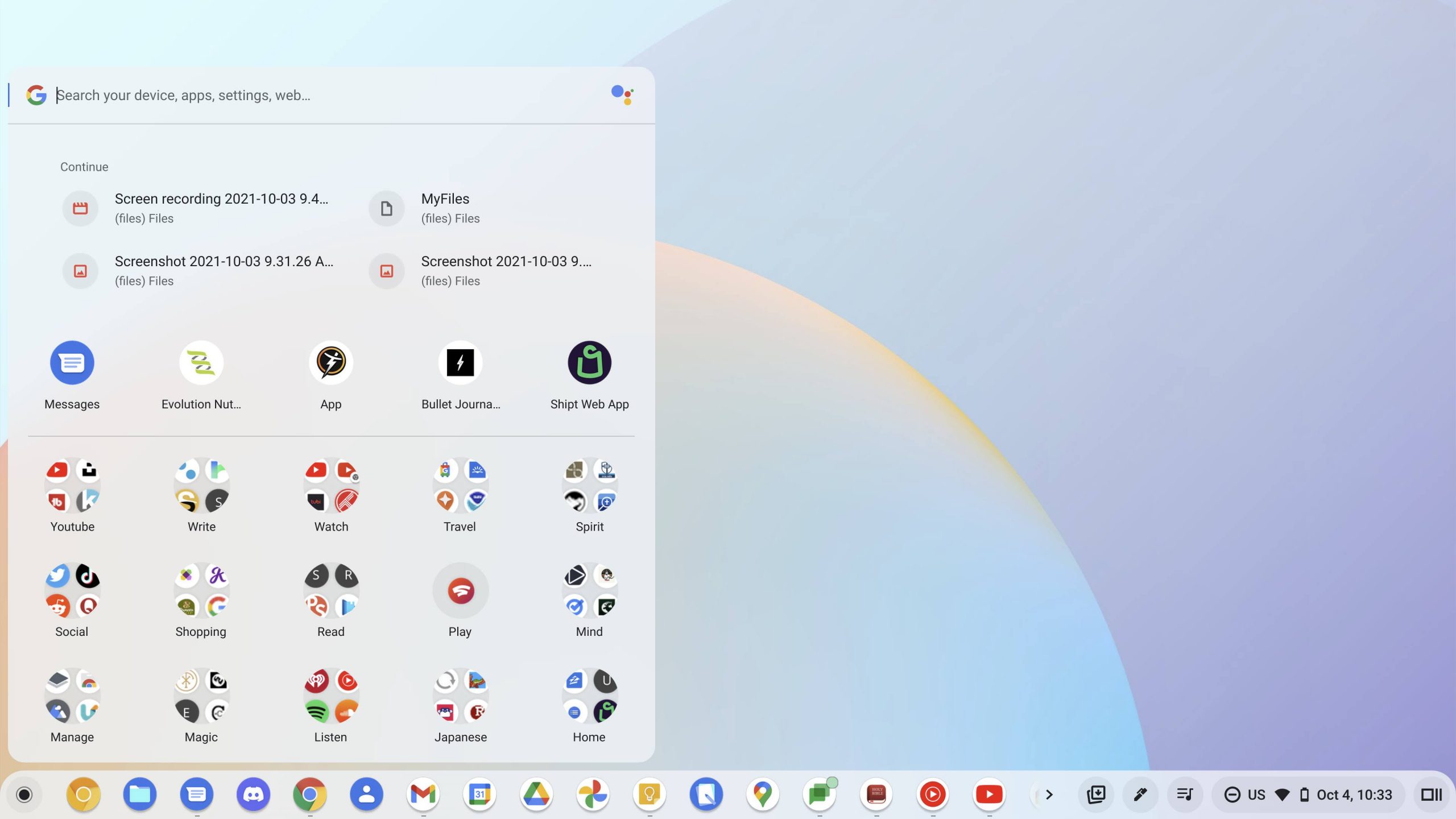
I’ve got mixed feelings about such a large chunk of my launcher being taken up by text when the rest of it is full of highly visual iconography, but I do understand the appeal of having this here. I would have also been okay with the development team adding ‘Recent files’ or this ‘Continue’ section to the Tote at the bottom-right of the Chromebook shelf, but that’s neither here nor there.
Each item is accompanied by an icon depending on its type. There’s a video and photo icon present, but the ‘MyFiles’ section that I have above is indicated by a broken piece of paper icon instead of a folder, which that item is. There’s also currently no separation between the Continue section and the ‘Recent’ apps, but another horizontal separator bar would look pretty outdated, and visually, it’s pretty easy to tell that you’re looking at a different type of content.
With the inclusion of more interactive elements like this, the massive speed pitfalls being cut out, including pagination and drag and drop animation times, the Productivity Launcher seems like it’s going to be a very welcome change for most people. I’ve seen many state that they wish it were centered like Windows 11’s Start menu, so I hope that when it comes to your laptop, the ability to choose this in addition to aligning it to the left are both present.
SUBSCRIBE TO UPSTREAM
Get Chrome Unboxed delivered straight to your inbox
Upstream is our flagship, curated newsletter with the top stories, most click-worthy deals, giveaways, and trending articles from Chrome Unboxed sent directly to your inbox a few times a week. Join 31,000+ subscribers.