Support our independent tech coverage. Chrome Unboxed is written by real people, for real people—not search algorithms. Join Chrome Unboxed Plus for just $2 a month to get an ad-free experience, access to our private Discord, and more. Learn more about membership here.
START FREE TRIAL (MONTHLY)START FREE TRIAL (ANNUAL)
Google has been quietly creating and testing what’s known as the Productivity Launcher Experiment on the back end of Chrome OS via the Canary channel, and it’s awesome. When enabled, instead of your Chromebook’s launcher taking up the entire width and height of your screen when opened, the updated look and feel takes up only about 33% of your display. You could say it’s very much reminiscent of the Windows 10 launcher, coming from the bottom-left of the screen, though it does incorporate many of the design and elements from the current Chrome OS launcher. While this is being deemed an ‘experiment’, I do believe this will replace the current design, or at the very least be something you can toggle between when it fully releases.
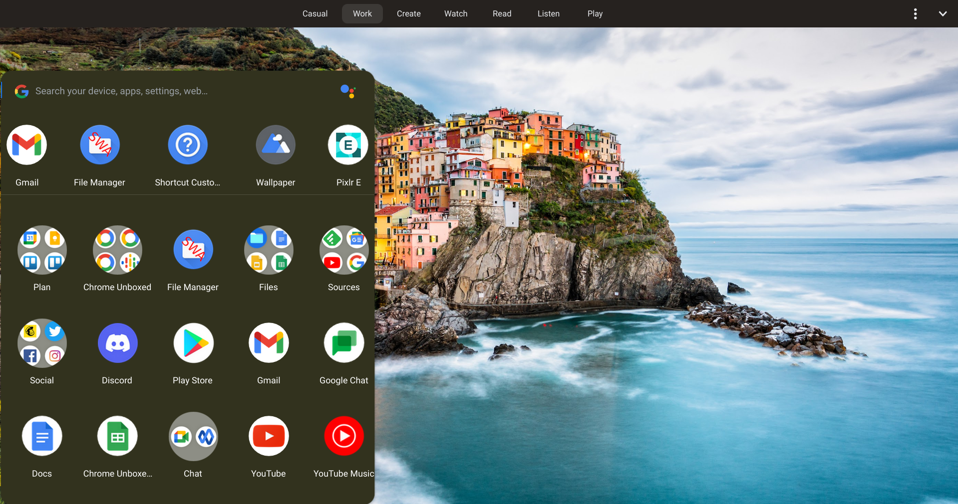
Speaking of releasing, it looks like the Productivity Launcher is getting ready for prime time! Today, much of the UI has been polished and is now more cohesive than it was before. There were several text list items that appeared above the ‘Recent’ apps that have now disappeared, and have been replaced by a clean recently opened apps bar that’s kept apart from the rest of your icons with a separator.
Additionally, Google Assistant has been fully integrated now and even has a clean white look with a voice visualizer and colorful welcome cards. More importantly, though, is the addition of a new development flag called ‘Reorder Apps’. Before its release, the Productivity Launcher would not allow you to drag and drop apps or folders to organize them. Now, all that’s left for functionality here is the ability to open folders. Once that’s fixed, then using the launcher, even in its early stages will be practical.
Productivity experiment: Reorder Apps
To evaluate an enhanced Launcher experience that enables users to reorder their apps in order to find them more easily. – Chrome OS
#productivity-reorder-apps
The last thing I want to point out is that the launcher isn’t completely polished yet. Yes, it’s made strides in the right direction with features and cleaning up nicely, but apps and folders still lack the proper padding near the edges of the launcher itself. At the bottom, icons will actually overlay the transparent section outside of the dark grey background and bleed into the shelf. This will no doubt be fixed before regular users get their hands on it, but for those of us who are test driving the Productivity Launcher prior to that time, it’s exciting to see it shaping up so quickly!
SUBSCRIBE TO UPSTREAM
Get Chrome Unboxed delivered straight to your inbox
Upstream is our flagship, curated newsletter with the top stories, most click-worthy deals, giveaways, and trending articles from Chrome Unboxed sent directly to your inbox a few times a week. Join 31,000+ subscribers.