

Support our independent tech coverage. Chrome Unboxed is written by real people, for real people—not search algorithms. Join Chrome Unboxed Plus for just $2 a month to get an ad-free experience, access to our private Discord, and more. Learn more about membership here.
START FREE TRIAL (MONTHLY)START FREE TRIAL (ANNUAL)
Google recently redesigned the way you navigate the Play Store menu system, and we’ve heard from several of our readers that they’re ending up a bit confused with the changes. Previously, it featured a left-hand three-line “hamburger menu” that housed your entire library of apps and games, a list of things that needed to be updated, your Account settings, subscription management, and more. Today, I’m going to help you adapt to the new user interface so you can navigate your Chromebook’s Google Play Store with confidence.
“Android” apps, especially Google-owned apps, have largely moved away from the hamburger-style navigation that they have implemented for so long, and have begun to embrace the idea of pushing as much information out into the open as possible via a bottom navigation shelf. Unfortunately, Google seems to be a trendsetter in UX design and is changing its mind as fast as it makes it up.
Now, you’ll find all of the previously left-aligned options for the Google Play Store by clicking on your profile image at the top-right of the window instead – with the exception of those primary navigation sections like ‘Games’, ‘Apps’, ‘Movies & TV’, and ‘Books’. Upon doing so, you’ll be met with a pop-up window that takes focus and holds all of the aforementioned menu items and more. Want to see your Play Points or recent Play Store notifications? These do exist here, but you may notice that they’re also prominently featured at the top-right next to your profile picture as well!

While I’m not a fan of redundant UI elements, I do like having a bell icon return for notifications in a primary Google app, and now that I’m starting to utilize (or at least claim) my Play Points, it’s nice to have them out in the open as well. I do think that Google should consider placing your Payments & Subscriptions out in the open so that you immediately understand where you can cancel them from, but I don’t really see that happening.
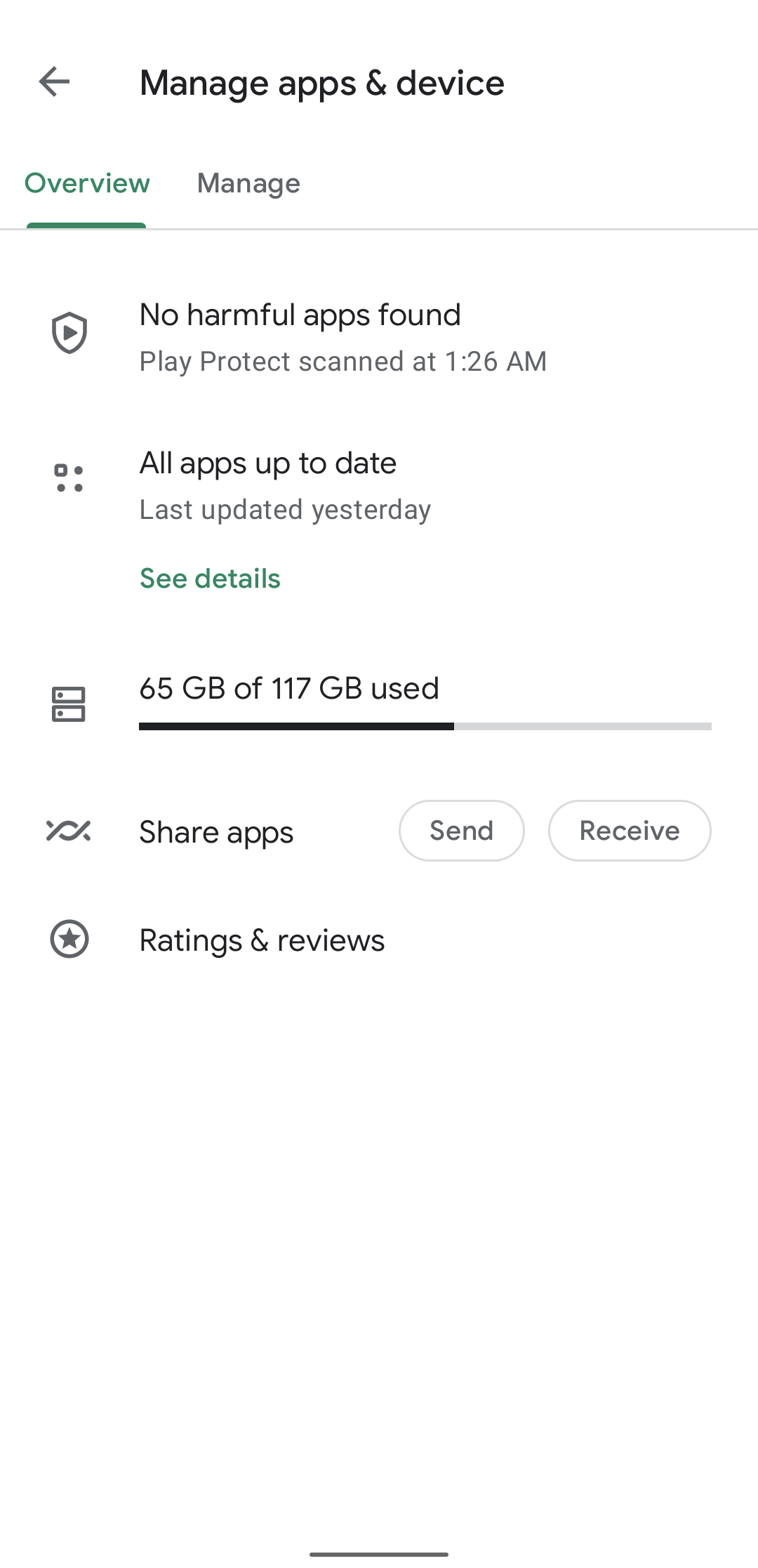
The company began testing another design tweak today – instead of seeing all of your apps and games when you click on ‘My apps and games’, you’ll be met with another sub-menu for items that have updates, Play Protect scanned apps that have been quarantined, and so on. In order to see the full list, you’ll need to click on the storage bar if this update rolls out to everyone. Right now, it’s only being seen on some Pixel phones over the past few weeks as reported by a Redditor named u/KnownStruggle.
Are you a fan of the new Google Play Store menu redesign? Do you even use the Play Store on your Chromebook? I personally just wish that the company would move the entire design to the web and make it a progressive web app, replacing the hideous (albeit accessible) design of the web entirely. Either way, I wanted to quickly inform those interested about how to find their stuff and manage important features when it comes to the Store itself. If you have any questions regarding this, please let me know in the comments section!
SUBSCRIBE TO UPSTREAM
Get Chrome Unboxed delivered straight to your inbox
Upstream is our flagship, curated newsletter with the top stories, most click-worthy deals, giveaways, and trending articles from Chrome Unboxed sent directly to your inbox a few times a week. Join 31,000+ subscribers.