


Support our independent tech coverage. Chrome Unboxed is written by real people, for real people—not search algorithms. Join Chrome Unboxed Plus for just $2 a month to get an ad-free experience, access to our private Discord, and more. Learn more about membership here.
START FREE TRIAL (MONTHLY)START FREE TRIAL (ANNUAL)
After breaching 50 million installs on the Play Store, Google’s podcasts app is receiving some long-awaited love. Earlier this year it received a full redesign and you can now add subscription sources directly via RSS feed. This week, your subscriptions tab began showing the same horizontal carousel on the web that exists in the Google Play app!
The new subscription feed now mirrors what has already existed on the homepage of the site. Previously, your subscriptions section only consisted of a vertical list of episodes. Now, you can scroll horizontally to check out which source you’re subbed to.
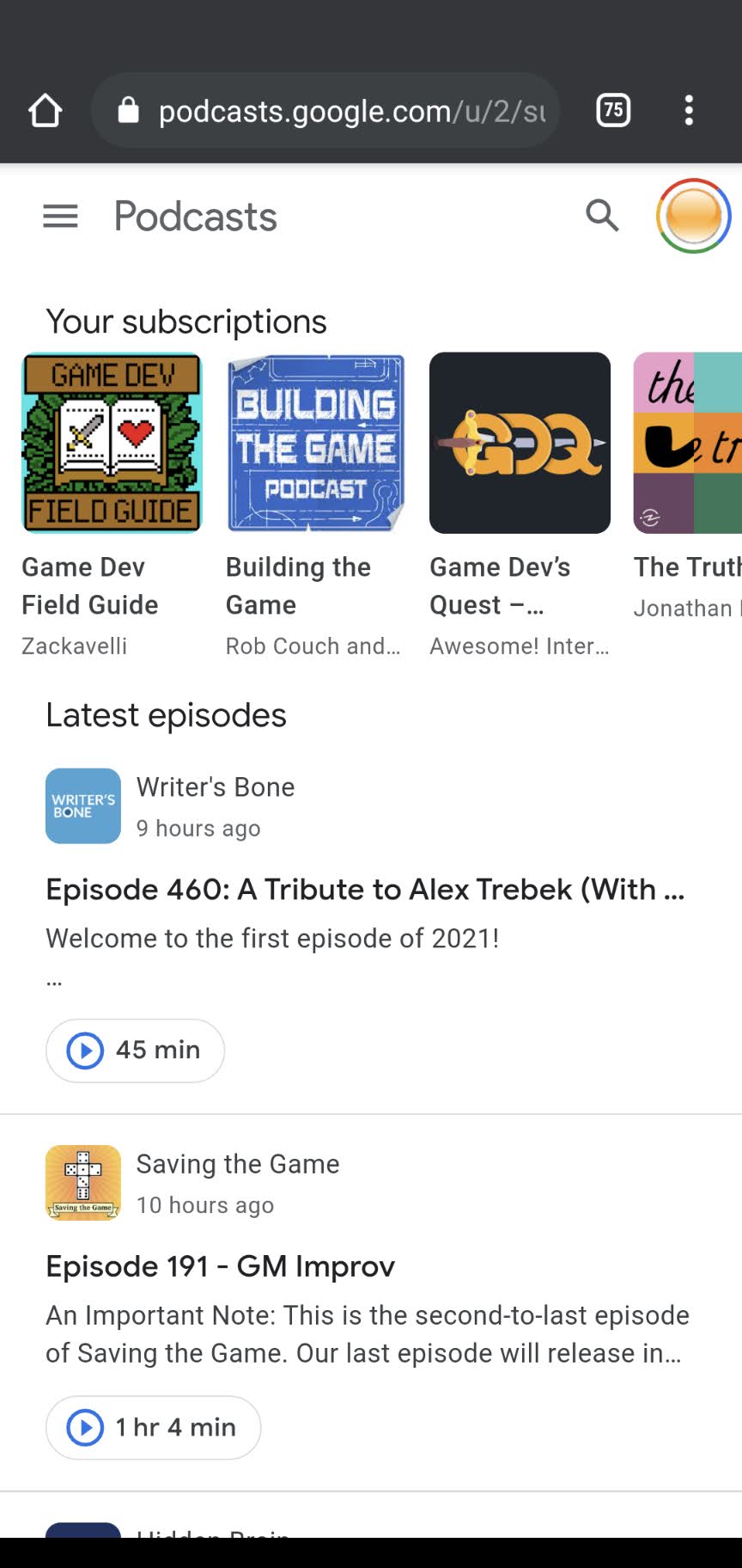
I seem to remember that before having a vertical list of episodes on this page (like the homepage), your sources were vertically listed instead. Not everyone will be a fan of this new change as our brains have become accustomed to managing data vertically as though we’re scrolling down a social media site or a web page, but if you read a lot of books in English or other sinistrodextral languages you’ll be okay since they read from left to right.
When adding Google Podcasts to your phone’s home screen from the Chrome for Android ‘more’ menu, you still receive the little Chrome design on the icon for the web app and upon opening it you still have the Omnibox at the top. If Google can get rid of these two things and make it a true PWA then it will be just another instance of the Google Play app becoming irrelevant aside from downloading podcast episodes. Contrary to popular belief, progressive web apps are capable of caching data locally, so this feature could also be added. Do you download podcasts, or do you just stream them? Let us know your thoughts on this in the comments!
SUBSCRIBE TO UPSTREAM
Get Chrome Unboxed delivered straight to your inbox
Upstream is our flagship, curated newsletter with the top stories, most click-worthy deals, giveaways, and trending articles from Chrome Unboxed sent directly to your inbox a few times a week. Join 31,000+ subscribers.