


Support our independent tech coverage. Chrome Unboxed is written by real people, for real people—not search algorithms. Join Chrome Unboxed Plus for just $2 a month to get an ad-free experience, access to our private Discord, and more. Learn more about membership here.
START FREE TRIAL (MONTHLY)START FREE TRIAL (ANNUAL)
I can’t even recall when exactly Google began to heavily advertise in-game limited-time events and discounts on the Play Store, but it’s nothing new. Luckily for anyone who really didn’t care to engage with this type of content, they could mostly just ignore the ads for “500 gems for $1.99”, or “80% off a lifetime membership for just $99”, and so on.
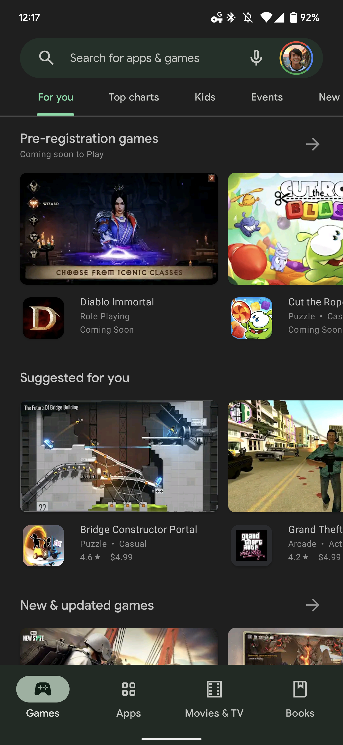
It looks like those days may be over, however, as some users who tipped into 9to5Google have reported a new “Offers” tab cluttering their bottom navigation on the Play Store for Android. Take a look at the images below, and you’ll see what I mean. The store is sporting the new Material You redesign, and at the bottom accompanying the “Games”, “Apps”, “Movies & TV”, and “Books” tabs is a new “Offers” tab smack dab in the middle.
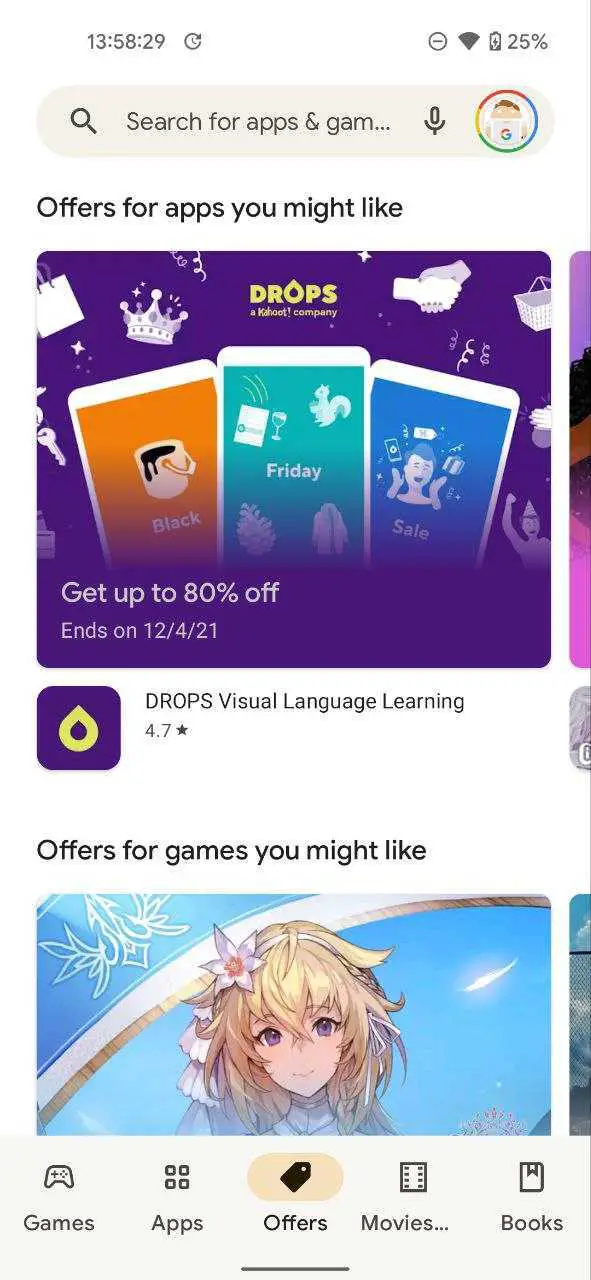
Based on the images, my guess is that it will feature almost exclusively gaming-related content, in addition to language learning memberships, and more. I do see value in these services being advertised and as a game developer, I can also understand how important it is to a game’s success to have additional means of producing income. My issue comes in with the prominent placement of the tab.
You could say “Mike, just don’t click it and you won’t have to see it”, and you’d be right, but there are two more pressing issues that supersede my skin-deep distaste for more advertising. First, I don’t really feel as though the Offers tab feels at home on the bottom navigation. All of the other existing tabs are for presenting the user with specific types of media that they can consume, and offers are more geared towards enhancing your experience with your existing games and apps.
While we aren’t seeing any book or movie discounts, offers, or add-ons in the screens, I can imagine they will either be few and far between or completely absent, meaning that the Offers tab will be less inclusive of these types of content. This alone makes it weird to place on the bottom nav, as its presence there gives a sense of complete inclusion.
Next, the fact that I’m a Google Play Pass subscriber means that either this navigation strip will be cluttered with six icons thanks to the new Offers tab joining the mix, or my Play Pass tab will no longer be displayed in place of this blatant advertising effort. The only other possibility is that the Offers tab will not display for Play Pass members, which would be great. Should this be the case, Google will not be able to display it persistently for all users, which enforces the fact that this is potentially a poor UX design choice.
Play Store Offers are not the same thing as the “Offers and notifications” tab, which will display Play Points claims, pre-registration game releases, and more. Instead, this will exclusively be for those types of deals we’ve already discussed. Again, I’m not opposed to the tab existing, I just think that its placement is awkward and disorienting, and I’m almost certain that most users will take issue with it.
This update is likely being prepped so that the Play Store web application can mirror it once it finalizes its complete redesign, which has been spotted out in the wild this past week. How do you feel about the Offers tab? With the insane amount of users turning to Chromebooks to play games, its implementation feels like a smart move on Google’s part. Millions will boot up their new laptops, open the Play Store and see loads of deals and discounts on their favorite mobile games. They’re sure to get a lot of buy-in, but I wish they were a bit more tactful about it.
SUBSCRIBE TO UPSTREAM
Get Chrome Unboxed delivered straight to your inbox
Upstream is our flagship, curated newsletter with the top stories, most click-worthy deals, giveaways, and trending articles from Chrome Unboxed sent directly to your inbox a few times a week. Join 31,000+ subscribers.