Support our independent tech coverage. Chrome Unboxed is written by real people, for real people—not search algorithms. Join Chrome Unboxed Plus for just $2 a month to get an ad-free experience, access to our private Discord, and more. Learn more about membership here.
START FREE TRIAL (MONTHLY)START FREE TRIAL (ANNUAL)
Chrome OS notifications take a shotgun approach to information delivery. To this day, it’s still using the old school Android-style setup where every single notification card is from an individual source – no grouping, no AI or machine learning implemented to make visually digesting the information easier for the user. Luckily, a new Chromium Repository commit first discovered by Android Police mentions an upcoming feature flag for a rework of notifications for your Chromebook, and I couldn’t be happier!
Add a feature flag for notifications refresh work
Chromium Repository
// Enables new notifications UI and grouped notifications.
ash_features.cc
const base::Feature kNotificationsRefresh{“NotificationsRefresh”,
base::FEATURE_DISABLED_BY_DEFAULT};
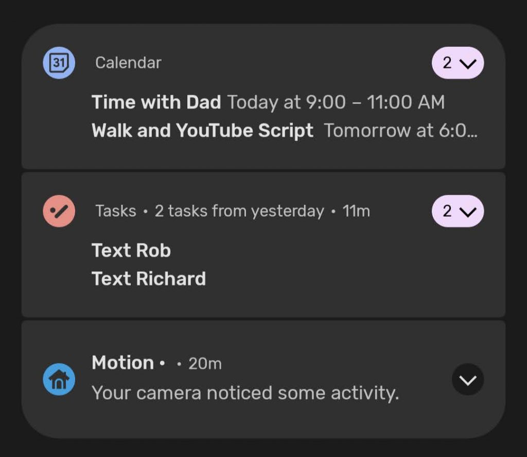
As you can see from the code source above, ‘NotificationsRefresh’, being disabled by default will deliver a completely new notifications UI to us which will include grouped notifications. Android 12 Beta 1 is taking this approach and it groups things based on the source which they’re coming from (see below). This will make it much easier for your eyes and mine to grab chunks of information and make decisions with it. Tapping on the group icon at the top-right of the card which shows how many cards are in that group will expand it so you can interact with them individually.
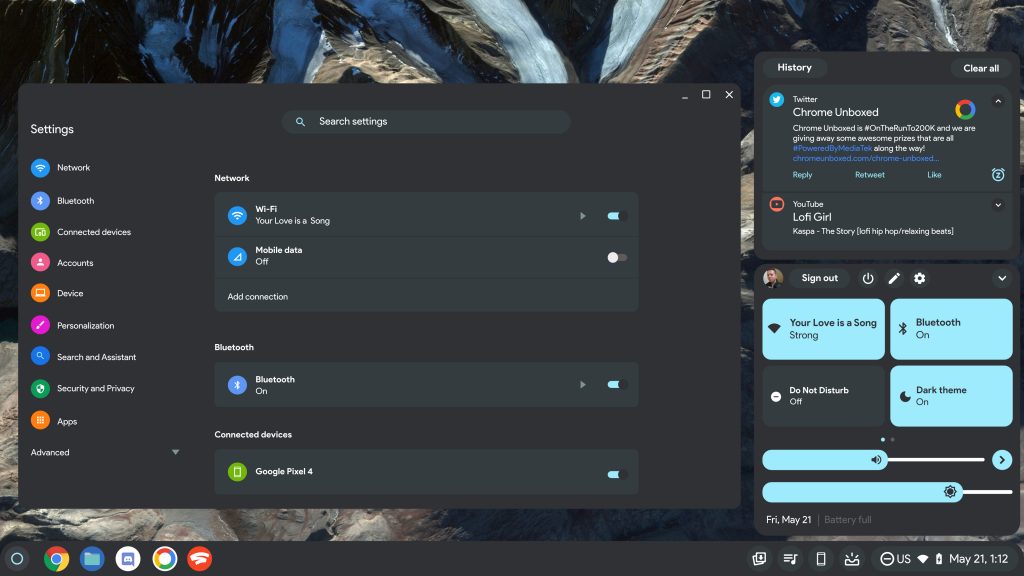
You’ll also notice that there’s a background behind the notification cards, but Chrome OS simply places these against the backdrop of your current wallpaper. In my visual mock-up of what Material You would look like on Chromebooks – which I put out just a few days ago – I’ve already designed what it would look like if Android 12’s notification background existed on Chromebooks, but I’ll drop it here as well. While we still don’t at all know what the redesign will look like, I truly believe that this is almost exactly what form it will take – rounded corners, new icons, group indicators, and a backdrop with padding.
I’m honestly hoping that Google also adds a ‘History’ button for past notifications as I’ve created in the mock-up since I think it would be really useful to many. Additionally, you’ll notice that I placed a new snooze icon at the bottom right of one of the notifications, so I hope that the rework introduces this as well since you can currently only slide a notification halfway away to reveal the snooze button, but it’s definitely not prominent like it is in Android 12 (which inspired my mock).
Over the past few days, I’ve received a lot of feedback on the design saying that it both looks too much like Windows and that it also looks like a 1 to 1 transference of the mobile design to the laptop, but I want to remind you all that that’s exactly why Google is doing this. Not only does Chrome OS look much like Windows (and Linux…and macOS), but it also looks much like Android because recurring design elements and user experience design dictates that there are several constants that inherently make sense to the end-user and that we’ve come to accept as a standard. The psychology of where the eye looks and what our minds have been trained to do means that specific aspects of the OS must maintain consistency with its competitors for the most part, but there’s nothing wrong with that.
SUBSCRIBE TO UPSTREAM
Get Chrome Unboxed delivered straight to your inbox
Upstream is our flagship, curated newsletter with the top stories, most click-worthy deals, giveaways, and trending articles from Chrome Unboxed sent directly to your inbox a few times a week. Join 31,000+ subscribers.


