Support our independent tech coverage. Chrome Unboxed is written by real people, for real people—not search algorithms. Join Chrome Unboxed Plus for just $2 a month to get an ad-free experience, access to our private Discord, and more. Learn more about membership here.
START FREE TRIAL (MONTHLY)START FREE TRIAL (ANNUAL)
Hot off of the heels of Windows 11 with its shiny, new, rounded window corners, Chrome OS now seems to be testing a similar user experience. Over the past few weeks, I’ve encountered two separate instances where a new look appeared for my Chromebook’s windows which had not only rounded corners, but also an odd two-tone design. You can see in the image below – gone are the ugly, sharp corners. No, I don’t believe this was done in response to Windows 11, before you ask – Google has long since toyed with the idea of a softer visual design. All you have to do is look at the shelf to see what I mean.
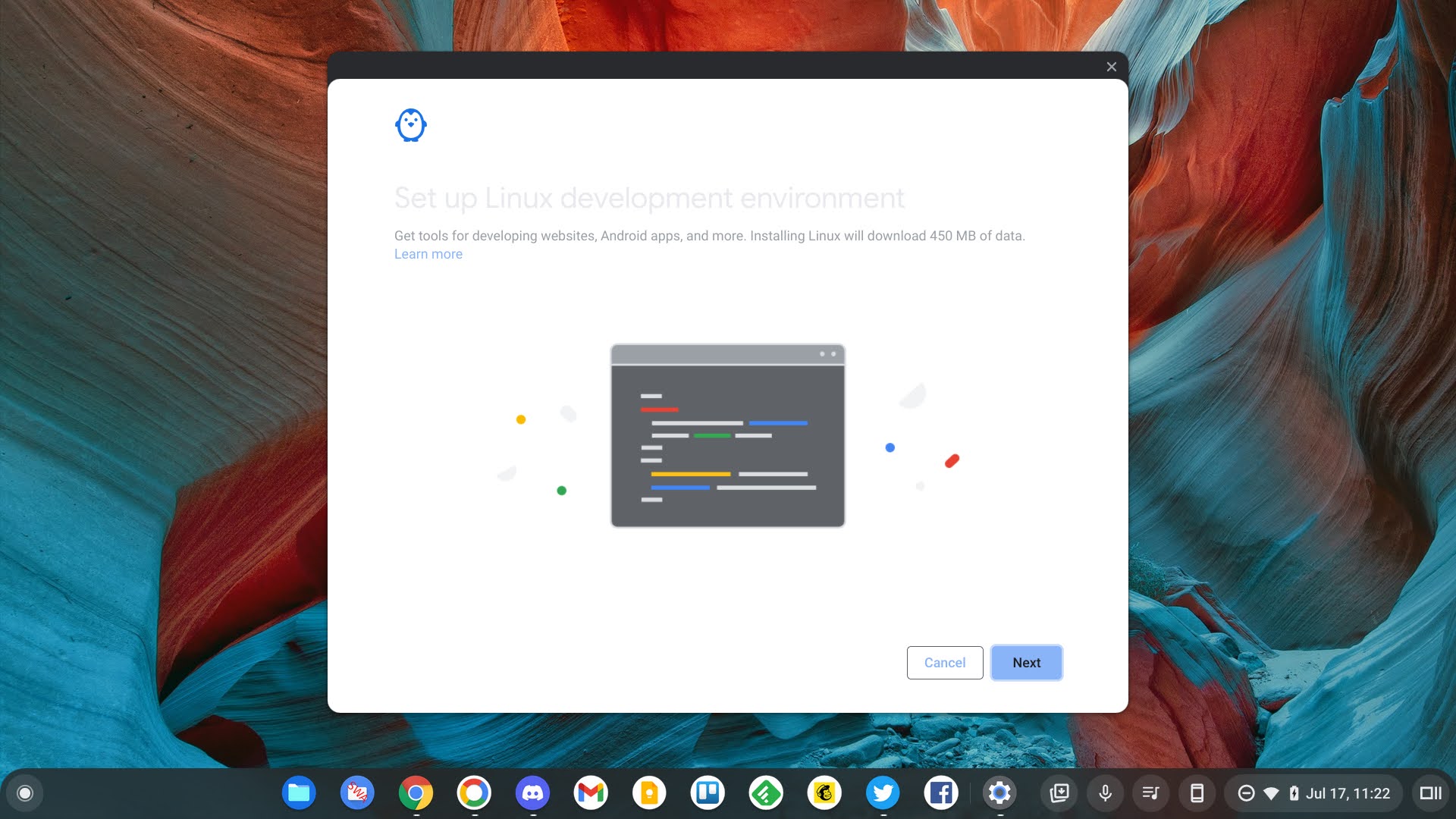
While setting up Crostini on my Pixelbook Go in Chrome OS Canary, and then again while enabling Phone Hub, the updated look and feel popped up for me. At first, I thought it was a visual glitch as it sports a new two-toned, layered look with white and dark grey, but then I noticed the rounded edges and got excited. So far, I’ve only encountered this on system integrated windows, not the Chrome browser itself or any Progressive web apps. It makes sense that it would appear on the former and not the latter, but if this is truly something the company is toying with releasing, I would hope for more of a unified, system-wide implementation.
Another thought I had is that the layered, multi-color look of the windows could be a direct result of Dark Mode. If Google hopes to retain clarity for the user, then having a dark top bar with dark mode probably wouldn’t be best. Instead, they may be opting for a window that swaps colors when the OS mode is toggled. For example, if light mode is turned on, perhaps the top bar on windows will be dark while the windows are white. Similarly, if dark mode is toggled on for the OS, perhaps the windows will be dark, while the top bar turns white. I can see this being hard to stomach, but maybe it will look great – who knows. All I’ll say is that if this becomes the case, it does certainly take away from the idea of “dark mode”.
As with any and all Chrome OS Canary features, there’s no saying whether or not this will even launch before it’s killed off, but I feel confident that while it may be difficult for some to accept or adjust to, it does seem to put window management more in line with the rest of the operating system from a purely visual standpoint. For now, just know that Google has made the corners on windows in Chrome OS twice as round as Microsoft has made those of Windows 11, so if more round equates to more friendly, then it looks like Chrome OS will come out on top. All jokes aside, keep an eye out – I’ll let you know when and if I discover more occurrences or more evidence of this in the near future!
SUBSCRIBE TO UPSTREAM
Get Chrome Unboxed delivered straight to your inbox
Upstream is our flagship, curated newsletter with the top stories, most click-worthy deals, giveaways, and trending articles from Chrome Unboxed sent directly to your inbox a few times a week. Join 31,000+ subscribers.