Support our independent tech coverage. Chrome Unboxed is written by real people, for real people—not search algorithms. Join Chrome Unboxed Plus for just $2 a month to get an ad-free experience, access to our private Discord, and more. Learn more about membership here.
START FREE TRIAL (MONTHLY)START FREE TRIAL (ANNUAL)
Last month, I shared a first look at the new Google Calendar Chromebook Productivity Experiment which adds a glanceable Calendar widget into the quick settings of your device. Upon clicking the date in your system tray, you would be presented with this widget, and could easily see what day of the week a date fell on without having to open up Google Calendar on the web. The lack of this feature up until now has been a point of contention for many users, myself included.
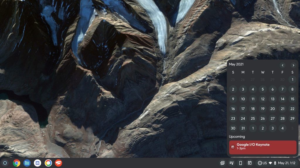
Now, that widget is officially integrating your upcoming events from Google Calendar, and clicking on any given date will update the bottom half of the widget with the event name that corresponds with it and the time it spans. You can see an example of this below. As a reminder, this is running on Chrome OS Canary right now. The little information icon to the left of each event will likely redirect you to the Google Calendar on the web so you can gain better context around that event’s details.
I noticed a few weeks ago that the dates would show a white dot indicator on them when I hovered over, and instead of passing it off as a bug, I had an inkling that this feature was incoming. It’s funny because the mockup that I created back in July for what Chrome OS would look like with a Calendar tool looks nearly identical to this, so it’s awesome to see exactly what I predicted coming to life before our very eyes! Obviously, my mockup didn’t look quite as nice as what the developers have thought up, but my imagination was focused on creating something that worked with Google’s new Material You theming.

If you notice, my mockup also showed a cute little calendar widget icon in the tray, but when the widget officially launched on Canary for Chrome OS, it was nowhere to be seen. Initially, I was disappointed that I got something wrong in my predictions, but today, I moved my device’s shelf to the left and right side of the screen instead of the bottom, and I happened upon a secret calendar widget icon!
Check out the original screenshot above. At the bottom-left of my screen, you’ll notice that the icon is present right next to the time, and although they’re not utilizing the same icon, there’s something more useful there – the date! I’m not sure why I hadn’t thought of that, but it’s genius. Anyone who aligns their shelf to another edge of the screen will now have a glanceable, and truncated view of the date without having to click – that’s just awesome!
For now, this new addition is still locked behind the “Productivity experiment: Monthly Calendar View” developer flag, and that’s okay. There’s still work to be done, and I can’t wait to see what else Google does with this before it goes live for all users. Between this, the new Productivity launcher experiment, alphabetical app sorting, categories, and more, it’s clear that the company is gearing up for a large and exciting feature update for Chromebook owners before the year ends or when the new year begins.
SUBSCRIBE TO UPSTREAM
Get Chrome Unboxed delivered straight to your inbox
Upstream is our flagship, curated newsletter with the top stories, most click-worthy deals, giveaways, and trending articles from Chrome Unboxed sent directly to your inbox a few times a week. Join 31,000+ subscribers.


