

Support our independent tech coverage. Chrome Unboxed is written by real people, for real people—not search algorithms. Join Chrome Unboxed Plus for just $2 a month to get an ad-free experience, access to our private Discord, and more. Learn more about membership here.
START FREE TRIAL (MONTHLY)START FREE TRIAL (ANNUAL)
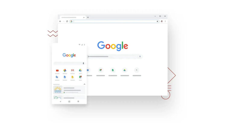
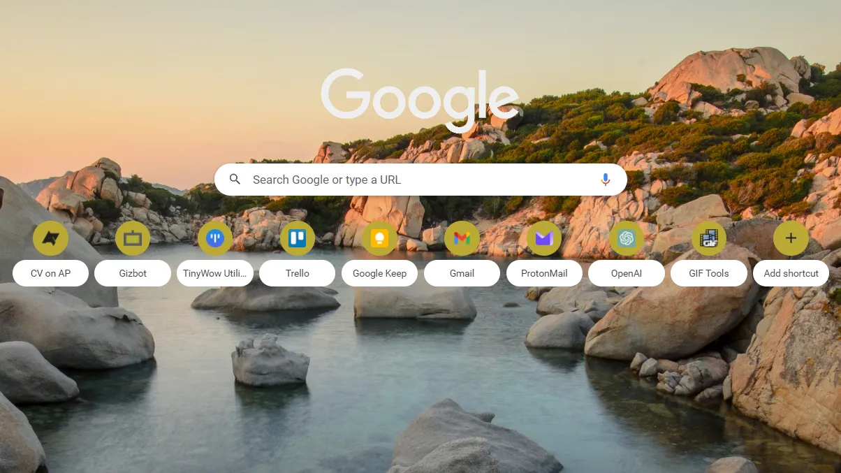
Chrome is shaking things up again and testing a redesigned layout for the browser’s New Tab Page (thanks Android Police). The familiar two-row layout that greets you upon hitting the plus button to call up a new tab is being swapped out for a single-row instead. This change is currently being tested in Chrome Canary 114, and it’s possible to enable it by using the chrome://flags/#ntp-single-row-shortcuts developer flag. The new layout features material design-looking chips for each shortcut name, which gives it a sleek, and modern look.
It’s not surprising that Google is revisiting these elements, given all the NTP cards it’s been testing over the past year for recipes and such. However, it’s somewhat unexpected for the company to tinker with something so long-standing. Personally, I’ve never used these shortcuts and often hide them – something you can easily do in the browser’s settings or the customize layout options in the Chrome Side Panel.
It’s clear that this change is part of Google’s new 2023 Chrome Refreshed design initiative. It’s been working hard to overhaul the browser’s design, primarily for accessibility reasons, and this new layout is just one small piece of that puzzle.
While not everyone will like this change, I’m a fan of it visually. It takes away from the central focal point and causes you to have to scan the page in a wider sweep, so it’s an accessibility sacrifice. If this is a part of the 2023 redesign, it’s obviously a failure from that standpoint, but it looks nice. Maybe after all of these changes, we’ll be left with a pretty browser, but a less functional one for many users.
SUBSCRIBE TO UPSTREAM
Get Chrome Unboxed delivered straight to your inbox
Upstream is our flagship, curated newsletter with the top stories, most click-worthy deals, giveaways, and trending articles from Chrome Unboxed sent directly to your inbox a few times a week. Join 31,000+ subscribers.