Support our independent tech coverage. Chrome Unboxed is written by real people, for real people—not search algorithms. Join Chrome Unboxed Plus for just $2 a month to get an ad-free experience, access to our private Discord, and more. Learn more about membership here.
START FREE TRIAL (MONTHLY)START FREE TRIAL (ANNUAL)
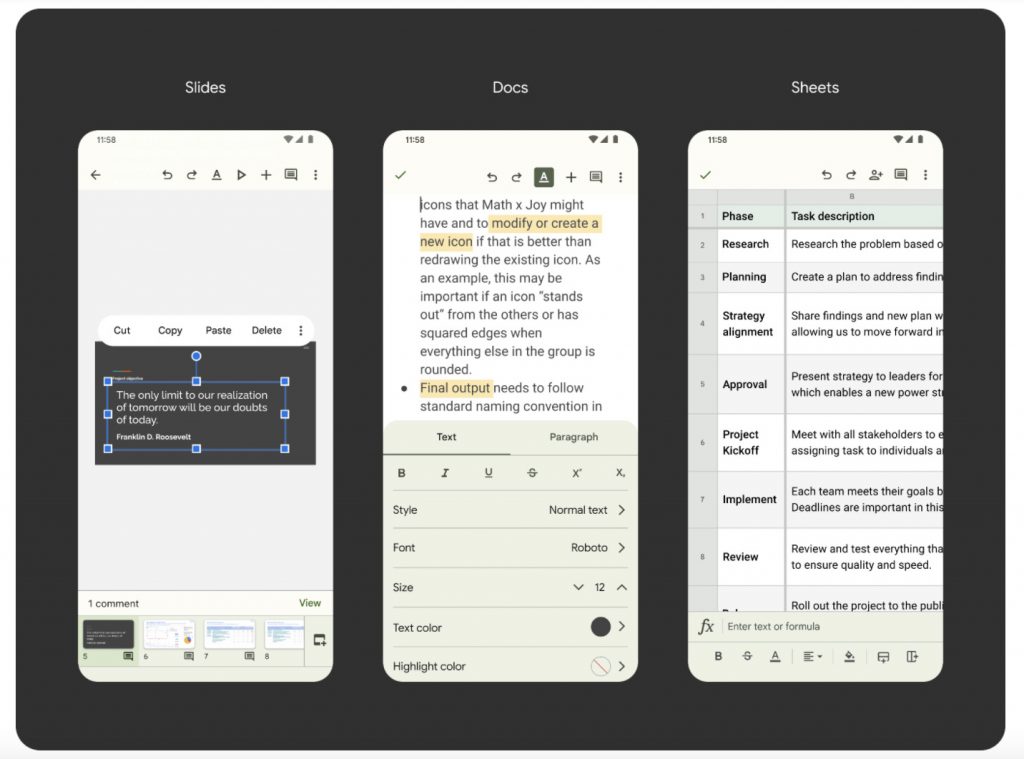
Android 12 Beta 5 just launched, and with this version of the mobile phone OS heading to the Pixel 6 and 6 Pro that’s completely upending its launch playbook, it’s easy to see why people are excited for the entirely new direction Google is going. A complete redesign of the user interface that adapts to you, and not the other way around! Yesterday, the Clock app and Calculator app both received Material You updates and look gorgeous, but now, the company has begun to roll out a slew of other Google service apps with the same theming for those on OS 12.
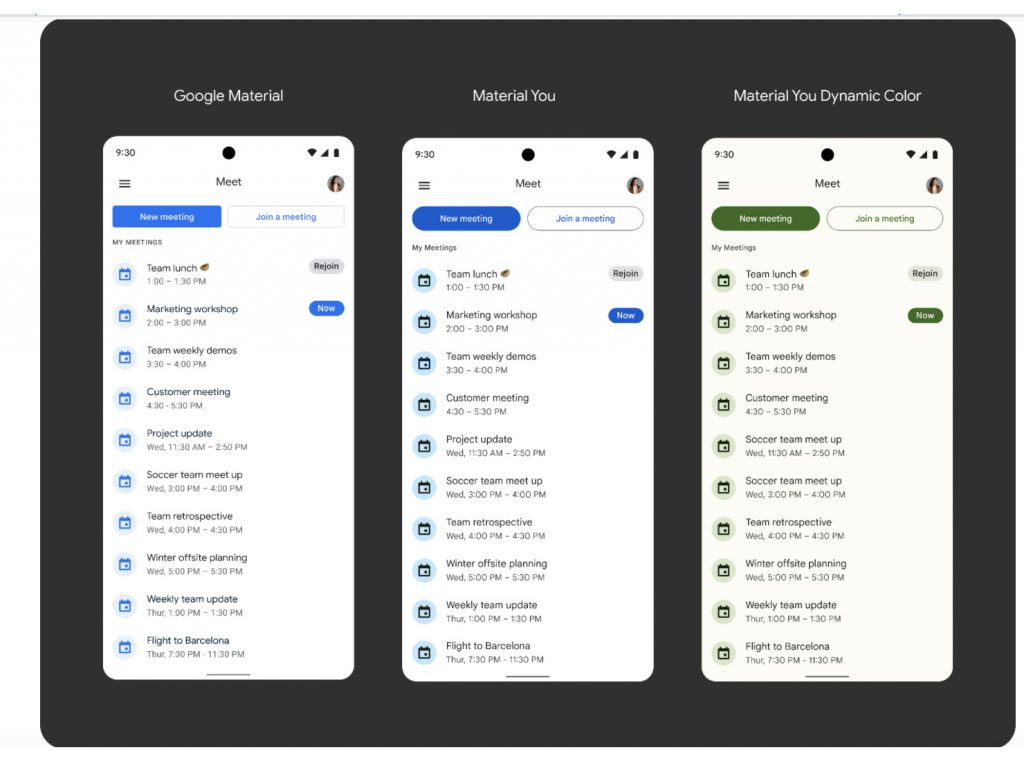
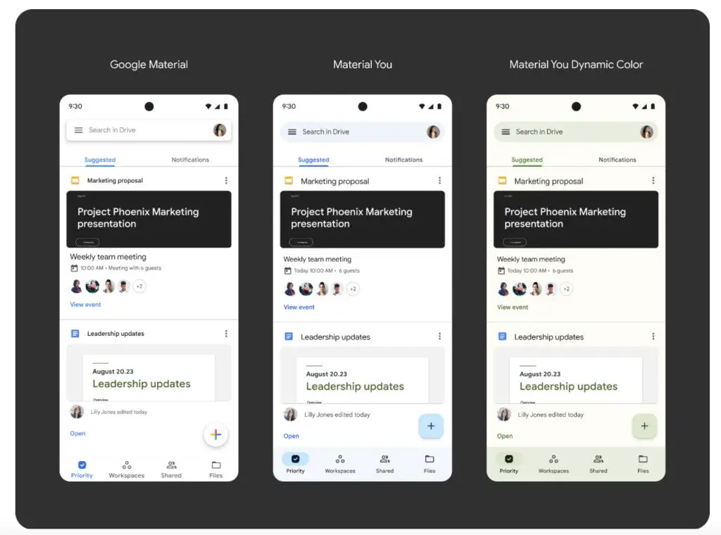
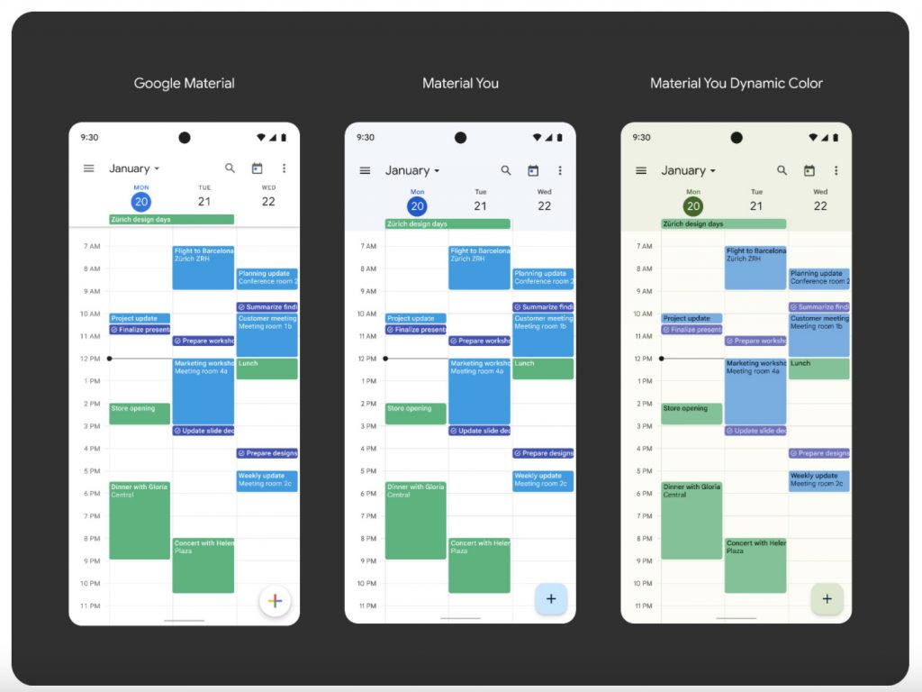
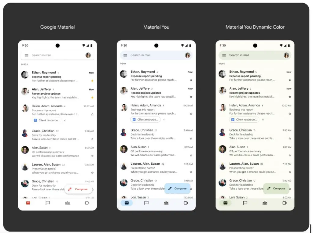
Gmail, Google Calendar, Drive, Docs, Sheets, and Slides, and Meet all join the ranks of the apps that have been completely overhauled to adapt to your highly specific color palette. You can see in the gallery below the before and after, and quite honestly, it’s drastic. Gone are the tap touch indicators in place of pill-shaped backgrounds on the active app tab you’ve navigated to, and everything has a nice pastel color swatch based on the app’s original branding.
Once you toggle on Dynamic Color, you’ll notice that it draws subtle hints of your wallpaper’s color in different shades into the app and styles it beautifully. Google is using AI and machine learning to dynamically pick these colors from your background, so it’s always going to look slightly different when you swap between imagery.
After having created special mock-ups for Material You on Chromebooks – something we know is on its way in time, and after seeing the new Spaces rollout feature a beautifully redesigned web app version of Gmail (You didn’t notice that, did you!) I’m more excited than ever to see Google bring Material You to the web so that Chromebook owners can enjoy it. Once that day comes, these devices will feel entirely different!
Of course, you can’t benefit from these new app updates on your Chromebook yet since we’re only rocking Android 11 on certain devices and it continues to roll out at a snail’s pace, but once the company pushes OS 12 to everyone with a laptop or tablet Chrome OS device, we’re going to start seeing some pretty incredible leaps and bounds in the design department across both apps and web apps alike.
Last year’s complete overhaul where Google stripped its services of any specific color and made them blindingly white was originally setting things up for Dark mode, but now that they’ve taken things a step further with Material You, the possibilities will be endless. They truly are trying to let you have your very own Google. Let me know below what you think about the screenshots above and look forward to more news on Material You as it makes its way to Chromebooks in the months and year to come!
SUBSCRIBE TO UPSTREAM
Get Chrome Unboxed delivered straight to your inbox
Upstream is our flagship, curated newsletter with the top stories, most click-worthy deals, giveaways, and trending articles from Chrome Unboxed sent directly to your inbox a few times a week. Join 31,000+ subscribers.


