


Support our independent tech coverage. Chrome Unboxed is written by real people, for real people—not search algorithms. Join Chrome Unboxed Plus for just $2 a month to get an ad-free experience, access to our private Discord, and more. Learn more about membership here.
START FREE TRIAL (MONTHLY)START FREE TRIAL (ANNUAL)
While the Chrome OS notification system seems fairly simple and straightforward, it’s actually quite robust. You can enable or disable app badging, block notifications entirely with ‘Do not disturb’, and even toggle apps or web apps to show or hide notifications individually. For all of its advancements over the years, I’ve noticed a few bad development decisions that have persisted, and I have a few recommendations that could go a long way toward improving the user experience. I think it can be fun to think about what could be improved, so without further ado, let’s take a look at 5 things that Chrome OS can fix or change about its notification system!
Prevent notification shifting
Something that frustrates me to no end is how notifications will shift and change size in some instances. For example, when Google Play apps are being installed, the progress bar will appear underneath them and then disappear at different times. This causes the notification card to change sizes, and sometimes even shift to a different ordering location among the other cards. Because of this, you can’t properly click on something of interest without accidentally hitting a completely different card, thus opening an app you had no interest in opening!
Perhaps the best fix for this is to maintain a consistent card ordering and size despite its information or function changing. Google could just allow all cards to show or hide a progress bar on the available space instead of vertically growing or shrinking a card’s height.
Easier notification dismissal
I enjoy swiping away notifications on tablet-style Chromebooks, but when using a mouse, aiming at the tiny “x” at the top-right corner of a card is frustrating. Not only because it’s so small, and I’m trying to rid myself of individual notifications that are duplicated between my phone (which I’ve griped about before), but also because the scrollbar often gets in the way of the “x” icon!
An easy fix for this, though admittedly not a very accessible one by today’s standards, would be to bake in new functionality for dismissing notifications. I would love to see the ability to use a mouse to right-click anywhere on the card to dismiss it – since left-clicking opens it. Pressing and holding a card with the mouse could also serve the same benefit, though I understand it opens the notification settings for that card at this time instead.
Auto-collapse quick settings when notifications arrive
I often find myself expanding and collapsing the quick settings area of my Chromebook shelf. When I want to swap between Chromebook logins without utilizing a keyboard shortcut or turn dark mode on or off, it’s awesome to have that area take up as much space as possible. However, I glance at my notifications much more often, and going back and forth between modifying the size of the quick settings area is a tad frustrating.
When a notification arrives, I would prefer for the entire quick settings area to shrink by force. This would give notifications a lot more room to breathe without requiring the user to manually opt for it each and every time they make a change to their Chromebook’s quick settings. I may be in the minority here, but I have a feeling I’m not alone with this request.
Cloud synchronize ‘Do not disturb’
This is something I’ve mentioned in the past! I’ve made it a subconscious habit to enable ‘Do not disturb’ each and every time I turn my Chromebook on, but why should I have to? In my mind, there’s zero reason why this setting isn’t cloud synchronized with a user’s Google account. If I ever want this to be toggled, it would be a manual decision, right?
I’ve never thought to myself – I want to see notifications appear at the bottom-right of my Chromebook screen and distract me from what I’m doing. In fact, since I started using Chromebooks, I’ve pretty much always checked for new pings manually. Doing so has become a habit, and It puts me in control of my time and attention. Let me know in the comments if you always have ‘Do not disturb’ enabled or if you like to see new notifications come to you in real-time.
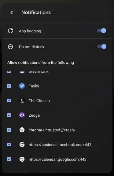
Categorize and clean up ‘Do not disturb’ items
Here’s a minor gripe – in the ‘Do not disturb’ section of the quick settings, I don’t much like how “Android” apps and web apps are all jumbled together. Furthermore, I probably wouldn’t mind it so much if the web apps weren’t listed out as web URLs. Instead, Google should avoid making a distinction here unless the user has both the Google Play and web app versions of something installed simultaneously.
Another great idea is to simply separate apps and web apps into a sub-menu here so that the user can tell the difference. Also, give those PWAs a custom favicon, and for goodness sake, clean up their name and hide their port from the primary menu area. Honestly, this just looks really bad, and I don’t much see a reason a standard Chromebook user would ever need to view the information in this way.
Bonus: Properly launch Phone Hub notifications
Lastly, I’ve got a bonus improvement. The reason I didn’t include this in the main list is because Phone Hub is still in development. Despite this, I wanted to draw attention to the fact that clicking on notifications pushed from your phone does not launch either an app or a web app at this time. Instead, all you can do is click ‘Reply’ on messaging and social media notifications and send that response back to your phone, which in turn, sends it back to that service it originated.
Clicking on a notification sent from your phone should launch the corresponding app or web app and allow you to go directly to that information on your Chromebook. As I understand it, Phone Hub or ‘Eche’ has this planned, but as of Chrome OS 92 Canary, it’s still non-functional.
SUBSCRIBE TO UPSTREAM
Get Chrome Unboxed delivered straight to your inbox
Upstream is our flagship, curated newsletter with the top stories, most click-worthy deals, giveaways, and trending articles from Chrome Unboxed sent directly to your inbox a few times a week. Join 31,000+ subscribers.