


Support our independent tech coverage. Chrome Unboxed is written by real people, for real people—not search algorithms. Join Chrome Unboxed Plus for just $2 a month to get an ad-free experience, access to our private Discord, and more. Learn more about membership here.
START FREE TRIAL (MONTHLY)START FREE TRIAL (ANNUAL)
Google has come a very long way when it comes to what Chromebooks are capable of. Just the other day, I was stating how the company has subverted many expectations by helping users unlock the full potential of creative activities on Chrome OS with Perks, and the public perception – outside of schools – has greatly improved over the past five years. As that happens, we’re seeing more unity between our phones, our homes, and our laptops. We previously thought Google wanted to merge the operating systems across Android and Chrome OS, and while that may one day become true despite what you think about Fuchsia, there’s no denying that it’s gone through great lengths to unify the experiences across our digital lives within its hardware and software ecosystem.
With that being said, there are still several things that I noticed are not present on Chromebooks that exist on our handheld devices. Some are significant, and others less so, but the consistent thread is that the addition of these five features and more would go a long way to closing the gap on how we interact between devices in our lives in order to complete tasks and achieve unity with our digital identities. My hope is that these items provide a starting point for Google to consider how it can take its efforts to the next level over the coming years.
Android 12 Notifications
This past week, I encountered a new Chrome developer flag called ‘Notifications Revamp’ that seeks to completely redesign the visual look and functionality of the notifications found above your Chromebook’s quick settings. After enabling it and receiving a new notif, my device locked up in Canary, so it’s not quite there yet. What’s interesting is that the visual design was more frosted glass and transparent than the current notifications, and each one had an arrow icon at the top right to collapse it should it be grouped with others of its kind.
Notifications Revamp
Enable notification UI revamp and grouped web notifications. – Chrome OS
#enable-notifications-revamp
Android 12 already has this intelligent grouping system built-in, and if you’re already benefitting from it on Beta 5, you’ll know what I mean. I predicted that this exact system would come to Chrome OS back when I created my Material You mock-up found in the image below. It’s incredible to see the developers implementing it – not because I nudged them, but because I understood that the natural trajectory of the laptop OS was to follow that of its phone counterpart.
Material You
Speaking of that Material You mock-up, here it is. I’ll stress this again – this is a mock-up. You can see a video and more photos of it back when I wrote it up. While we’ve seen rounded corners come to many system windows over the past few months with the latest being Google Assistant voice match setup, the design is clearly deviating from my vision of it, but the fact remains that my excitement is continuing to unfold into reality.
There has yet to be any word publicly or internally on the redesigned quick settings, but my hope is that we see a commit or something soon that indicates Google is turning those ugly little circles into larger, more colorful tiles or cards as seen below. Let me know what you think, and also if you agree that the OS may soon look similar to this.
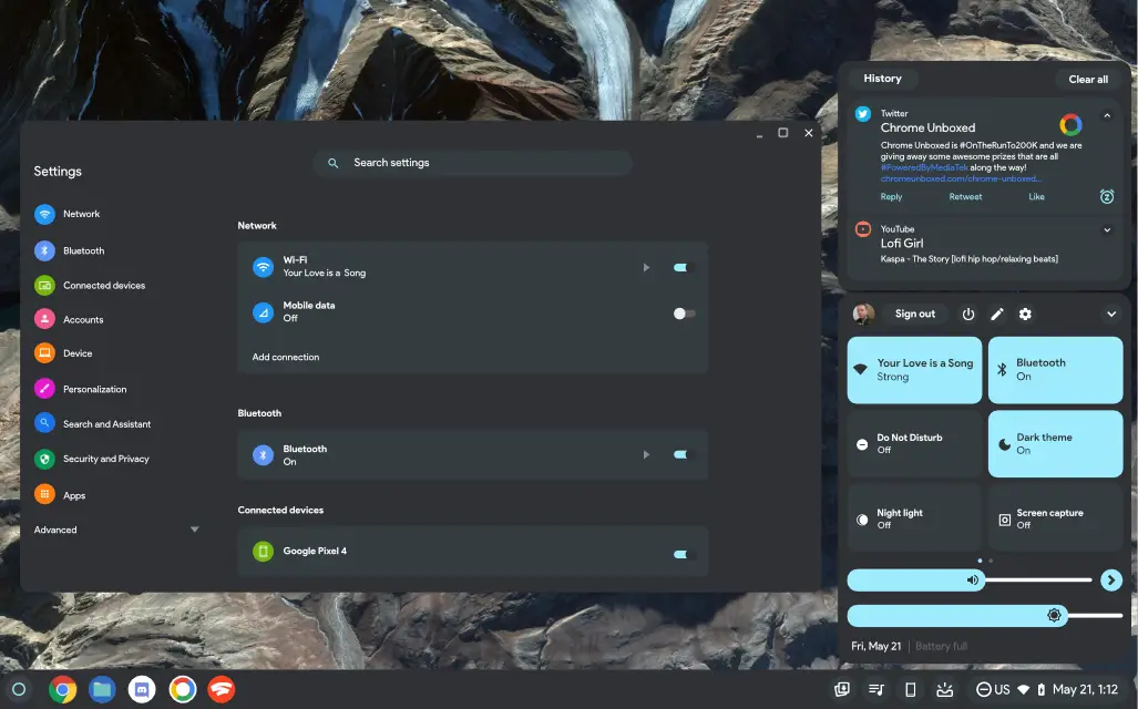
‘Edit’ quick settings panels
Before you avert your eyes from the image above, please take note of a small detail I’ve added into the quick settings panel. The small pencil icon was my idea of Google letting Chromebook users organize their quick setting tiles. Swapping out which ones show and in what order is still not possible, but as the operating system grows in popularity and gains new and exciting capabilities, that section is slowly becoming more cluttered.
Offering a way to customize these options seems like the right move. Oh, and it’s already a thing on Android. In fact, it has been for years. I’m not saying that I want Chrome OS to become Android, but I think a certain amount of cross-pollination, especially where it makes sense logically for the user experience, is unavoidable and inevitable.
Home controls and Storage Tiles
If you’re already using Android 12 you’ll notice that Chromebooks – which don’t yet have Android 12 – are missing two pretty important tiles that are present on your phone. First, there’s a new quick settings tile for managing smart home devices. This ‘Device controls’ tile lets you add a few smart bulbs, Nest minis, or anything else you have set up in your house. From there, you can get to them immediately and turn them on or off without having to open the Google Home app separately.
I personally think this would make a ton of sense for Chromebooks to have. As devices that often sit in our homes, having instantaneous access to control our homes from our laptop would be nice, and since the company doesn’t provide a web-based interface for the Google Home app (fix that, Google!) it would be welcomed. There have already been talks of making Assistant a deeper, more integrated part of Chromebooks, and I think this would be a good start to that journey.
In regards to the ‘Storage’ tile, the Chrome OS Files app continues to get more intelligent, but the Files app by Google (I know, confusing, right?) has many more AI and machine learning features that automate storage on behalf of users. Its locked, private folder, storage clearing suggestions, ability to automatically delete locally stored but already backed up Google Photos, and so much more make it an obvious addition for Chromebooks. I’m actually surprised that the company has yet to do this. In the end, having a way to quickly free up space from the quick settings makes sense to me, but what do you think?
Digital wellbeing dashboard
Last, but certainly not least, I would love to see the Digital Wellbeing dashboard make its way to Chromebooks. It’s only available in beta on Android, but if you’ve utilized it yet, you’ll agree that it absolutely should have a home on a laptop. The ability to see how long you’ve spent in email, calls, and so on is already rolling out to Workspace users with Time Insights, but being able to perform personal time management across all apps and web apps would supercharge user productivity.
Taking that a step further, injecting notifications with extra superpowers like time limits, blocking, and so on in the same way that Android Work Profiles and Family Link operate would make having a Chromebook in your home a more ‘thoughtful’ experience and not just a smart one. Anyways, all of this was meant to get the gears turning and share some of the exciting thoughts for the future of Chrome OS that I’ve had for some time now.
Chromebooks are going to become much more than something we use to get work done – they will evolve into a natural part of our homes and lives, and Google has already begun on this journey. I hope that these five features and more become a part of that journey before long. If I missed anything, please let me know in the comments where I hope to discuss with you!
SUBSCRIBE TO UPSTREAM
Get Chrome Unboxed delivered straight to your inbox
Upstream is our flagship, curated newsletter with the top stories, most click-worthy deals, giveaways, and trending articles from Chrome Unboxed sent directly to your inbox a few times a week. Join 31,000+ subscribers.