

Support our independent tech coverage. Chrome Unboxed is written by real people, for real people—not search algorithms. Join Chrome Unboxed Plus for just $2 a month to get an ad-free experience, access to our private Discord, and more. Learn more about membership here.
START FREE TRIAL (MONTHLY)START FREE TRIAL (ANNUAL)
It looks like Google is modernizing the Youtube app yet again with new, stylish buttons, panels, and more. First spotted and reported by The Verge, the video streaming platform is apparently adding more visually appealing and accessible access to many of its core options while in fullscreen mode.
As you can see in the image below, the vertical three dots “more” options menu at the top right of the display has now been replaced by a cogwheel. More notably, the bottom left is occupied by the thumbs up and down buttons, comments or live chat, the add to playlist option, and the sharing button as per usual, but now, they’re outlined icons that are encircled.
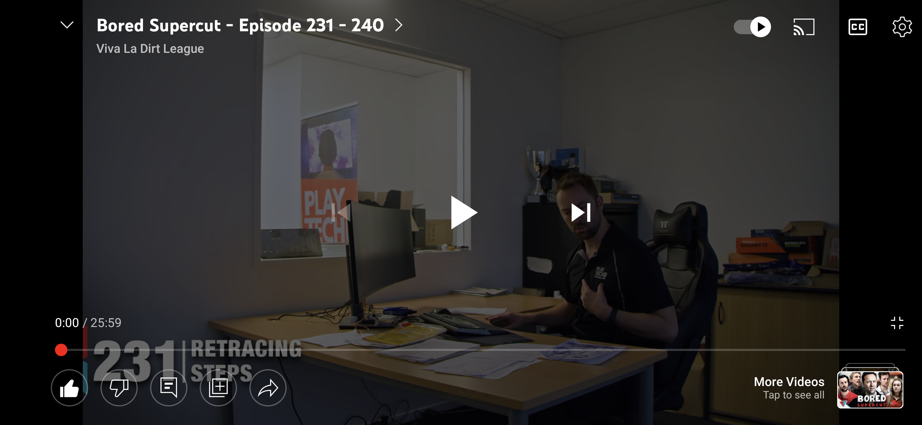
Another interesting element is the stack of cards on the bottom right for “More Videos”. Tapping this will bring up the common video carousel while you’re watching. In the past, you’d just call this up by swiping up on your screen as the video plays, but it’s a nice touch to see this redesigned.
Lastly, calling up the chat option or the listening controls gives you a right-aligned card that occupies one-third of the fullscreen experience. While this hasn’t been met with complete acceptance or warmth by many people thus far, I quite like that I can read comments and see the video’s details without exiting fullscreen and while in landscape mode. In my opinion, you still get enough screen real estate to make it worthwhile, and it’s more than you’d get by watching the video in the standard portrait mode.
According to The Verge, the update has been rolling out to users over the course of the week on both Android and iOS. Seeing a refreshed design that’s both more fun and accessible be cross-platform and unified for all who watch Youtube entirely too much as I do does put a smile to my face.
Photo by freestocks.org from Pexels
SUBSCRIBE TO UPSTREAM
Get Chrome Unboxed delivered straight to your inbox
Upstream is our flagship, curated newsletter with the top stories, most click-worthy deals, giveaways, and trending articles from Chrome Unboxed sent directly to your inbox a few times a week. Join 31,000+ subscribers.