Support our independent tech coverage. Chrome Unboxed is written by real people, for real people—not search algorithms. Join Chrome Unboxed Plus for just $2 a month to get an ad-free experience, access to our private Discord, and more. Learn more about membership here.
START FREE TRIAL (MONTHLY)START FREE TRIAL (ANNUAL)
A user on Reddit by the name of Leopeva64 (Thanks for the heads up!) made us aware of some pretty significant changes that are coming to your Chrome browser’s global media controls and even provided Chromium Repository commits to reflect these changes. We previously detailed how Google was turning your music controls on their head, and these new changes lean further into that design. At this time, there is no timeline that we’re aware of for when these changes will come to Chromebooks, but as with previous alterations, the browser and Chrome OS implemented them pretty much immediately in step with one another.
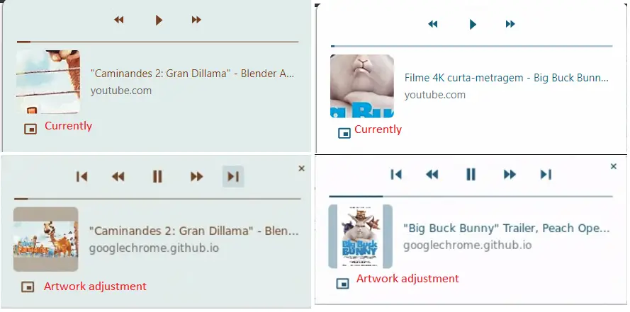
First – and this is a weird one – the global media controls section is modifying how your album art will display. It’s being changed to show the entire album art instead of a zoomed-in version, and that means that the area dedicated to album art will pretty much never be completely filled out. I’m personally partial to the zoomed-in, cropped version of the album art because it looks cleaner and more intentional. I’m definitely not a fan of this one!
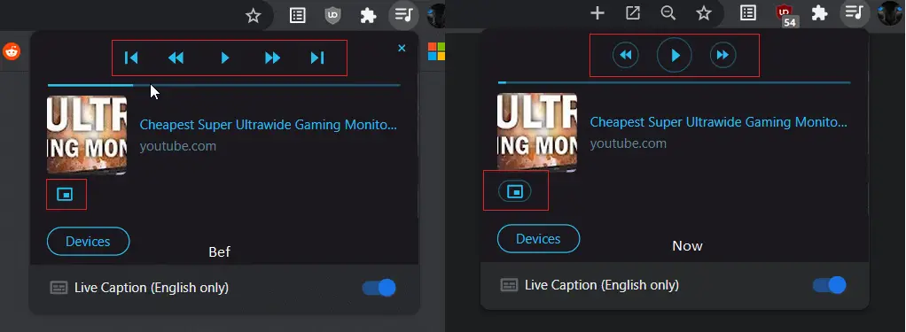
Next up, a device selector is being added to the bottom of the global media control card for your active item. The first two available devices that you can cast to will be shown, followed by a drop-down arrow that will allow you to select from any other available cast devices. I did notice this one recently on Desktop Chrome, and I welcome this change with open arms! Previously, devices were listed in a separate cast section of the three dots ‘more’ menu.

Additionally, the play and pause buttons as well as the buttons used to skip forward and backward are receiving a bit of a makeover. Now, they will feature a clean-looking, attention-drawing circle around them. This looks pretty nice! I’m a bit surprised this wasn’t implemented upon the launch of the global media controls section, but I understand that polish is definitely not a priority while features are being tested and developed.
Lastly, while no image exists for a volume slider being built directly into the media card, there is a Chromium Repository commit that details this as a future implementation. I’m not really sure I can imagine where this would be placed in order to prevent confusion with the scrubbing bar, but I do believe it would be useful. I personally approve of almost all of these changes and look forward to what Google is going to make of global media controls over time, but I am still having trouble adjusting to the primary controls for each card appearing above the artwork at the top of the card as opposed to its traditional placement on the bottom.
SUBSCRIBE TO UPSTREAM
Get Chrome Unboxed delivered straight to your inbox
Upstream is our flagship, curated newsletter with the top stories, most click-worthy deals, giveaways, and trending articles from Chrome Unboxed sent directly to your inbox a few times a week. Join 31,000+ subscribers.