

Support our independent tech coverage. Chrome Unboxed is written by real people, for real people—not search algorithms. Join Chrome Unboxed Plus for just $2 a month to get an ad-free experience, access to our private Discord, and more. Learn more about membership here.
START FREE TRIAL (MONTHLY)START FREE TRIAL (ANNUAL)
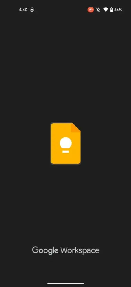
It looks like my absolute favorite Google app just made the switch in its branding to reflect its bundling into Google Workspace. Shown in the screenshot below, the splashscreen for the notetaking app now shows the Workspace logo near the bottom of the screen. 9to5Google first noticed this change, and though our devices are reflecting this too, I went ahead and showed their device.
While it has no real bearing on the app’s functionality up front, this could spell more updates and features for Keep – a service that his historically received little to no attention until recently. As you may remember, text formatting and font sizes are headed to your notes in the near future, and note background images were implemented earlier this year. Oh, and on tablets, Keep is getting a sweet productivity-focused “Dual pane” which will let you edit and navigate notes at the same time, so there’s that.
Most recently, Google Docs, Sheets, Slides, Drive and Meet have all swapped out their splash screens for ones featuring “Google Workspace” as well, and other apps like Chat, Calendar, Tasks and more shouldn’t be far off from doing the same. I personally believe that Keep has a lot it can do to cater to power users, but I also know that Google’s focus is so far from such a thing that it may remain quite simple in nature even with upcoming additions and changes.
I’m fine with this, but it would still be nice to get a few more advanced notetaking features so that it can remain competitive with something like Evernote. We need more AI-driven features, Google! Perhaps something like Lens integration or scanning or even improved image to text transcriptions. Hey, one can hope, right?
SUBSCRIBE TO UPSTREAM
Get Chrome Unboxed delivered straight to your inbox
Upstream is our flagship, curated newsletter with the top stories, most click-worthy deals, giveaways, and trending articles from Chrome Unboxed sent directly to your inbox a few times a week. Join 31,000+ subscribers.