


Support our independent tech coverage. Chrome Unboxed is written by real people, for real people—not search algorithms. Join Chrome Unboxed Plus for just $2 a month to get an ad-free experience, access to our private Discord, and more. Learn more about membership here.
START FREE TRIAL (MONTHLY)START FREE TRIAL (ANNUAL)
It’s no secret that Google has historically been terrible at its widget game. Apple has some of the most beautiful widgets I’ve ever seen, and I don’t even own an iPhone or iPad. If an Android and Chromebook user notices the stark difference between the two, there’s a major chasm, right?
Well, over the past few months, Google has slowly but surely been redesigning these (starting on iOS, of course) and it’s now competing in the race. Its Android widgets are now largely up to snuff, and Chrome even received a widget that lets you play Dino Run right from your home screen just last month.
Sadly, Google Play Books – one of my absolute favorite Google services – has suffered up until now, and it’s been rocking the same old, dusty widget from Android Honeycomb 11 years ago. Google did let drop that they would be updating this back in December, and I was under the impression that this would roll out over the few weeks following that announcement, but I was wrong.
Now, it’s the middle of March in the new year, and we have finally received the new Play Books widget! It’s gorgeous and is built with Material You. You can see an example of it below. It does seem to be a tad buggy though as I had to spend upward of 10 minutes resizing it back and forth to get the four columns with two rows of books and audiobooks to show. It can also be laid out in a 2×2 and 3×2 formation as well.
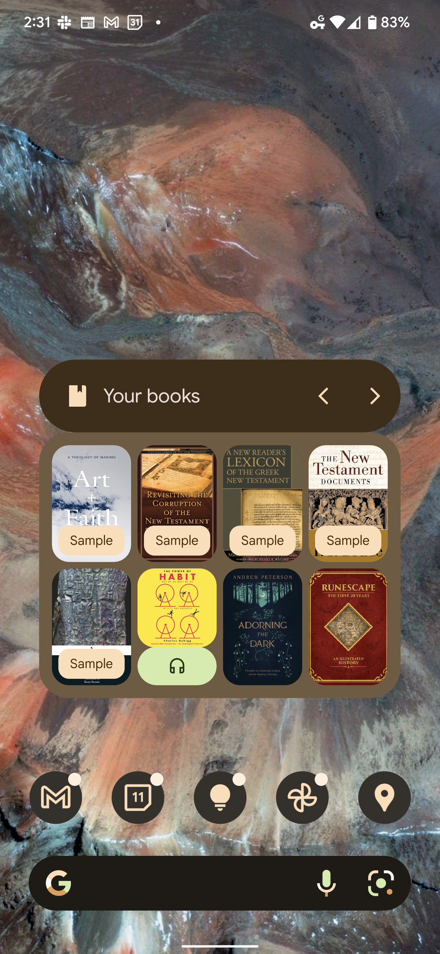
I’m not gonna lie, I wasn’t in love with it at first. It only cycles through three pages of your last read content, and the word ‘Sample’ or the headphones icon for an audiobook covers a third of the book cover. I also don’t love how I can’t have three or four rows, but I suppose that’s why it’s a widget, right? A small sliver of interactivity for convenience that spurs you toward opening the full experience. Still, it’s a wonderful addition to the new widgets lineup, and I won’t complain so much since it took Google over a decade to redesign this.
One tap of any cover and you’re instantly reading or listening, so it most certainly does its job without issue. My last complaint is that the two-row and four-column setup takes up more invisible widget space than I’d like, so I can’t exactly place much above it in the example because the widget extends further up than the visual design of its header. Let me know what you think of this in the comments, and whether or not you even use Play Books or widgets to begin with!
SUBSCRIBE TO UPSTREAM
Get Chrome Unboxed delivered straight to your inbox
Upstream is our flagship, curated newsletter with the top stories, most click-worthy deals, giveaways, and trending articles from Chrome Unboxed sent directly to your inbox a few times a week. Join 31,000+ subscribers.