


Support our independent tech coverage. Chrome Unboxed is written by real people, for real people—not search algorithms. Join Chrome Unboxed Plus for just $2 a month to get an ad-free experience, access to our private Discord, and more. Learn more about membership here.
START FREE TRIAL (MONTHLY)START FREE TRIAL (ANNUAL)
Yesterday, I was about to share an image from Google Photos when what I thought was an accidentally shown share bar appeared at the bottom. As it turns out, this is a part of a new user interface update by Google in the app! It appears only on one of my accounts and not the others, indicating that this is still in testing or simply not fully rolled out yet.
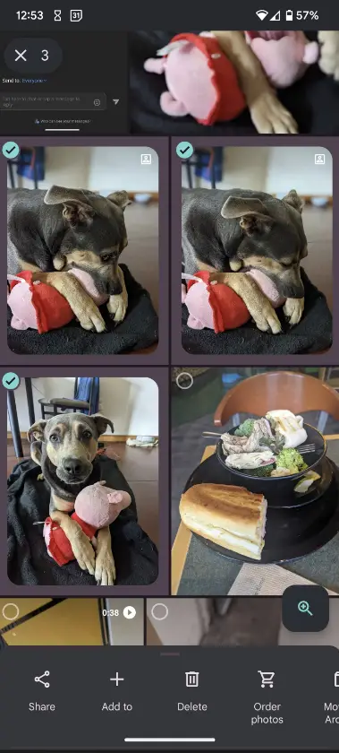
Several users have already pointed out to Android Police that “Share”, “Add to”, “Delete”, “Order photos”, and “Move to archive” all appear preemptively across the bottom of the screen. This could be Google Photos attempting to take a step out of sharing. Until now, you’d multi-select a few images, tap the plus at the top of the screen and then select one of these options.
However, having everything out in the open the moment you press and hold one or multiple images seems like a welcome feature, so I’ll take it. The only problem is that I think like me, many users may start off confused with such a drastic change to the experience. Perhaps a tutorial can appear once the feature launches in full to walk everyone through the shift in process of sharing or managing photos.
In addition to the menu appearing at the bottom once you select something, you can slide upward on the pop-up itself to see the usual recommendations like other Google Photos users you’re connected with, additional sharing options, albums, and even the photo information.
SUBSCRIBE TO UPSTREAM
Get Chrome Unboxed delivered straight to your inbox
Upstream is our flagship, curated newsletter with the top stories, most click-worthy deals, giveaways, and trending articles from Chrome Unboxed sent directly to your inbox a few times a week. Join 31,000+ subscribers.