


Support our independent tech coverage. Chrome Unboxed is written by real people, for real people—not search algorithms. Join Chrome Unboxed Plus for just $2 a month to get an ad-free experience, access to our private Discord, and more. Learn more about membership here.
START FREE TRIAL (MONTHLY)START FREE TRIAL (ANNUAL)
As a long-time Fitbit Versa user (I’ve had them all at this point), I can definitely say that the biggest gripe I tend to have is the lack of fluidity and questionable layout of the UI. With the Fitbit Versa 3 I currently have on my wrist, general responsiveness is OK, but moving through the actual parts of the interface can get a little clunky and slow, especially if notifications are loaded up a bit.
In a find by the folks over at 9to5 Google, however, it looks like the overall Fitbit smartwatch UI is going to get a pretty big overhaul with the introduction of the Fitbit Versa 4 and Fitbit Sense 2. Both watches are slated to start shipping on September 23rd, and with these new smartwatches comes a slew of new-to-Fitbit options thanks to the company’s buyout by Google.
We’ve discussed it prior, but services like Google Pay and Google Maps are both on the way for these new smartwatches, and that should bring quite a bit of new usefulness to Fitbit’s latest wearables. On top of that, new sensors and what looks like a bit more power under the hood is also coming. All of these upgrades sound awesome, and to top it all off, it looks like the Fitbit team has taken to the Wear OS way of getting around your smartwatch and is adjusting the latest Fitbit UI to come a bit closer in-line with Google’s way of doing things.
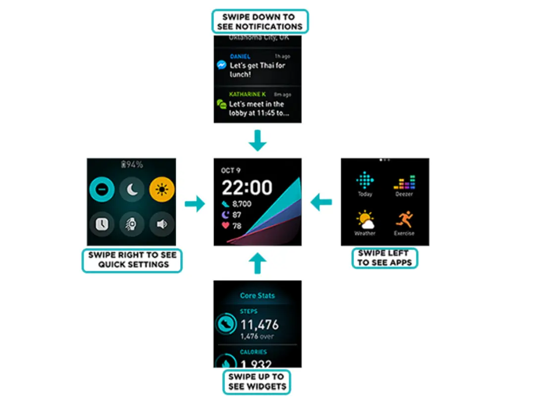
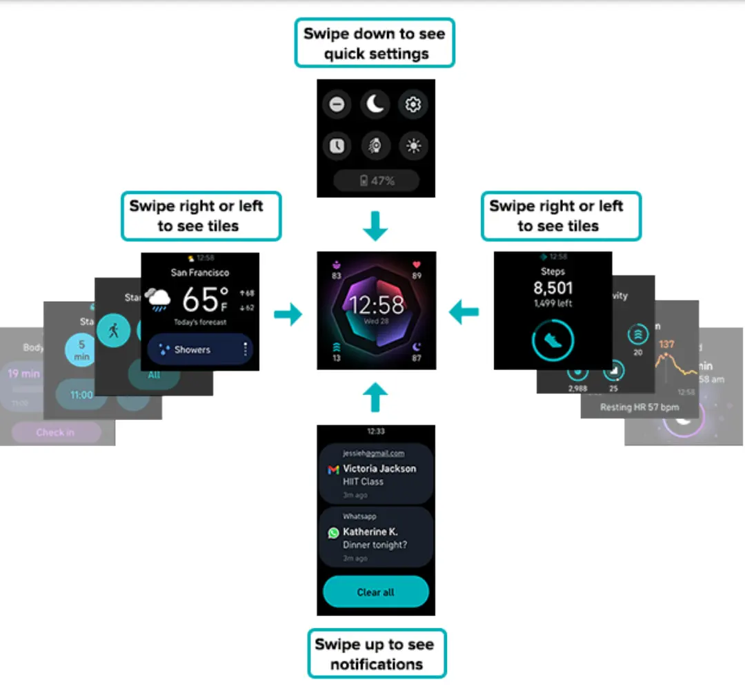
As you can see in the images above, the new Fitbit UI brings a lot over from Wear OS 3 (it is not Wear OS, by the way) in the form of pill-shaped buttons, some Material You elements, and a navigation that falls more in-line with the way we expect to see the Pixel Watch operate. As 9to5 Google points out, this new navigation setup matches what is found in the Android Studio emulator for the Montblanc Summit 3: the only watch currently running Wear OS 3 that isn’t made by Samsung.
This new setup will have users swipe left or right for tiles, down for quick settings, and up for notifications. According to this layout, however, I’m unsure how the ‘All Apps’ portion will present itself. Either way, the overall look and feel of all this leans decidedly more-Google and I’m hopeful it means the interactions with the new Fitbit watches feel more intuitive because of it. If this much effort is going into rearranging the UI, my hope is the OS as a whole is cleaned up, better to look at, and just easier to navigate.
I don’t have long to wait to find out as I’ve already decided I’ll run over to Best Buy and snag one this week when they go on sale. I am looking forward to the Pixel Watch, but if the latest rumors are correct, I may be waiting until November to even decide if that device is right for me or not. Fitbit Versas have been tried and true companions for me over the past few years, and with these Wear OS-like changes on-board and more Google services integrated in, I think it is worth giving the new one a try before I jump in on Google’s in-house wearable.
SUBSCRIBE TO UPSTREAM
Get Chrome Unboxed delivered straight to your inbox
Upstream is our flagship, curated newsletter with the top stories, most click-worthy deals, giveaways, and trending articles from Chrome Unboxed sent directly to your inbox a few times a week. Join 31,000+ subscribers.