

Support our independent tech coverage. Chrome Unboxed is written by real people, for real people—not search algorithms. Join Chrome Unboxed Plus for just $2 a month to get an ad-free experience, access to our private Discord, and more. Learn more about membership here.
START FREE TRIAL (MONTHLY)START FREE TRIAL (ANNUAL)
Anyone utilizing Google Drive or its various sub-apps (Docs, Sheets, or Slides) over the past year will be plenty familiar with their new Material You designs on phones. However, despite the facelift that these apps received on the web and for desktops in the past, they still weren’t as good-looking as their mobile counterparts.
Now, Google Drive, Docs, Sheets, and Slides are all receiving a long-overdue refresh with Material You elements such as the famous two-tone coloration. As you can see in these screenshots that the company shared on its Workspace blog yesterday, comments in documents, as well as the top ribbon’s editing tools and various buttons across the UI now stand out more with beautiful cards.
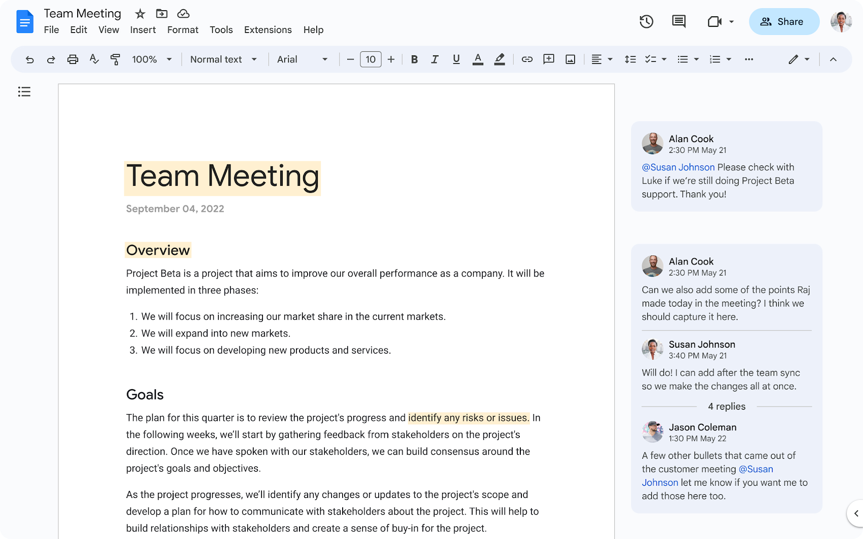
Additionally, the Google Drive interface pictured above takes massive inspiration from the latest Material You Gmail redesign, separating its main body from the side panel and various other aspects of the UI using rounded corners and a grey or dynamically colored blue tinge.

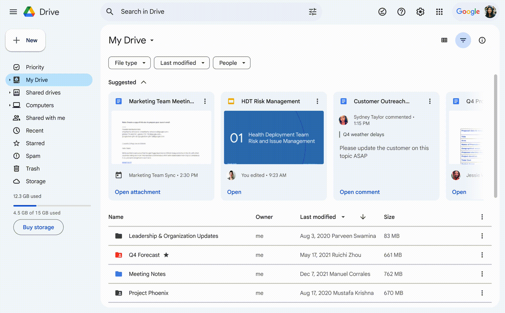
Lastly, the “+ New” floating action button (FAB) above your left-hand sidebar has been converted to a squircle instead of a pill (a change I personally don’t like). We’ve yet to receive this update on our end, but Google says it’s rolling out as a server-side update “in the coming weeks”.
Google states it wants to collapse the boundaries between apps and streamline the flow of work with these new updates. Let me know in the comments if you’re a fan of this or if you prefer the current UI implementation!
SUBSCRIBE TO UPSTREAM
Get Chrome Unboxed delivered straight to your inbox
Upstream is our flagship, curated newsletter with the top stories, most click-worthy deals, giveaways, and trending articles from Chrome Unboxed sent directly to your inbox a few times a week. Join 31,000+ subscribers.