Support our independent tech coverage. Chrome Unboxed is written by real people, for real people—not search algorithms. Join Chrome Unboxed Plus for just $2 a month to get an ad-free experience, access to our private Discord, and more. Learn more about membership here.
START FREE TRIAL (MONTHLY)START FREE TRIAL (ANNUAL)
Ah, Overview Mode for Chrome OS: it is, without doubt, my most favorite desktop UI feature and simultaneously my pick for most frustrating. On one hand, when it is behaving properly, the ability to fling 3 fingers on the trackpad and see all my open windows is priceless. I use it all the time, every day, and on every Chrome OS device I own.
On the other hand, since they last made some serious UI changes to the feature over a year ago, things just haven’t been great. As a matter of fact, I’d argue that the overall jank present in Overview Mode is responsible for a large portion of the negative reviews of the Pixel Slate when it launched. While Overview Mode is a nice feature on desktop, it is essential for tablet mode and is the primary way you multitask. With its dropped frames and lagging animations, Overview Mode made the Pixel Slate look far slower and buggier than it really ever was.
With that being said, improvements have been consistently been made and we’re finally starting to see things ironed out with the existing way Overview Mode animates in and out. In desktop mode, I usually don’t have too much issue with lag and animation jank and the tablet mode has been much better in Chrome OS 75 as well. However, as tablet mode is still the more important piece of this puzzle, it is increasingly important that Google gets this multitasking gesture down pat and done right. After all, with iPads being the de-facto tablet experience with their buttery-smooth multitasking animations, consumers are beginning to expect this type of behavior out of tablets when they use them.
A New Overview
Enter a new way to animate and lay out Overview Mode found in this commit:
overview: Limit displayed window to six for new layout.
The new positioning logic is hidden behind a flag.
In one of the linked files pertaining to this commit, the following language is found:
// Gets the layout of the overview items. Currently only for tablet mode.
// Positions up to six windows into two rows of equal height, scaling each
// window to fit that height. Additional windows are placed off-screen.
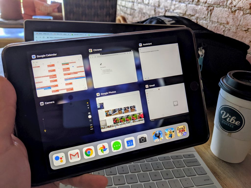
Starting on tablet mode first, it looks like there will be a new and more-uniform look to the panels in the Overview Mode layout. Additionally, it appears that only 6 tiles will appear at a time instead of animating every single window into frame. This makes sense for tablets as you may not keep track on how many apps you have open at any given time. With iPads and Android phones, we’ve become more used to seeing only a portion of our open apps in multitasking modes and simply swiping to see more.

As a matter of fact, look at the multitasking screen on my iPad Mini in the picture above. Though I have about 12 apps ‘open’, only 6 need to be animated into view when I need to multitask. The rest are just slid into view as I swipe them over. This will have huge savings on processor overhead and should equate to a much, much smoother overview animation once implemented.
Right now it doesn’t look like they are pushing this on desktop, but I could see them doing it there as well. Animate the last 6 windows into view that have been active and let the other rest to the side where they can be animated in with a simple swipe of the trackpad. For lower-powered devices, this would likely make overview mode a much better, much smoother overall experience.
As we can’t see the bug attached in the commit, it isn’t clear when we’ll see this take effect. I wouldn’t expect this in Chrome OS 76 by any means, but we could possibly see it show up in Chrome OS 77 for sure. With Virtual Desks ready to show up in the next few weeks for all users, I for one am very excited to see this change to Overview Mode show up on the scene. Anything that cleans up the multitasking experience for Chrome OS is a welcome change in my book.

