


Since the introduction of YouTube apps on smart TVs, I’ve found myself using this method of consuming videos possibly more than any other way. I’m not what I would consider a YouTube addict, but the larger focus of YouTube on longer-form videos makes it a perfect fit for the bigger screen, and I spend a good amount of time watching golf content, tech videos, and even some lifestyle stuff here and there: all on my TV and mostly on YouTube.
But for so long, the YouTube experience on Google TV has kind of felt incomplete. Video descriptions and comments are a big part of the overall experience, and the way they are currently handled by YouTube on Google TV makes most people – including myself – not want to bother using them. With the description/comments section covering nearly half of the video I’m watching, interacting in any way with the content feels obtrusive. I’ve largely just skipped that sort of stuff when viewing on a TV.
But that’s no longer going to be the case as the YouTube team has just announced a major update that gives the app – and its users – a whole new way to interact with videos from the comfort of their couches and the simplicity of their TVs.
A meaningful shift
The biggest change on the way is finally having a way to interact with videos in the same way you expect on a phone or laptop. Comments, video descriptions, channel info, and more will soon be accessible on the TV without blocking the actual video. The YouTube team refers to it as a “lean in, lean back” update and that feels perfect, here. These changes give users the chance to keep enjoying a video front and center, while also letting them dive deeper when they choose to.
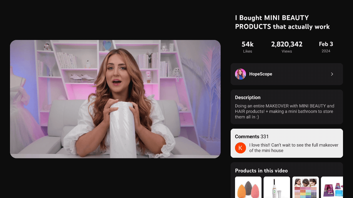
And this change also means more of the features from the phone and desktop can make it to the YouTube app on TVs down the road, too. Stuff like shopping for products, live sports scores, and even live chats are things we can expect in the future with this overhauled design.
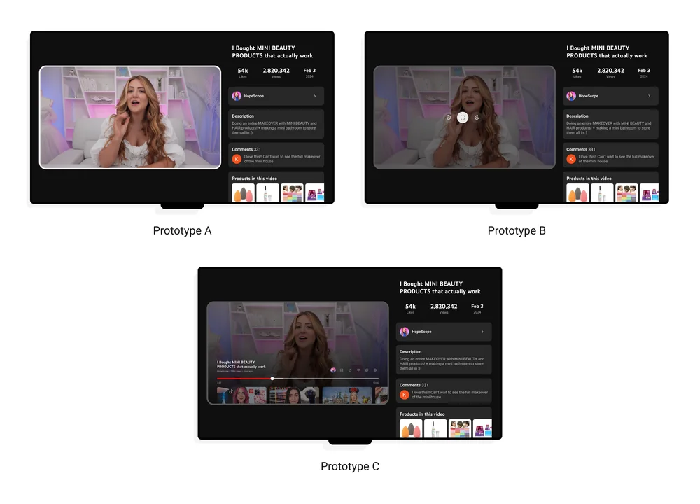
YouTube understands that watching videos on a TV is a flat-out different experience than watching on a small screen. The update is all about giving us more control and interaction without taking away from the simple ease of watching YouTube on the big screen. They did a ton of research on this, showing users a bunch of different prototypes to collect feedback and they’ve made the UI function the way that seemed to work best for the largest number of people. My app hasn’t been updated just yet, but I certainly like what I’m seeing. I’ll be on the lookout for this new layout – as you should be – over the next few weeks.
Join Chrome Unboxed Plus
Introducing Chrome Unboxed Plus – our revamped membership community. Join today at just $2 / month to get access to our private Discord, exclusive giveaways, AMAs, an ad-free website, ad-free podcast experience and more.
Plus Monthly
$2/mo. after 7-day free trial
Pay monthly to support our independent coverage and get access to exclusive benefits.
Plus Annual
$20/yr. after 7-day free trial
Pay yearly to support our independent coverage and get access to exclusive benefits.
Our newsletters are also a great way to get connected. Subscribe here!
Click here to learn more and for membership FAQ