
One of the very last Google apps that I ever expected to receive a logo refresh just got one, and it’s just…bad. I’m not a pessimist by any stretch of the imagination (the glass is always also half-full of air too, right?) and when it comes to the company’s new unified branding logos, I’ve largely embraced them. I get what they’re going for, and I even thought at first that they were modern and exciting.
However, the more I try to search for and tap to open these things, the less I’m on board. Not only are they pretty much impossible to differentiate from one another and my brain just can’t process them, but they’re also completely unimaginative. Most of the time, they just equate to Google smashing together the first letter of each word in the app or service name and slapping the four primary colors on it.
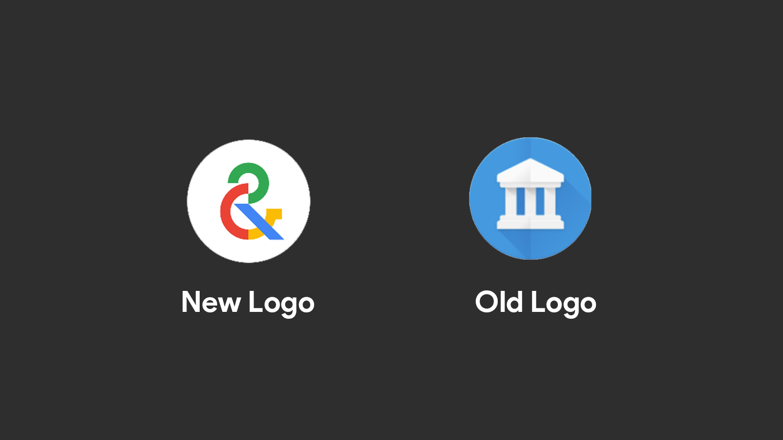
Now, Google Arts & Culture has sadly received the same disappointing treatment. Instead of featuring its classic museum building on a blue background, it’s now literally just parts of the letters “GA&C” all horrifyingly merged into one logo.
It’s one thing to discuss how the company has done its best to modernize the experience of using the app itself with all of its fun filters and such – something I have very much enjoyed as of late. It’s another thing entirely to rip the classy museum snob feeling we all love and yearn for from the branding. Now, it just looks and feels like some distasteful amalgamation.
Either way, I digress – Google won’t fix this, and we’re stuck with it. I use the app often, so I guess I’ll have to get a third-party icon changer from the Play Store and carry on about my business. Do you like the new logo, or did you also just throw up a bit in your mouth like I did? Let’s discuss branding in the comments below!
Newsletter Signup

Leave a Reply
You must be logged in to post a comment.