


Support our independent tech coverage. Chrome Unboxed is written by real people, for real people—not search algorithms. Join Chrome Unboxed Plus for just $2 a month to get an ad-free experience, access to our private Discord, and more. Learn more about membership here.
START FREE TRIAL (MONTHLY)START FREE TRIAL (ANNUAL)
The Chromecast experience on Chrome has been largely the same for quite some time. They’ve slowly changed small features and layouts along the way, but it seems a pretty significant overhaul is happening with the Casting interface. We’re oddly only seeing this change occurring on the HP Chromebook x360 at the moment and that device is in the Beta Channel of Chrome OS. For now, it seems this change is pretty limited in its release, so we’re unsure when you should be expecting to see it on your device.
All that aside, let’s take a look at what’s new.
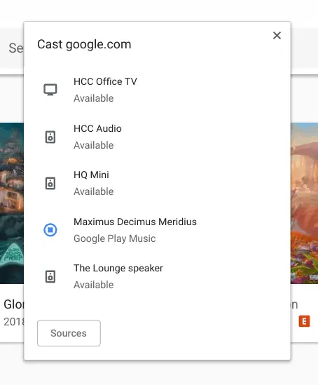
First up, the entire interface is getting a facelift. It doesn’t take much to see the overall look and feel of the Cast menu now looks a great deal like the updated Google Home interface: and it should. As all these Cast-enabled devices all exist and interact around the Google Home app, it only makes sense that the UI on all these connected devices feels the same.
Second, the way you start and stop casting sessions has changed. You used to have to click the Cast button, select the playback device, and then click the stop button under the volume controls. With the new menu, you can simply click the stop button right next to device in the list and stop playback. It is much quicker and cleaner.
As this is still under development, there is an important piece missing. As I said, with the old UI you can adjust volume and play/pause from the interface. At the moment, that isn’t possible with this new Cast menu. Clicking a device in the list doesn’t do anything currently, so I’d hope we’ll see play/pause and volume as a quick drop-down as this whole project gets finished up.
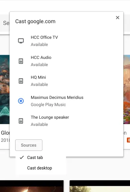
Finally, the sources selector is WAY better. The old source selector was quite confusing and only visible in certain places as you clicked around the Cast UI. Now, the source button is right at the bottom of your device list and you can select if you want to Cast your screen or a tab easily.
Overall, as long as they find a clear and simple way to retain the play/pause and volume controls in this new setup, I’m a huge fan of this change. For new users, this is a much cleaner and straightforward design and for those who’ve been used to the old way of doing things, I think the change will be easy to adapt to. The whole experience just feels thoughtful completely aligns with what it feels like to use Google Home products in general.
We’d expect to see this change to roll out pretty soon, but there’s no real timeline here. For what it’s worth, the HP we’re seeing this running on is on Chrome OS 71 Beta, so that should let us know we’ll see this hit users sooner than later.