Support our independent tech coverage. Chrome Unboxed is written by real people, for real people—not search algorithms. Join Chrome Unboxed Plus for just $2 a month to get an ad-free experience, access to our private Discord, and more. Learn more about membership here.
START FREE TRIAL (MONTHLY)START FREE TRIAL (ANNUAL)
 Slowly but surely, the Material Design language that is present in most parts of Android is starting to become the norm for Chromebooks as well. The main browser, settings, notifications and system tray have all adapted the material treatment over the past few months.
Most recently, the Chrome Flags page has received the same treatment.
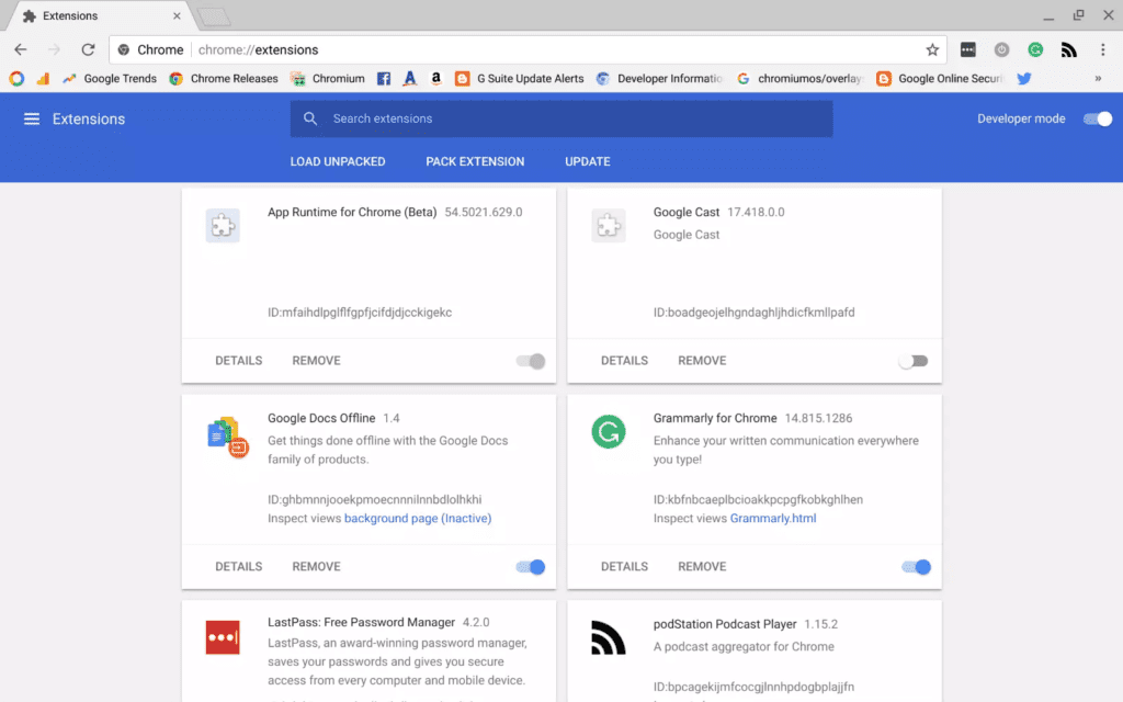
It seems that the Chrome Extensions management page is also getting the Material Design treatment now.
You can see in the picture below the new layout and design of the extensions page. It now falls completely in line with the new settings and flags pages and gives the entire underpinning of Chrome OS a bit more cohesiveness.

Instead of the stark, boring layout that is currently on offer, we are now getting a nice card interface with the more standard Android toggle switches.
In those cards are also a quick summary of the extension and a clear way to remove them if desired. Versus the current layout, this just feels so much better and in line with the settings menus of Chrome OS.
Granted, this is a small change and you’ll only deal with it from time to time, but it is really nice to see even the less-used portions of the OS getting redesigned. It is a sign that Chrome OS is coming into its own with a design language that persists throughout the user experience.
As Android and Chrome OS continue to come together on Chromebooks, this more unified look helps users navigate uncharted waters a bit easier. It is a welcome update, for sure.

