


Support our independent tech coverage. Chrome Unboxed is written by real people, for real people—not search algorithms. Join Chrome Unboxed Plus for just $2 a month to get an ad-free experience, access to our private Discord, and more. Learn more about membership here.
START FREE TRIAL (MONTHLY)START FREE TRIAL (ANNUAL)
That title should tell you a ton about the contents of this article and video. It is crammed full of descriptive words and much longer than we generally make titles. For this article and video, however, it is absolutely fitting as the newest update to our favorite operating system is an absolutely massive one.
Mainly focused around tablet mode optimizations, we’re feeling pretty confident the bulk of these changes are aimed squarely at ‘Nocturne’, the upcoming device we feel confident we’ll see at the October 4th #madebyGoogle event. As it will be a detachable, Google really needed to spend some time on the feel and function when in tablet mode.
Up to this point it has felt like an afterthought. But not any longer.
So, since there’s so much to cover (and likely more that we simply haven’t found yet), let’s take this in chunks from small changes to more dramatic. Keep in mind: this is all just Dev Channel stuff. No flags, no Developer Mode, no tweaks. Everything in this article and video are in Chrome OS 70 right out of the box.
And a big shout out to Michael Perrigo for bringing all this to our attention. I’m sure he’d appreciate a follow: @michaelperrigo
Files App
The changes in the Files App are the most subtle, but you get a new layout for your left panel that adds you Play Files and Linux Files right beneath your Downloads folder. All this is housed in under the “My Files” section and is followed up by your Google Drive folders which used to live up top.
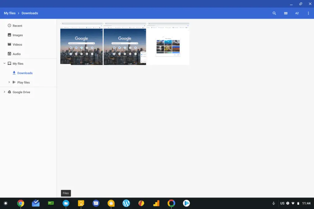
Secondly, they’ve moved the option to add external file services out of the left panel and into the 3-dot settings menu. It makes way more sense over there, honestly.
Wallpaper Picker
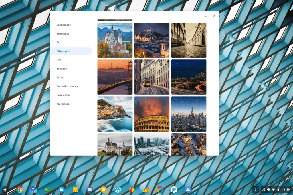
Again, not a massive functional upgrade, but the wallpaper picker is what we’ve seen in Canary for a little while. Clean, full of Material Design elements and ready to serve you up all the same wallpapers you get on the Pixel phone or any other Android device if you use Google wallpaper service.
The interface is clean and works really well. In tablet mode, you even get a sweet blurred transition when applying the new background.
Shelf and Settings Tray
We’re starting to get into some of the more drastic changes now. The settings tray, for one, is a pretty massive overhaul in the way the tray has looked in the past. Sure, with Chrome Canary and/or flags this new UI has been available, but as I said up top, the new system tray is available right out of the box with Chrome OS 70.
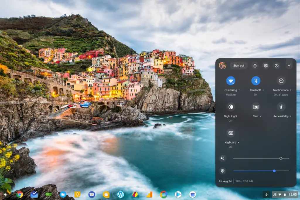
You get a dark mode look, round icons, and a beautiful transition from compact to expanded. Notification now sit atop this tray and all of it gets the pill-shaped round corners that we’re seeing so much in Google’s design these days.
If you’ve seen the quick settings on Android Pie, you’ve seen this. They are extremely similar and we’ve know this sort of collusion would start happening more and more as time goes by. Chrome OS is getting all the best parts of Android, for sure!
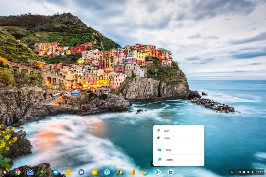
The app shelf gets a few new menu tweaks as well, giving us a new look for the shelf menu (shelf alignment, auto-hide, etc.) and also providing new menus for all pinned apps.
For the native Chrome apps or pinned sites, the menu hasn’t changed in content, just in style. For Android apps, however, you get the shortcuts I’ve personally grown to love on my phone. Long-press or 2-finger-click any Android app and you’ll get quick actions. For example, with Google Play Books a long press or right click brings up additional options like a shortcut to the bookstore or straight to your library.
Messaging apps will take full advantage of this by offering new message creation and quick contacts. It’s a great feature and I’m glad to see it arrive!
App Launcher
So, all the above stuff is fine for a standard update, but now we’re getting into the big changes to overall UI.
The app launcher, up to this point, has been a mixed bag of odd choices. It’s never felt polished as a desktop or tablet launcher. Even with the new design that came out with the Pixelbook, it’s always felt out of place to me.
This new overhaul is a big step in the right direction. Larger icons, better scrolling, Anroid Pie folder treatments, and quick shortcuts make the launcher feel much more finished. It is still a bit broken at the moment (dragging icons around crashes Chrome), but this IS the Developer Channel, so some of that is expected.
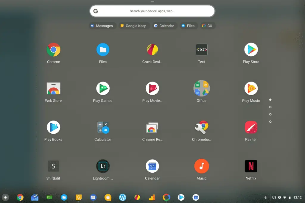
It simply feels like it fits now. I’d compare it much more to the app launcher you get on a Mac or Android tablet. On the Acer Chromebook Tab 10, it feels perfectly spaced and sized, similar to what you’d expect from an iPad or Android device.
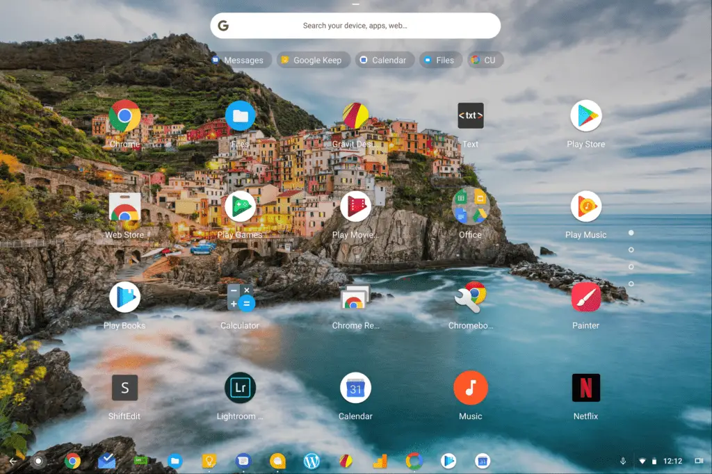
For tablets, this launcher screen dominates the home screen. It feels a bit odd, honestly, but it’s the approach Apple has taken with the iPad and – like it or not – the iPad still dominates the tablet market in units sold. My only beef with it right now is the icons seem to blend in with your background. I’m not sure what other systems do to avert this, but Chrome OS needs to adopt whatever it is immediately.
I never feel this way about apps or widgets on my phone or iPad, but it is simply hard to distinguish apps from the background. Likely, some tweaks are coming to mitigate this.
Still, little touches like the scrolling navigation dots taking you to each new page of apps simply by pressing or clicking them makes all of this start to feel very well thought out and purposed. Chrome OS 70 should really redefine much of the UI for Chromebooks moving forward, and that is exciting.
Multitasking
Along with the app launcher, multitasking in tablet mode for Chromebooks has been a bit of a nag as well for me. Sure, it functions in it’s current state, but it is nowhere near the polish of Windows 10 or iOS.
That is rapidly changing, though.
With the new multitasking setup, gone are the awkward top bars from apps. Instead, a swipe down from the top of the screen gets you to a place where you can drop you current app among all the others open. It is smooth and works just like you’d expect it to.
From there, you can maximize another app, drag an app to either side for split screen, or simply swipe up or down on the app to close it. It’s a bit of Windows 10, iOS, and Chrome OS all in one. I can’t do all this and get screen grabs, but we show it off in the video, so I’d encourage you to check it out.
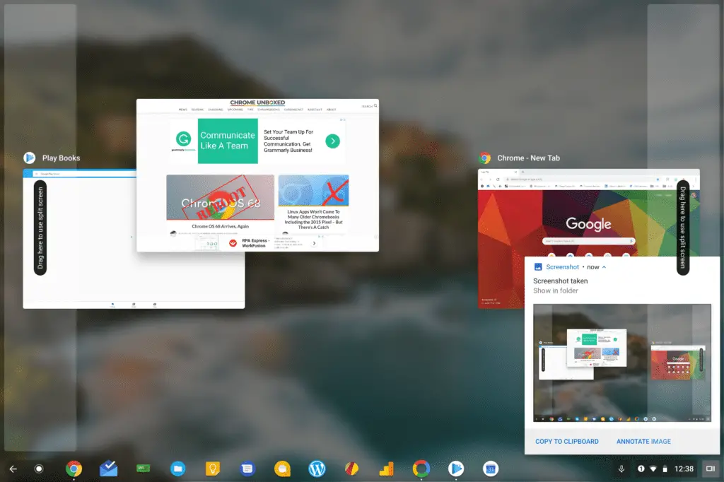
The best way I can describe all of these gestures is that it makes me feel less claustrophobic when using my Pixelbook as a tablet. It makes me feel less constrained. It makes me enjoy using it in this fashion, actually.
Sure, I love the productivity of windowed apps, but when kicked back and consuming in tablet mode, i just want an easy way to do a couple things at a time without it being a major task to do so.
These new gestures feel great, work great, and make the entire tablet experience a joy to use. I would have never said that about Chrome OS tablet mode just days ago.
Keyboard
In all the changes, this may be my favorite. The Chrome OS virtual keyboard has always been servicable. It does its job and not much else. Not great to use, but not broken. It was a utility.
Most of the keyboard is the same, boasting support for voice input, pen input, swipe input and emojis. However, one very specific feature has been added that simply changes the utility of this keyboard. That feature? The ability to detach and float around the screen.
With all this screen real estate, why anchor your keyboard to the bottom? Why make it so large that my thumbs can’t reach across? Why not let it resize and move wherever I want it?
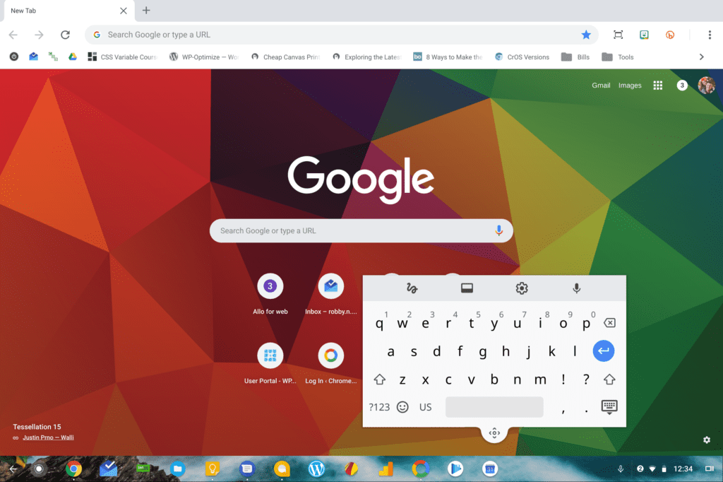
It seems Google has answered the mail, here, and we have a fundamental change in the Chrome OS virtual keyboard. By hitting the “float” option above the standard keys, your keyboard shrinks down and adds an anchror on the bottom for repositioning.
It can be placed anywhere, still works exactly as you’d expect, and disappears just like you’d expect when you don’t need it only to reappear as soon as you click in a text box.
In a word, it is fantastic. With all the bugs that come with the Developer Channel, I usually only stick around for a little bit. This keyboard may force my hand this time around.
And I could say that of all these features. This update is stunning in its scope. So many additions and I’d bet more will arise. It is, by far, the most impressive and substantial update I’ve seen to Chrome OS in a single version. I simply cannot wait for all this to get fully ironed out and make it to Stable Channel for every one to see and enjoy.
Oh, and by the way, Chrome OS 70 is slated for release in mid-October. Just in time for all the new Google devices we plan to see on October 4th. Get ready.