

Support our independent tech coverage. Chrome Unboxed is written by real people, for real people—not search algorithms. Join Chrome Unboxed Plus for just $2 a month to get an ad-free experience, access to our private Discord, and more. Learn more about membership here.
START FREE TRIAL (MONTHLY)START FREE TRIAL (ANNUAL)
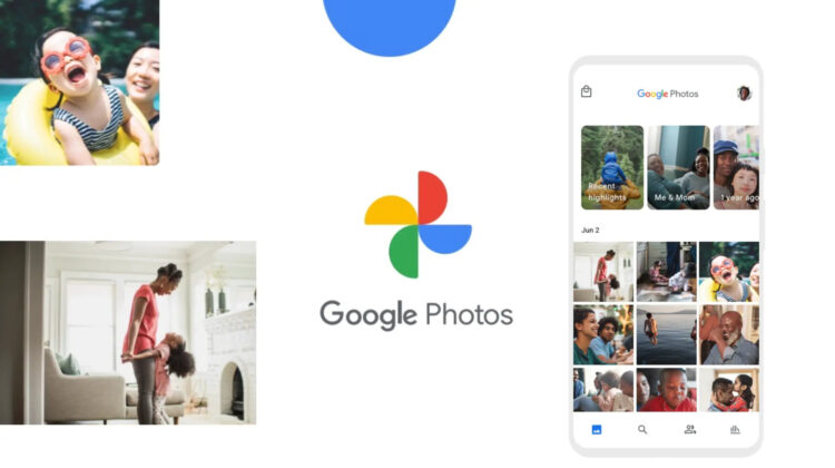
Google Photos appears to be testing a significant interface overhaul. As reported by @Nail_Sadykov, an editor for the Google News Telegram Channel, there’s a fresh Google Photos UI design making the rounds, and it seems to divert quite significantly from Google’s current design principles.
Most notably, it swaps out the usual bottom navigation bar, traditionally anchored to the edges of the screen, with a pill-shaped floating nav bar. This neat little design tweak situates your Photos, Memories, and Library into a cleaner focal point.
There are a few other changes too – search has been relocated to the right of the new floating nav bar, in the form of a small circular button and the “Share” button, which now resides in the top right, only appears when an image or a set of images are pressed and held to be selected.
Lastly, the Google Photos logo, typically centered in the app header, has been shifted to the left. It’s a minor change, but one that transforms to the overall feel of the new interface design. Apart from these things, the rest of the app remains virtually unchanged.
However, these design decisions collectively give Google Photos with a fresh, modern touch that makes it stand out compared to Google’s other apps and completely diverge from the company’s current design theory. Could this be a hint of a more extensive overhaul for the rest of the ecosystem? I think so. Google may only be testing this, but when it commits to something, it goes all the way with it, even if it’s a bad decision.
For now, this new Google Photos UI layout is not yet live for everyone. Despite this, some users are already having it pop up for them. What about you? Do you have this slick, new look yet? Let me know in the comments section below!
SUBSCRIBE TO UPSTREAM
Get Chrome Unboxed delivered straight to your inbox
Upstream is our flagship, curated newsletter with the top stories, most click-worthy deals, giveaways, and trending articles from Chrome Unboxed sent directly to your inbox a few times a week. Join 31,000+ subscribers.