


Support our independent tech coverage. Chrome Unboxed is written by real people, for real people—not search algorithms. Join Chrome Unboxed Plus for just $2 a month to get an ad-free experience, access to our private Discord, and more. Learn more about membership here.
START FREE TRIAL (MONTHLY)START FREE TRIAL (ANNUAL)
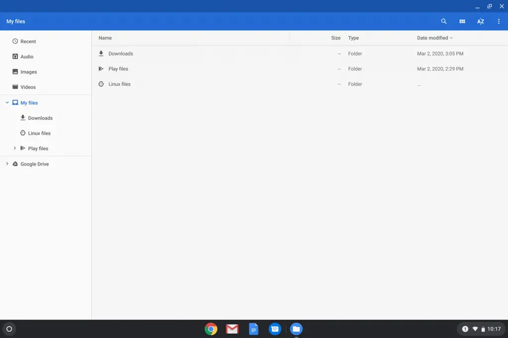
The humble Chrome OS Files app has remained largely unchanged for many years at this point. While not the most functional thing in the world, it does its job fairly well, has picked up new features and abilities over time, and is simply one of those system apps you don’t give a ton of thought to until something goes wrong with it.
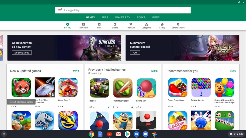
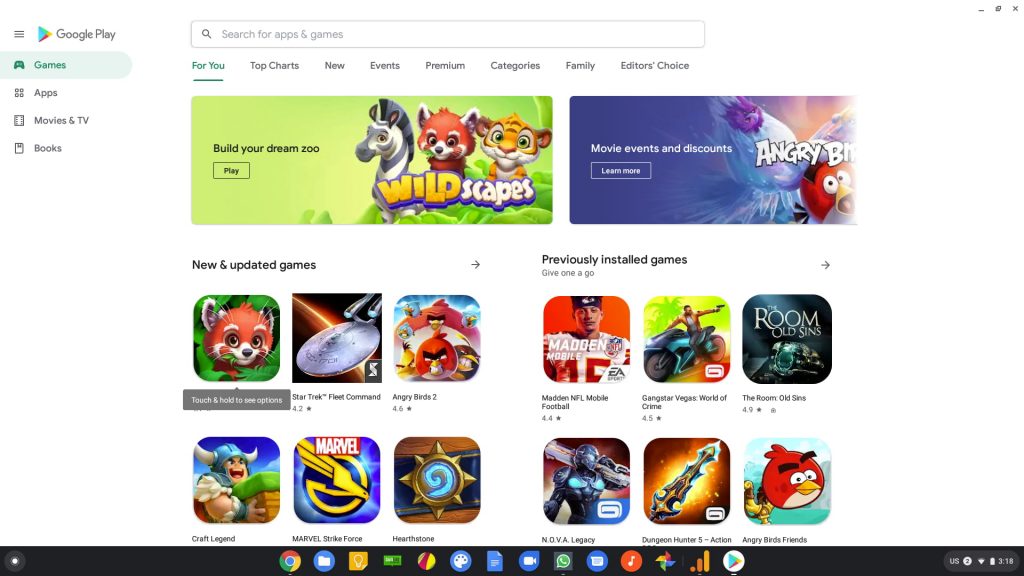
We’ve heard reports of a full-blown redesign coming to the Files app for quite some time now, and I’ve enabled the flag for the Next-Gen Files App countless times over the past year or so, but there’s never really been anything to look at aside from a few icon changes with that flag. If you’re calling something ‘next-gen’, it should be a pretty big departure in the aesthetics department.
Thankfully, what we’ve seen up to this point from the new Files App isn’t indicative of the end result. Instead, what we’re seeing currently only available in Chrome OS 82 is a full-blown material design overhaul. Think about the changes that have occurred to things like Google Drive, Google Photos, and Gmail over the past few months and you get an idea how the look has changed for the Files app on Chrome OS. Probably the change that is most similar to this revamp is the old vs. new Play Store app. Check out the side-by-sides in the galleries below.
Shop All The Latest Chromebook Deals
Gone are the colored bars, the block-laden accents of Material Design 1.0, and the gray backgrounds. It’s all been replaced with white on white, clean Material Design that matches all the recent changes and looks offered by Google’s other products. From icons to fonts to pill-shaped highlights, this app now looks the Google part in 2020. Functionally, nothing has really changed from the looks of it as this is a skin-deep transformation for sure. As a system app that users will interact with on a very routine basis, however, it is awesome to finally see this update rolling out soon. If things stay on schedule, we expect to see Chrome OS 82 hit in early May, just in time for the Lenovo IdeaPad Duet Chromebook. Coincidence? I think not.
SUBSCRIBE TO UPSTREAM
Get Chrome Unboxed delivered straight to your inbox
Upstream is our flagship, curated newsletter with the top stories, most click-worthy deals, giveaways, and trending articles from Chrome Unboxed sent directly to your inbox a few times a week. Join 31,000+ subscribers.