
Support our independent tech coverage. Chrome Unboxed is written by real people, for real people—not search algorithms. Join Chrome Unboxed Plus for just $2 a month to get an ad-free experience, access to our private Discord, and more. Learn more about membership here.
START FREE TRIAL (MONTHLY)START FREE TRIAL (ANNUAL)
As I continue spending my days living inside Googlebook OS, there are genuinely parts of the experience I’m really beginning to appreciate. But as anyone who read our thoughts on preaching patience with early software quirks knows, building a brand-new desktop platform from mobile roots inevitably leads to a few interface head-scratchers.
Right now, one of my bigger gripes comes down to a persistent strip of screen real estate sitting right along the top of the display that feels unneccessary coming from a Chromebook or Windows device.
I understand why it’s there from an architectural perspective. Googlebook OS is built on Android 17, and keeping the persistent top bar maintains visual parity across Android phones, tablets, and this new desktop form factor. But on a dedicated desktop experience, that persistent top bar feels like a massive waste of vertical screen space; especially when Android desktop software from some other companies already solves for this.
A mobile leftover on a desktop display
The fundamental issue is how the top bar interacts with desktop window management. When you maximize an application window on a laptop screen, vertical screen real estate is at an absolute premium.
Instead of seamlessly integrating into the title bar or tab strip of a full-screen app, the Googlebook OS status bar sits entirely separated above your workspace. It stubbornly occupies valuable vertical pixels just to host a clock, Wi-Fi status, battery info, and notification pills. And with apps like Chrome, it just looks like a stacked-up mess.
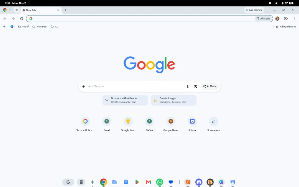
Even worse, looking down at the bottom shelf, there is a giant expanse of empty, unused space sitting right on the right and left sides of the app dock. I know that once tablet-mode for convertible and tablet form factors gets truly ironed out down the road, having a top bar might make sense when you rip a keyboard away. But when you are in laptop mode staring at a 14-inch or 15-inch 16:10 display, having that strip permanently eat up vertical space feels completely unneccessary.
Samsung DeX and Lenovo already solved this issue
The most frustrating part about this design choice is that Google didn’t have to reinvent the wheel. Alternative Android desktop environments tackled this exact issue already and have implemented a logical work-around.
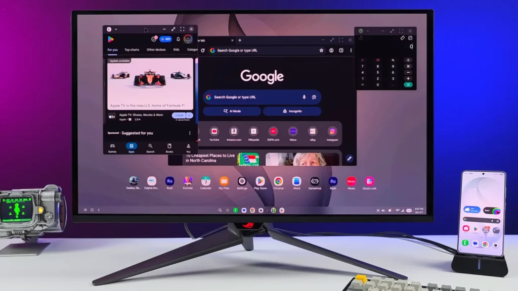
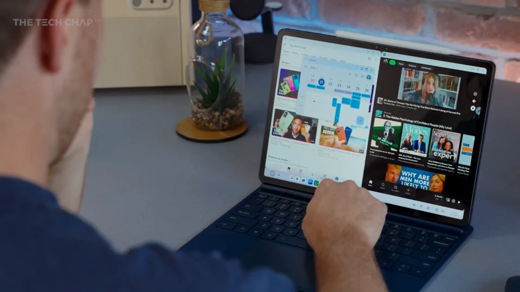
Look at Samsung DeX, or even Lenovo’s newer desktop interface for Android tablets. Both environments took the mobile status elements like the clock, the quick settings tray, notification icons, and calendar flyouts and tucked them neatly into the bottom-right corner of the taskbar.
Consolidating these elements into the bottom tray accomplishes two critical things:
- Reclaims full-height vertical space: Maximized windows can extend right to the top bezel without being crowded by a permanent mobile bar.
- Eliminates visual clutter: It groups quick-access toggles right next to where your mouse naturally travels when navigating the app shelf, rather than forcing you to jump between the extreme top and bottom edges of the screen.
It’s clean, it’s intuitive, and it respects the fact that you are sitting in front of a desktop workstation rather than holding a handheld tablet.
As Google continues refining Googlebook OS and addressing early desktop productivity bottlenecks, rethinking the status bar layout should be near the top of the priority list. Moving the system tray down to that empty space in the bottom shelf would immediately make the entire OS feel less like an expanded mobile UI and more like the powerhouse desktop environment it wants to be.
SUBSCRIBE TO UPSTREAM
Get Chrome Unboxed delivered straight to your inbox
Upstream is our flagship, curated newsletter with the top stories, most click-worthy deals, giveaways, and trending articles from Chrome Unboxed sent directly to your inbox a few times a week. Join 31,000+ subscribers.

