

Support our independent tech coverage. Chrome Unboxed is written by real people, for real people—not search algorithms. Join Chrome Unboxed Plus for just $2 a month to get an ad-free experience, access to our private Discord, and more. Learn more about membership here.
START FREE TRIAL (MONTHLY)START FREE TRIAL (ANNUAL)
Last year, Google introduced an ‘Air Quality Information’ or AQI on Nest Hub devices, allowing users to see whether or not the air they’re breathing in from around them is of high or low quality. This took EPA measurement data on the level of pollution in the air and reported it in a visual format for anyone to easily understand in their homes.
If the air was marked ‘Unhealthy’, the badge in the top right corner of the screen would turn red and alert the user. One could also say “Hey Google, what’s the air quality near me” to get this information. Now, the company has announced that this same feature is making its way to Google Maps on Android and iOS!
You can now check the air quality of your area right from your phone before you go out and take part in outdoor activities. If it’s unusually smoggy, for example, you may change your mind about spending an extended amount of time in the park until it clears up. Having this data can help you and your family make informed decisions that positively impact your health and wellness.
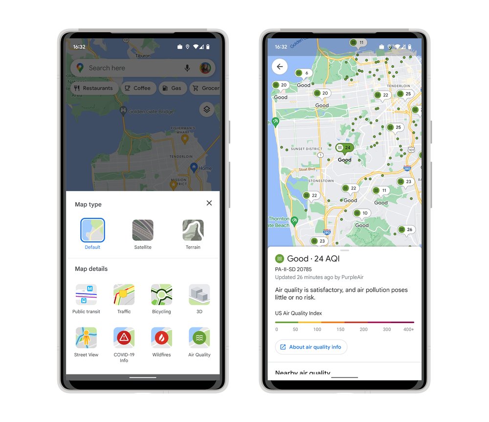
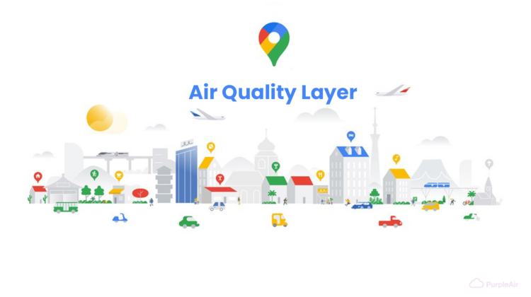
By tapping the layers button at the top right of the Google Maps app and selecting the newly added ‘Air Quality’ layer seen above, you’ll get trusted data from government agencies like the Environmental Protection Agency in the U.S. and PurpleAir, a low-cost sensor network which Google says gives you a “hyperlocal view of conditions”.
To be alive in a time where this type of data analysis is in the hands of everyday technology users is absolutely incredible. When you think about all that Google Maps can now do in 2022, it truly is staggering, and I think we take much of it for granted because we’ve become accustomed to it and it’s just “normal”. However, the level of machine learning and aggregation that’s going on is staggering.
SUBSCRIBE TO UPSTREAM
Get Chrome Unboxed delivered straight to your inbox
Upstream is our flagship, curated newsletter with the top stories, most click-worthy deals, giveaways, and trending articles from Chrome Unboxed sent directly to your inbox a few times a week. Join 31,000+ subscribers.