

Support our independent tech coverage. Chrome Unboxed is written by real people, for real people—not search algorithms. Join Chrome Unboxed Plus for just $2 a month to get an ad-free experience, access to our private Discord, and more. Learn more about membership here.
START FREE TRIAL (MONTHLY)START FREE TRIAL (ANNUAL)
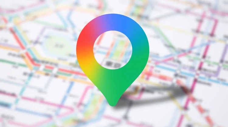
It looks like Google is officially rolling out a redesigned icon for Google Maps on both Android and iOS, ditching the classic flat colors for a modern, AI-inspired gradient. This isn’t just a minor color swap; it’s a complete modernization of the iconic map pin that has defined the app for years and was hinted at back in November as a coming-soon change.
A modern spin on the pin
While the icon is still fundamentally a pin, the proportions have shifted significantly. The top ring is now noticeably thinner, while the inner circle is much larger.
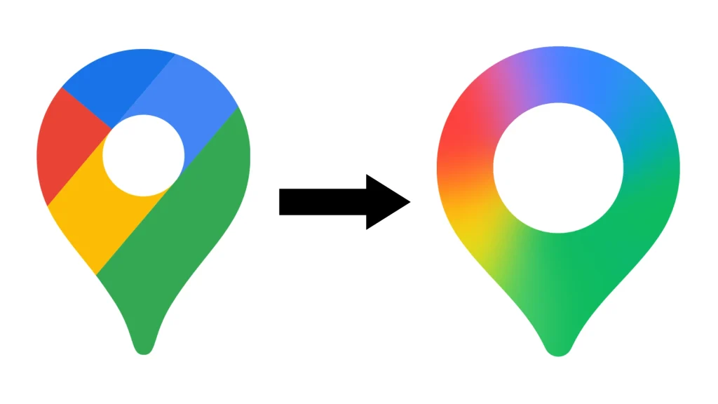
The biggest change, however, is the color scheme. Google has removed the diagonal partitions that used to separate the four signature colors. In their place is a smooth, vibrant gradient that mirrors the design language seen in the Gemini app and other recently updated Google services like Photos, Home, and Search.
Bringing the Gemini look to the map
This visual overhaul obviously isn’t a coincidence. In recent months, Google Maps has been aggressively integrated with Gemini features, including:
- Conversational navigation: A new AI-driven experience that replaces the traditional Google Assistant for turn-by-turn directions.
- Know before you go: Gemini-powered summaries for business listings that help you understand the vibe and details of a location at a glance.
- Gemini in Lens: Enhanced visual searching within the Maps interface.
By aligning the icon with the rest of the Gemini family, Google is visually signaling that Maps is no longer just a utility tool, but instead is becoming a core part of their AI-first ecosystem.
How to get the new look
The update is rolling out now as a server-side switch alongside the latest app versions. On Android, look for version 26.09.06 or higher, while iOS users should see the change with version 26.09.5. It might take a few days for the new icon to hit your specific device, but for what it is worth, we’re seeing it show up on our end already.
SUBSCRIBE TO UPSTREAM
Get Chrome Unboxed delivered straight to your inbox
Upstream is our flagship, curated newsletter with the top stories, most click-worthy deals, giveaways, and trending articles from Chrome Unboxed sent directly to your inbox a few times a week. Join 31,000+ subscribers.