
Support our independent tech coverage. Chrome Unboxed is written by real people, for real people—not search algorithms. Join Chrome Unboxed Plus for just $2 a month to get an ad-free experience, access to our private Discord, and more. Learn more about membership here.
START FREE TRIAL (MONTHLY)START FREE TRIAL (ANNUAL)
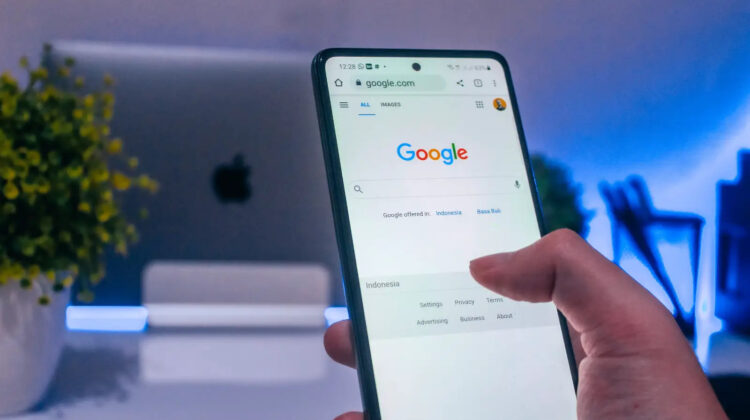
The Google App is undergoing yet another visual transformation, this time saying goodbye to its longstanding Material Design 3 attire. The fresher look? It’s inspired by Google’s Material You, aiming to replace the old and somewhat outdated appearance that users have been familiar with for years.
Android Police recently highlighted that the app, in its version 14.31.19.29, is trialing a card-based design for its search results. In this iteration, every search result is elegantly placed on a white card. Each card, distinct with its rounded corners, sits against a subtle light gray backdrop. The intent? To clearly separate each result from the next. If this sounds somewhat familiar, it’s because this design choice is in line with what many of us have seen in Google Discover and Collections, the other 2/3 of the Google app.


For those who prefer the nocturnal hues of dark mode, Google hasn’t forgotten you. The card UI adapts accordingly, showcasing a dark card placed against a marginally lighter backdrop. The defining rounded edges of each card remain, of course.
Personally, I love this new approach. It feels modern, organized, and very much in line with Google’s other recent design choices. I’m not sure why it took the company so freaking long to implement it, but there’s nothing new there.
As with many of these A/B tests, it remains unclear whether this redesign will become a permanent fixture for all users or disappear into the wind in a week or two, never to be seen or heard from again. If I were to guess, they’re going all in on this, since it just makes so much sense. If you’ve got this card-based interface on your app, jump into the comments and let me know!
SUBSCRIBE TO UPSTREAM
Get Chrome Unboxed delivered straight to your inbox
Upstream is our flagship, curated newsletter with the top stories, most click-worthy deals, giveaways, and trending articles from Chrome Unboxed sent directly to your inbox a few times a week. Join 31,000+ subscribers.