A few versions ago, we got a new way to navigate Virtual Desks on ChromeOS. With a small button that now sits to the left of your pinned apps, you can not only see the desk you are on, but click it to see all your desks in a ALT+TAB sort of view or click the small arrows to each side of the desk name to move through your open desks.
For those of us that like to keep a mouse to the right or left of our Chromebook most days, having a simple way to move through desks is handy. I personally still use the SEARCH + [ or ] shortcut to quickly jump desks, but I’m also a long-time ChromeOS user and – like most of you – a creature of habit. I like the new button, but I don’t tend to use it as often as I probably should.
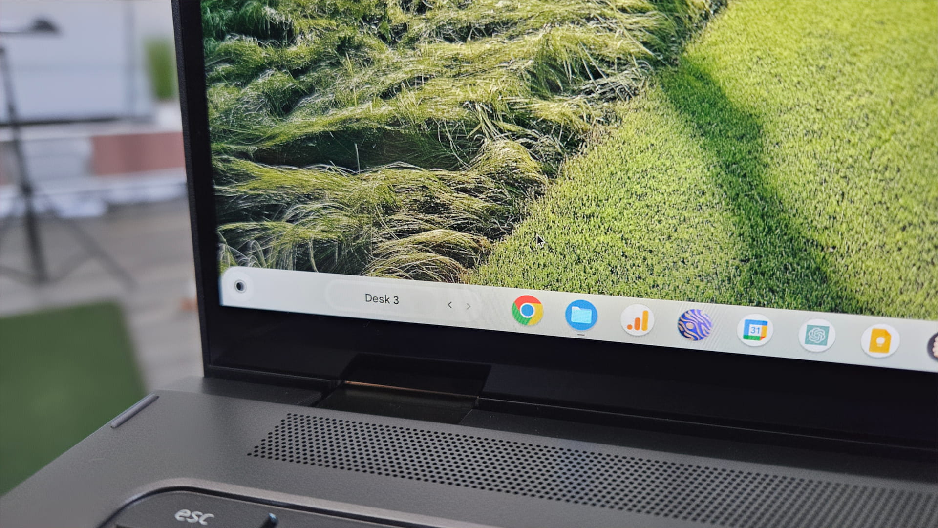
Still, I like this more-visual approach to guiding users through the very-useful Virtual Desk feature, and now, it’s getting a visual overhaul that makes it look far more like part of the OS instead of a temporary, beta test feature.


As you can see, the new look has a nice Material You touch added in and immediately strikes you as more considered than the older, plain version. Without hovering, you can easily tell that this button is there to move you through your desks thanks to the always-present arrows on the side of the desk name. It’s a small touch that really makes a big difference.
Right now, there are no flags for this and it is showing up in the Beta Channel of ChromeOS 123. It stands to reason that it should show up in the upcoming ChromeOS 123 Stable Channel update in a week or so, and at that point, you’ll be able to see it in action for yourself. Again, a small change that will yield a pretty big change to the way people approach this Chromebook feature, and I’m here for it.
Newsletter Signup

Leave a Reply
You must be logged in to post a comment.