 A new commit has shown up in the repositories and it is in reference to something that is a bit odd, honestly.
Here’s the opening language
Add a back button to the shelf. This is in preparation for removing title bars work. This approach of adding a back button expands the current app list button to be modal and have two functionalities depending on which side is pressed.
Upon first seeing this, what stood out most was the phrase ‘removing title bars…’
At this point, I’m quite unsure how this will work, but I can tell you after digging through the comments in this commit what I think might be going on here.
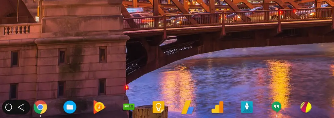
First, this seems to only be going into effect when Android apps go full-screen. If you’ve used any immersive Android apps on a Chromebook, you know that finding the back button if you need it can be a bit difficult. Some apps allow you to swipe down from the top, but sometimes they don’t. And when they don’t, hitting the back button on-screen isn’t possible.
My guess is the reference to the removal of the title bar is in reference to full-screen apps, so having an easier-to-access back button would be fantastic. Just like in Android, when in a full-screen app, you can swipe in from the side or top to get your general navigation buttons on-screen. If this behavior becomes similar on Chrome OS in tablet mode, I’d count that a win all around.
Second, reading a bit closer reveals the fact that this won’t be an additional button. Instead, it seems the app launcher button (the round one in the bottom-left corner) will change to make room for the new back button. It is unclear at this point if that means the button will simply morph into a back button or if something else is going on.
If we look back at the quote above, it seems the button will become and either/or type of interface. It is clearly stated that the button will have two functions, depending on which side is pressed. In a comment near the bottom, we see:
In maximized mode, the button will increase its primary axis size to accommodate the back button arrow in addition to the app list button circle.
This seems clear that the button will simply split into two sides and accommodate the back button. Granted, the commit message references another possible setup, but the commit owner clearly sees this as an inferior method.
The alternative (separate back button) is IMO very difficult to achieve what is shown in the mocks (namely the color in between and animation (not in this CL) of said color in between). The exact functionality of the back button is not 100% defined yet…
The other option would be a separate back button showing up in the dock when needed. This option, for whatever reason, is apparently more difficult and less workable. They reference some mock-ups and link them in the commit, but those images are not accessible to regular folks like us, so we just have to wonder what this will all look like in the end.
Lastly, it seems this function isn’t yet fully defined. The last line of the quote above makes it quite clear that how this feature will get utilized isn’t fully decided yet. Personally, I don’t see any reason why you wouldn’t have a back button there at all times when in tablet mode. When the keyboard is not engaged, there are plenty of times a concrete back key would be very handy, especially in the eyes of Android users.
With the keyboard in front of me, I don’t see much reason to have this feature at all. There is a dedicated back button on the surface at all times, so it seems this feature would make most sense in tablet mode.
We’re unsure at this time when this new feature will roll out, but as we see more about it, we’ll let you know.
Leave a Reply
You must be logged in to post a comment.