

Support our independent tech coverage. Chrome Unboxed is written by real people, for real people—not search algorithms. Join Chrome Unboxed Plus for just $2 a month to get an ad-free experience, access to our private Discord, and more. Learn more about membership here.
START FREE TRIAL (MONTHLY)START FREE TRIAL (ANNUAL)
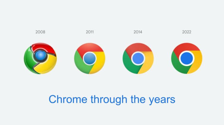
It’s been eight years since Google Chrome has changed its logo design, and this week, it’s finally time! In-house Chrome designer Elvin Hu took to Twitter to show off the new design, and at first blush, you may not realize the differences.
First showing off the history of the browser icon, you can see below that in 2008, it was very shiny and bulky. Over the years you’ll notice that it slowly lost its sheen and is now completely flat and modern.
In fact, the new 2022 icon has a larger circle in the center, brighter, more vibrant colors, and ditches the subtle shadow occlusion. This is one of the most notable changes. Another is the fact that the proportions are much more appropriate when stacked up against a grid view. You can see a larger view of the timeline below.

Something I found quite exciting about the update is that each operating system will now have its own Chrome Browser icon design that’s meant to match the rest of the system icons. For example, macOS has a slightly 3D icon with a drop shadow, Chrome OS has even brighter colors than normal with no gradients to match what surrounds it, and on iOS the Beta version of the app will have a architectural blueprint-inspired themeing complete with a blue background and white, chalky lines.
All of these changes will begin appearing over the next few months, and you’ll slowly start to see the old or rather the current Chrome browser icon fade into obscurity in favor of the new, big and bold one. It will appear across the web and beyond, Elvin says, and he and the team are looking for feedback regarding the redesign over on the Tweet above.
SUBSCRIBE TO UPSTREAM
Get Chrome Unboxed delivered straight to your inbox
Upstream is our flagship, curated newsletter with the top stories, most click-worthy deals, giveaways, and trending articles from Chrome Unboxed sent directly to your inbox a few times a week. Join 31,000+ subscribers.