Support our independent tech coverage. Chrome Unboxed is written by real people, for real people—not search algorithms. Join Chrome Unboxed Plus for just $2 a month to get an ad-free experience, access to our private Discord, and more. Learn more about membership here.
START FREE TRIAL (MONTHLY)START FREE TRIAL (ANNUAL)
For as long as YouTube TV on streaming devices has been a thing, there’s a glaring, aggravating, annoying, and admittedly tiny thing missing from the entire experience. And there’s a chance you’ve either made due without it around or you’ve noticed it and once you did, it annoyed you every time you couch surfed through live TV. What is it? A simple clock to give you an idea of what time it actually is while you’re searching through live TV selections.
Yes, I know it is a tiny, minuscule addition to an interface, but I can’t tell you how many times I’ve been looking through the lineup of available stuff to watch, found something I want to veg out with, and only after clicking it realized it was 5 minutes from being finished.
You see, the live guide for YouTube shows you the current 30-minute block up until the very last second, so without a clock to reference, there’s no way to really know where you are in that block unless you get the time from an outside source. If you don’t have a watch on your wrist, a phone in your hand, or a clock on the wall nearby, you’re basically left guessing.
For me, I have all those things around, but it has always felt a bit odd to have to look outside the screen I’m using to figure out where I am in the viewing schedule. Don’t get me wrong, I’ve become accustomed to looking at the guide, finding what I want, and referencing the clock on the wall to see where I stand with the content in the guide. But doesn’t that feel like a silly thing to have to do in 2022? Again, this is a small change, but a very welcome one.
What I’d rather see for the live guide
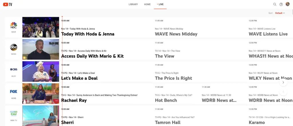
While the clock addition is enough to get the job done, I’d rather see a live progression line in the guide like we’ve seen for years from companies like DirecTV or Dish Network. Most of our video playback services these days provide a clear, visual reference for where you are in a show’s runtime. YouTube TV on streaming devices should simply adopt this same method they employ on the web. This would negate the need to add a clock and, in my opinion, it is a far better way to get to the same end.
Additionally, the Live tab in the Google TV interface (that is showing content from YouTube TV) has this progression bar as well, making it even more curious as to why it isn’t present in the actual YouTube TV app. As if the distinction between YouTube TV and Google TV isn’t fuzzy enough, this difference between the guides is notable and completely bizarre since they are offering you the exact same content.

Either way, I’m glad to see Google respond to complaints, even if it is in the simplest way possible. Perhaps the progression UI is in the works for the YouTube TV guide, but if it isn’t, I hope posts like this one might spark the flame to get it in place. If YouTube TV wants to continue growing and supplanting cable TV options, little UI additions like this feel necessary and important, even if they are seemingly minimal.
VIA: DroidLife
SUBSCRIBE TO UPSTREAM
Get Chrome Unboxed delivered straight to your inbox
Upstream is our flagship, curated newsletter with the top stories, most click-worthy deals, giveaways, and trending articles from Chrome Unboxed sent directly to your inbox a few times a week. Join 31,000+ subscribers.

