
Support our independent tech coverage. Chrome Unboxed is written by real people, for real people—not search algorithms. Join Chrome Unboxed Plus for just $2 a month to get an ad-free experience, access to our private Discord, and more. Learn more about membership here.
START FREE TRIAL (MONTHLY)START FREE TRIAL (ANNUAL)
I remember when Google first created the new Productivity launcher. In fact, I predicted it almost a year ahead of time when I made my mock-up of what Material You would look like on Chromebooks! With increased performance due to much better animations, more intelligent pagination for apps, and more, I’ve fallen in love with what the replacement for the ‘Peeking launcher’ has become.
Sadly, I didn’t anticipate the fact that the company would use it as an opportunity to experiment with new tools and features, and I certainly didn’t think they would slap something right at the top of the launcher that pretty much no one asked for. The ‘Suggested files’ section has been present for some time, and though it can now be collapsed and hidden with one click, the row of recently accessed files is still an eyesore and takes up space above your most important experiences.
Well, it’s our lucky day, folks, because according to C2 Productions on Twitter, these suggested files may very well be moving out soon. To where you may ask? Well, there’s currently no evidence that they will be removed from the launcher entirely as I hope they will be, but at least they will be added to the Tote or ‘holding space’ at the bottom-right of your Chromebook’s shelf.
This makes a whole lot more sense than placing them right out in the open when you’re searching for an app to open via the ‘Everything button‘. The Tote itself was created to store recently captured screenshots, downloaded files, and more and provide you with quick access to them without first needing to open the Downloads folder.
According to C2, Tote will suggest files you can ‘pin’ to the Files app’s sidebar, but double-clicking on one will, in fact, launch it. This means it will function exactly as you would hope and expect, assuming this is a change you’re on board with.
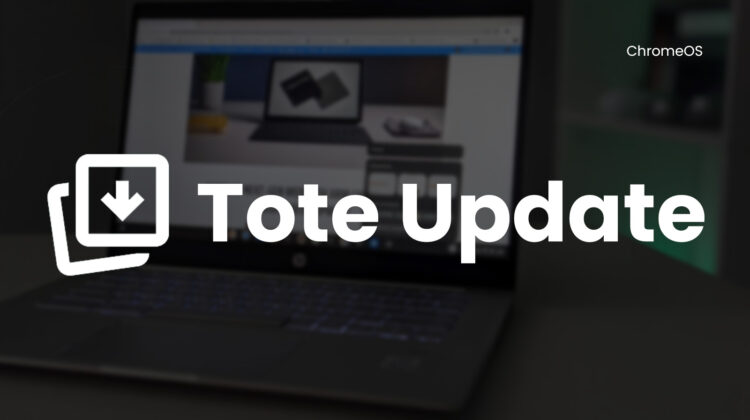
I personally love this and feel that they will be right at home here instead. I won’t lie and say that I use this tool all that often, but when I do need it, it does come in handy! The only thing I don’t like is how the file previews add additional icon bubbles, but right-clicking Tote and hiding previews returns it back to its default icon you see in the feature image of this post.
Let me know down below in the comments if you hope there’s an option to disable suggested files in the holding space to reclaim space after this update launches in Stable. For now, I like that it makes the section more versatile and useful, and it’s a Canary channel-only feature anyway. We’ll keep you apprised as it develops further.
SUBSCRIBE TO UPSTREAM
Get Chrome Unboxed delivered straight to your inbox
Upstream is our flagship, curated newsletter with the top stories, most click-worthy deals, giveaways, and trending articles from Chrome Unboxed sent directly to your inbox a few times a week. Join 31,000+ subscribers.