 Back in the early days of Android apps on Chromebooks, most of the overall experience felt completely bolted on. Things worked and things failed, but you could tell very clearly that most Android apps weren’t made with Chromebooks as a target.
That wasn’t surprising, to be honest. The whole venture sort of came out of left field, so it’s taken time to get things lined out to the point that many apps actually feel at home on Chromebooks these days.
This pattern didn’t escape Google’s own apps, either. The in-house services Google offers, though usually ahead of the game in this respect, still felt non-native when Android apps first arrived on the scene. One app in particular we’ve always kept an eye on as this whole process has unfolded is the Google Play Store. After all, of all the apps available, this one should be the torch-bearer for Android apps on Chromebooks.
And, in general, that has been the case. The Play Store has been through a few redesigns since its arrival on Chromebooks, and with each one the app feels more and more at home and native in its new Chrome OS home.
If you remember the article we published not long ago about the new Android context menus for apps on Chromebooks, the first place I went to test out the new feature was the Play Store. I knew if I was going to see a new Android feature activated on a Chromebook, that was where I’d see it first. And unsurprisingly, I was right.
So What’s New?
Just like that story, this change is small and could be written off as insignificant. I would disagree, however. When it comes to changes that make Android apps feel more native on Chromebooks, I think the importance lies in these small pieces that make up the whole of the entire experience for end users.
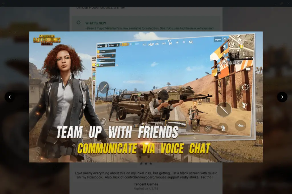
What we’re now seeing in the latest Play Store update is a Chromebook-specific handling of screenshots when browsing for apps. You know the area after the install prompts and ratings in the play store where you get a carousel of images from the app itself? That section used to look like a blown-up version of what you see on a phone, which meant that portrait screenshots had huge black bars on the left and right and the navigation left a lot to be desired.
Fast forward to today and the lightbox effect we’re seeing on screenshots looks, again, like it was made for Chromebooks.

More and more we are seeing this type of treatment for Android apps as time moves on. Features and UI elements built for Chromebooks make the entire experience of using that app feel more at home on the larger screen. Adding in proper keyboard controls and trackpad gestures simply sweetens the overall experience, and we’re slowly seeing more apps do this as well.
It has been a long road, but seeing the smaller pieces fall into place like this makes me feel like we’re finally getting over the hump. Perhaps we’re finally getting near the point where developers and users alike start taking Android apps on Chromebooks very seriously. That is the point where all we’ve been talking about with the latent potential of Chrome OS and Android finally starts to convert into amazing user experiences across the board.
Thanks to Corbin Baxter for the heads up!

Leave a Reply
You must be logged in to post a comment.