

Support our independent tech coverage. Chrome Unboxed is written by real people, for real people—not search algorithms. Join Chrome Unboxed Plus for just $2 a month to get an ad-free experience, access to our private Discord, and more. Learn more about membership here.
START FREE TRIAL (MONTHLY)START FREE TRIAL (ANNUAL)
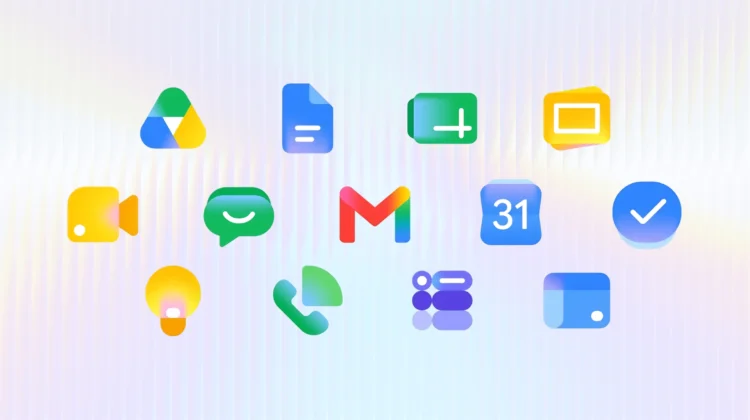
Google is answering the long-standing criticisms of its uniform Workspace icons with a brand-new gradient redesign that is finally starting to hit users on the web. As spotted by 9to5Google, the updated look is ditching the confusing, hard-to-see four-color theme in favor of distinct shapes and colors, making it much easier to tell your apps apart at a glance.
Where to spot the new icons
The new gradient icons are currently making their debut in the web app launcher found in the top-right corner of most Google websites and right on your Chrome New Tab page. If the update is live on your account, you’ll see refreshed logos for almost the entire suite, including Gmail, Google Drive, Docs, Sheets, Slides, Calendar, Chat, Meet, Vids, Forms, Keep, Voice, and Tasks.
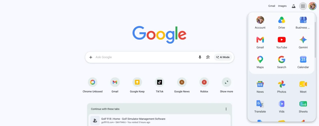
As of the writing of this post, we’re beginning to also see these new icons in Google’s individual services as well. Head directly to Google’s web apps like docs.google.com or sheets.google.com for instance, and you’ll see the new icons at the top of the page. For the time being, this is a bit hit-or-miss, and it seems the favicons are not yet updated at this point on any of these types of URLs. I’d wager in a day or two we’ll see these new icons across the board, though.
Ditching the four-color rule
When Google initially unified the Workspace icons a few years ago, the biggest complaint across the board was that they all looked entirely too similar. By forcing the four company colors into almost every logo, it became a bit of a chore to quickly click the right app. I’ve confused Drive and Home for years, along with Chat and Meet. It was a poor decision in hindsight.
This redesign fixes that problem head-on. With the exception of Gmail, the strict four-color rule is completely gone for Workspace apps. Google has also removed the Workspace page container for most of these apps, allowing the icons themselves to be larger, bolder, and much more visually distinct.
A staged rollout
While the new icons look fantastic in the app launcher and on the app pages themselves, the rollout is still very much in a transitional phase. The actual document editor pages and your browser favicons are still rocking the older look for now. Additionally, this gradient revamp hasn’t made its way to the Android or iOS mobile apps just yet.
Keep an eye out as this visual refresh continues to propagate across the rest of the Google ecosystem. It is a much-needed update that should make navigating your daily workflows just a little bit easier.
SUBSCRIBE TO UPSTREAM
Get Chrome Unboxed delivered straight to your inbox
Upstream is our flagship, curated newsletter with the top stories, most click-worthy deals, giveaways, and trending articles from Chrome Unboxed sent directly to your inbox a few times a week. Join 31,000+ subscribers.