Support our independent tech coverage. Chrome Unboxed is written by real people, for real people—not search algorithms. Join Chrome Unboxed Plus for just $2 a month to get an ad-free experience, access to our private Discord, and more. Learn more about membership here.
START FREE TRIAL (MONTHLY)START FREE TRIAL (ANNUAL)
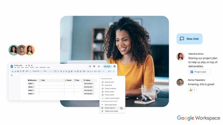
Following Google’s recent moves to streamline the UI of its larger products, Workspace apps are now getting a visual overhaul to put them more inline with things like Gmail, Search, and other Google services that have already undergone a Material You visual transformation. According to Google, this won’t have an impact on features or usability and is only in place to clean up the general UI and UX of these services.
As Google continues connecting users through Gmail to Docs to Drive and other apps, a cohesive look and feel should be part of the process. Currently, moving from something like Gmail over to Google Docs feels a bit jarring and it shouldn’t. Instead, Google wants to create a seamless visual transition from one service to the next to match what they are trying to accomplish from a workflow standpoint with Smart Canvas.
.gif)
For now, I’m only seeing this visual change in Google Drive, but Google says it could be up to 15 days for the roll-out to hit your account. With this change going into effect on March 6th, we should see most users on the updated interface by the end of March for sure.
Cohesion is great for users
At the end of the day, the goal of any UI is to help users get to what they need in a more-obvious way. As more and more Google products adopt Material You, it’s becoming easier and easier across Google’s product line to know where to look for different parts of the user experience. As services like Drive, Docs, Sheets and Slides get ever more complex, keeping a clean, intuitive UI has become more important than ever.
For instance, when I go to Google Drive on the web, I now get an interface that is far closer to what I see on my Chromebook in the Files app. While not a carbon copy, the feel and function of the two more closely align and for a person like myself who is accustomed to looking at the Files app on a daily basis, I feel more at home when opening Drive, and that’s a great thing for end user experience.
With these core apps now updating to Google’s design language, we’re even more excited to see ChromeOS finally get it’s Material You makeover that should get us to a place where Google’s hardware and software product truly have a unique look and feel that is all-Google. We’ve been through quite a few Google UI changes over the years, but it feels like Material You is here to stay, and as it begins to fully take shape across the product portfolio, things are looking very nice, indeed.
SUBSCRIBE TO UPSTREAM
Get Chrome Unboxed delivered straight to your inbox
Upstream is our flagship, curated newsletter with the top stories, most click-worthy deals, giveaways, and trending articles from Chrome Unboxed sent directly to your inbox a few times a week. Join 31,000+ subscribers.

