
Support our independent tech coverage. Chrome Unboxed is written by real people, for real people—not search algorithms. Join Chrome Unboxed Plus for just $2 a month to get an ad-free experience, access to our private Discord, and more. Learn more about membership here.
START FREE TRIAL (MONTHLY)START FREE TRIAL (ANNUAL)
Do you want to know what I can’t stand? When app developers make poor use of my device’s available screen real estate. In some instances, these decisions are made out of a desire to explore new UX territory or to be clever and different from the competition.
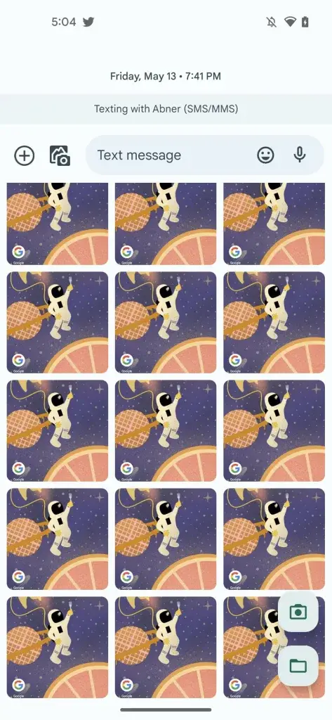
For the longest time, Google Messages has forced users to scroll left to right in the photo picker to find and attach recent photos. Because of the horizontal nature of this, anyone trying to slap their latest cute puppy pic on a text to their friends or significant other would often be met with cramped frustration.
Thanks to a new discovery by 9to5Google, Google is experimenting with a more traditional, vertically scrolling photo picker. I say experimenting because it’s not fully implemented yet, and only a few users have encountered it.
There’s always the chance that this will simply be an A/B test that doesn’t go live, but I doubt it. Most Messages users I’ve ever seen discuss the photo picker have expressed their frustrations with it, and while it’s not a terrible design as it allows you to view your message while simultaneously browsing incoming replies, the new design will prove to be easier to focus on.
Once you’ve scrolled down far enough in the vertical gallery, a photo button for taking a new picture with the camera and a folder icon for launching the full-fledged files app will appear on the bottom-left-hand side. I feel like this sure beats the odd three dots menu that used to sit there, and I hope this updated UI comes to everyone sooner rather than later or not at all.
SUBSCRIBE TO UPSTREAM
Get Chrome Unboxed delivered straight to your inbox
Upstream is our flagship, curated newsletter with the top stories, most click-worthy deals, giveaways, and trending articles from Chrome Unboxed sent directly to your inbox a few times a week. Join 31,000+ subscribers.