


Support our independent tech coverage. Chrome Unboxed is written by real people, for real people—not search algorithms. Join Chrome Unboxed Plus for just $2 a month to get an ad-free experience, access to our private Discord, and more. Learn more about membership here.
START FREE TRIAL (MONTHLY)START FREE TRIAL (ANNUAL)
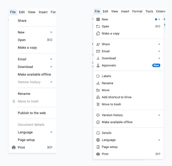
Soon, when you log in to Google Docs, you will find the menus have changed slightly, looking more modern with some improved visuals. Google has announced this update in a blog post stating that this change is geared toward making it easier to locate the most commonly-used features, opting for shortened menus and prominent icons. Google described the change as follows:
We’re updating the menus in Google Docs to make it easier to locate the most commonly-used features. In this update you’ll notice:
Google Workspace Updates- Shortened menus for better navigation
- Reorganization for more intuitive feature location
- Prominent icons for faster recognition
Though functionality is not changing with this redesign, some features have been reorganized and grouped based on what makes it easier and faster to navigate. For example, the “New,” “Open,” and “Make a copy” options have been grouped right at the top while moving “Share” right underneath with the sub-menus. The “Add-Ons” main menu is also gone now and in its place is a new “Extensions” menu that encompasses everything Apps Script and Add-Ons related.
This new design will be the default for all Google accounts (Workspace and Personal), with an extended rollout that should be completed by the end of May. Although this hasn’t hit any of my accounts yet, just by looking at the screenshots above, I can see how much of an improvement this is, and I believe this will go a long way in helping users find their way around Docs.