


Support our independent tech coverage. Chrome Unboxed is written by real people, for real people—not search algorithms. Join Chrome Unboxed Plus for just $2 a month to get an ad-free experience, access to our private Discord, and more. Learn more about membership here.
START FREE TRIAL (MONTHLY)START FREE TRIAL (ANNUAL)
I’m one of those people who live on the bleeding edge of technology. I’m always excited to see what companies are doing with their hardware and software, and I rarely ever complain about it if I know it has positive implications down the road.
In fact, most changes that are made to Chrome OS over the years, for example, have been transitional steps towards the beautiful and functional operating system that it’s become over the past two years or so. As someone who is quite used to observing things from the perspective of a user experience designer, I can tell you now that Google’s idea to combine your Chromebook’s notifications with the quick settings toggles was a terrible idea.
Not to say this is an objective truth or anything, as it’s certainly just my opinion, but I bet if you ask a handful of people who actually utilize their notifications day-to-day, they will also agree that the experience of going between them and the toggles for Wi-Fi, Bluetooth, volume, and so on is just janky at best, and not well thought out at worst.
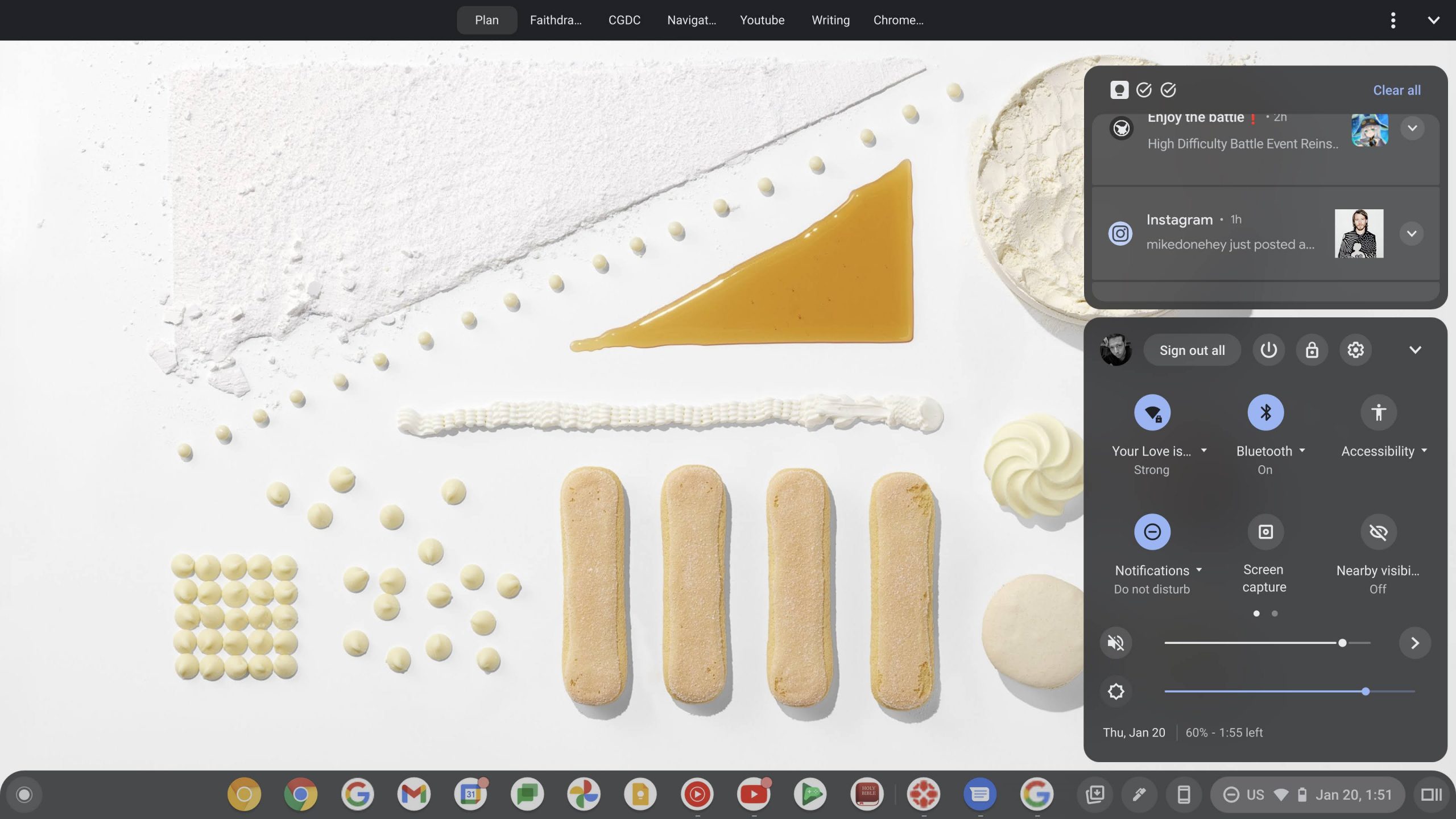
Don’t get me wrong, I love the compact space on the shelf that comes as a result of the merger of these two features, but ever since the overview button, Phone Hub, Tote, and more were added to the bottom-right, I found myself asking why we don’t have separate notifications again like the old days. I’m not terribly nostalgic for the way things were in the early days of Chrome OS, but the separate notification bell icon was fantastic, and I find myself missing it more each day.
Recently, Google implemented a revamped notifications design that’s very much in line with my original mock-up for the operating system, and I love everything about it. I’m not about to complain that it feels more cramped, as the trade-off for the extra stylization and padding feels like notifs stand out more – something that’s needed. Additionally, notification grouping is excellent and I love it. However, I will say that while the company is making a pass at notifications from a design perspective, perhaps it can find the time or a desire to parse them out entirely from the quick settings and place them back in their own separate area.
The reason this is such a strong hope of mine is that I swap between multiple logged in accounts often or change from light to dark mode and back all from the quick settings panel, and any and all interactions there cause the entire menu to expand vertically, leaving virtually no space for my notifications. I can collapse it again, and I often do, but it gets annoying as hell to have to continuously let these two necessary areas fight for control of the space available.
Because Android 12L is truly taking the Android and Chrome OS merger that Google swears is not happening to a new level, I don’t foresee them segregating the notifications out of the quick settings area, but I do have hope for the possibility of a wider area where these two segments are horizontally alongside one another instead of stacked.

12L refines the system UI to make it more beautiful and easier to use on large screens—across notifications, quick settings, lockscreen, overview, the home screen, and more.
On large screens, the notification shade takes advantage of the space by showing Quick Settings and notifications in a new two-column layout. The lock screen also uses a larger two-column layout to highlight notifications and clock, and system apps like Settings are also optimized.
An OS optimized for large screens
If you take a look at this beautiful rendition of the notifications and quick settings panel in Android 12L, you’ll notice that this is exactly what these larger screen devices are doing with the design! In my original OS mock-up for the future design of Chrome OS, I utilized many of these visual elements for sliders, tiles, and more, but at the time, 12L was not yet a thing. I’m calling it now – I believe that to alleviate the awkward space control issues we currently have on Chromebooks for these two features, Google is eventually going to place them side by side instead of stacking them vertically.
Chromebooks don’t run exclusively on Android, so it’s impossible to say for sure, but since Android 12L is verified as coming to Chrome OS, and Google’s laptop operating system takes tons of inspiration from Android, it will likely immediately bring this change. This makes the whole thing less of a prediction and more of an obvious observation of an eventual outcome, but it’s still exciting to me, either way, to think of a future where it doesn’t annoy the crap out of me to look at notifications in a one-inch space anymore. Let me know if you’d like this change to come to your Chromebook, or if, for some reason, you’re fine with its current implementation.
SUBSCRIBE TO UPSTREAM
Get Chrome Unboxed delivered straight to your inbox
Upstream is our flagship, curated newsletter with the top stories, most click-worthy deals, giveaways, and trending articles from Chrome Unboxed sent directly to your inbox a few times a week. Join 31,000+ subscribers.